
















Copyright: ©Author(s) 2026.
World J Transplant. Sep 18, 2026; 16(3): 121821
Published online Sep 18, 2026. doi: 10.5500/wjt.121821
Published online Sep 18, 2026. doi: 10.5500/wjt.121821
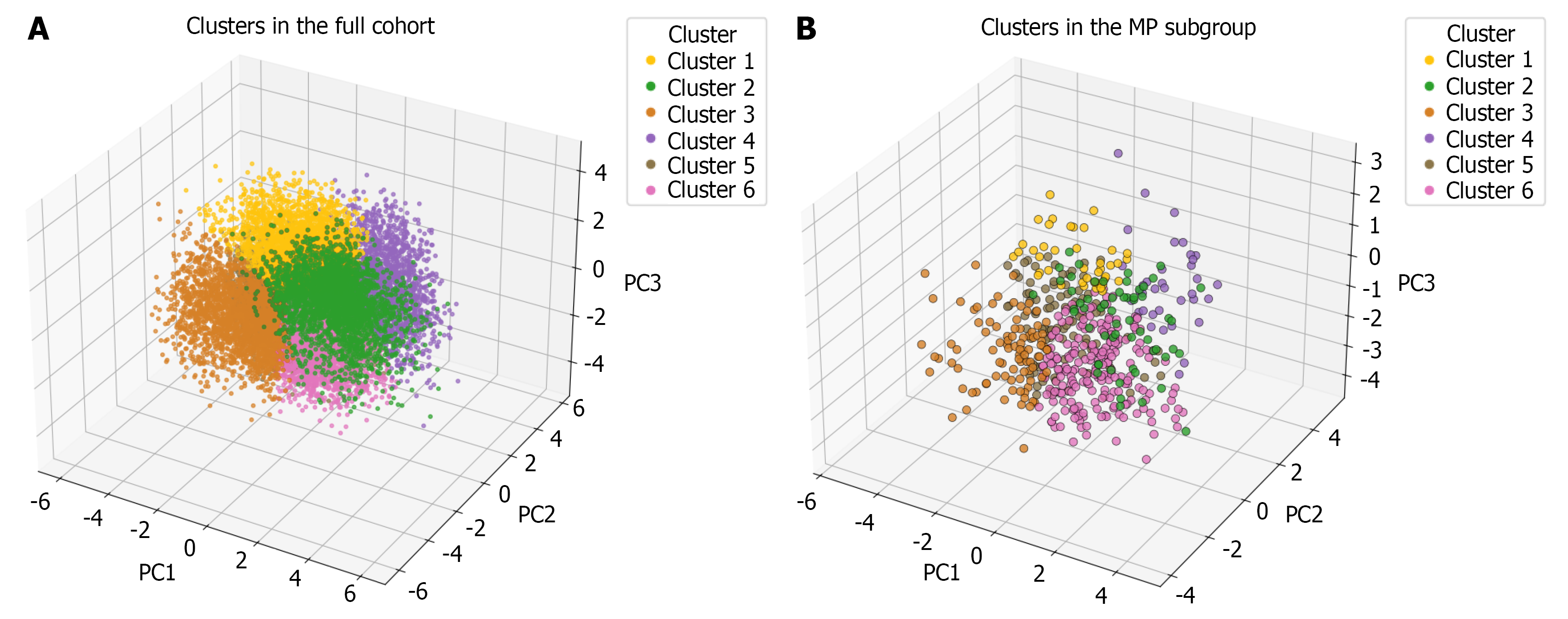
Figure 1 Resulting clusters in the full cohort and the machine perfusion subgroup.
A and B: 3D visualisation of clustering results from weighted principal component analysis for mixed-type data followed by gaussian mixture model in the full cohort (A) and machine perfusion subgroup (B). Points represent individuals projected onto the first three principal components (PC1–PC3), with colours indicating gaussian mixture model-derived cluster membership. MP: Machine perfusion.
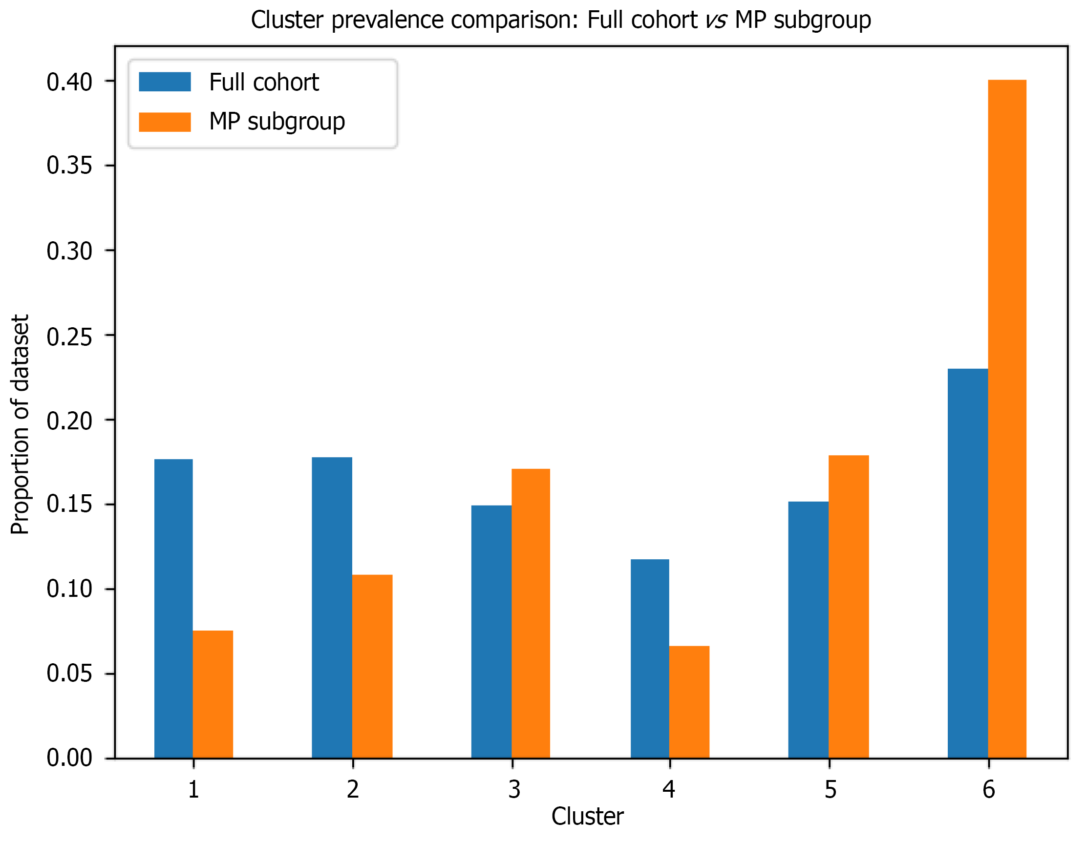
Figure 2 Cluster samples distribution comparison between the full cohort (n = 15904) and the machine perfusion subgroup (n = 544).
The machine perfusion (MP) subgroup shows notable enrichment in cluster 6 (40.0% vs 22.9% in full cohort) and cluster 5 (17.8% vs 15.1%), with corresponding under-representation in clusters 1 (7.5% vs 17.5%) and 4 (6.6% vs 11.6%). Cluster distribution in the full cohort: Cluster 1 n = 2797 (17.5%), cluster 2 n = 2826 (17.7%), cluster 3 n = 2370 (14.9%), cluster 4 n = 1854 (11.6%), cluster 5 n = 2402 (15.1%), cluster 6 n = 3655 (22.9%); In the MP subgroup: Cluster 1 n = 41 (7.5%), cluster 2 n = 59 (10.8%), cluster 3 n = 93 (17.0%), cluster 4 n = 36 (6.6%), cluster 5 n = 97 (17.8%), cluster 6 n = 218 (40.0%). MP: Machine perfusion.
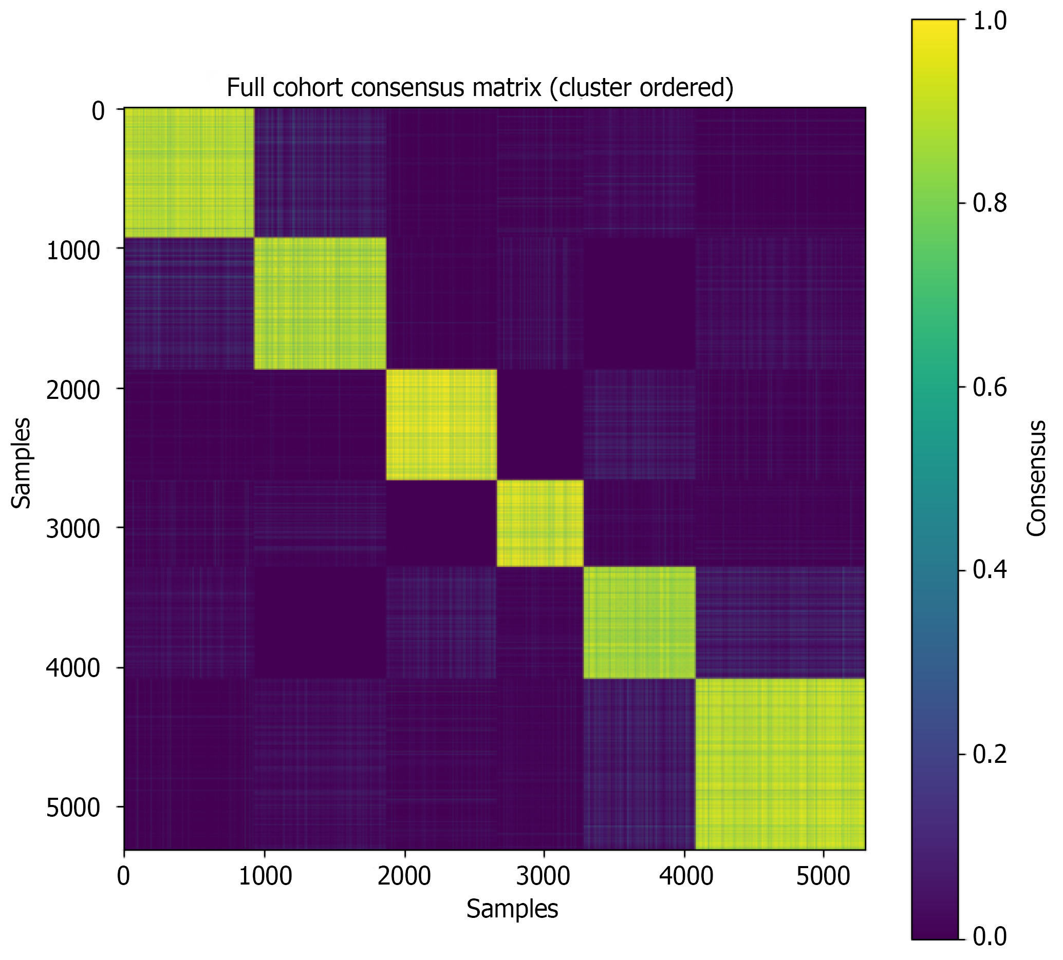
Figure 3 Full cohort cluster stability consensus matrix.
Consensus clustering matrix for the full cohort based on 100 iterations with 80% subsampling. Each cell represents the proportion of times a pair of samples was assigned to the same cluster across resampled runs. Samples are ordered by cluster membership, with blocks along the diagonal indicating stable clusters. Higher values (yellow) reflect more consistent co-clustering, whereas diffuse or intermediate values indicate instability (dark purple). Clusters are ordered from left to right (first on the left cluster 1, last on the right cluster 6).
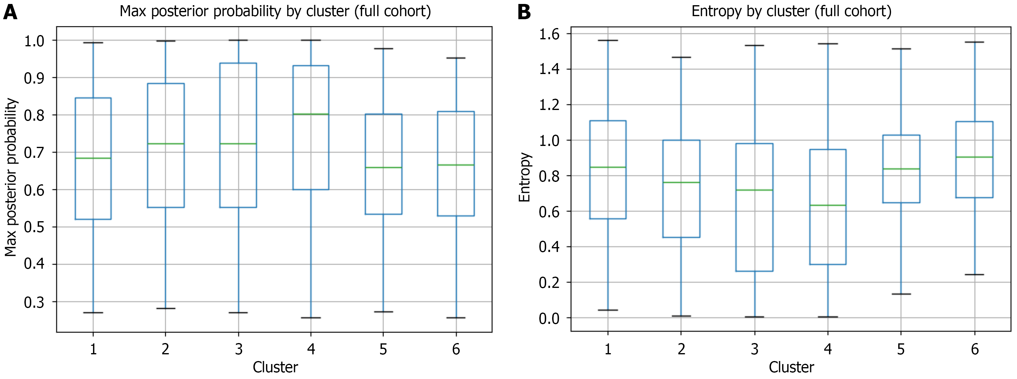
Figure 4 Cluster membership uncertainty assessed by maximum posterior probability and Shannon entropy in the full cohort.
A: Boxplots showing the distribution of maximum posterior probability for each of the six patient clusters identified by gaussian mixture model. Maximum posterior probability represents each patient’s confidence of assignment to their designated cluster, with values closer to 1 indicating higher certainty. Box boundaries represent the 25th and 75th percentiles, horizontal lines indicate medians, and whiskers extend to 1.5 × the interquartile range; B: Boxplots showing the distribution of Shannon entropy of the full posterior distribution for each cluster. Entropy quantifies assignment uncertainty, with lower values indicating more confident cluster membership. Cluster 4 demonstrates the highest membership confidence (median max probability = 0.80, median entropy = 0.63), while clusters 5 and 6 show greater uncertainty (median max probabilities = 0.66 for both, median entropies = 0.84 and 0.90, respectively).
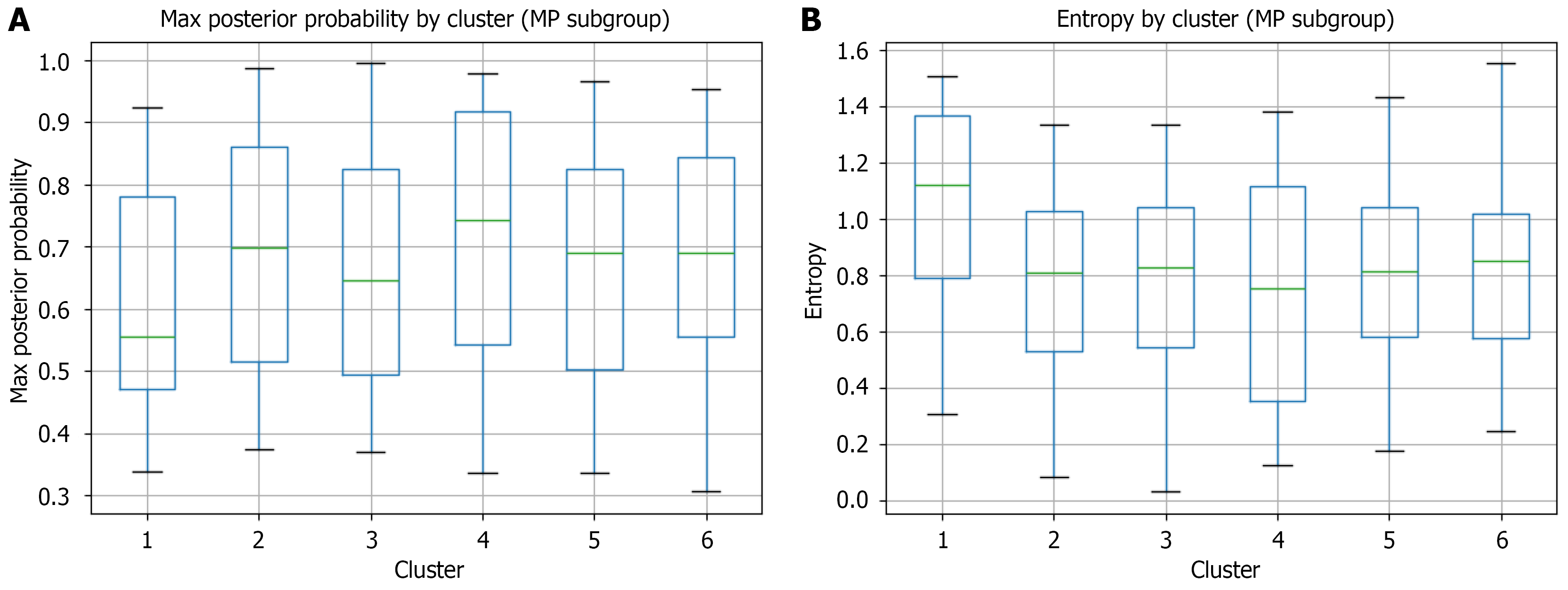
Figure 5 Cluster membership uncertainty assessed by maximum posterior probability and Shannon entropy in the machine perfusion subgroup.
A: Boxplots showing the distribution of maximum posterior probability for each of the six patient clusters identified by gaussian mixture model. Maximum posterior probability represents each patient’s confidence of assignment to their designated cluster, with values closer to 1 indicating higher certainty. Box boundaries represent the 25th and 75th percentiles, horizontal lines indicate medians, and whiskers extend to 1.5 × the interquartile range; B: Boxplots showing the distribution of Shannon entropy of the full posterior distribution for each cluster. Entropy quantifies assignment uncertainty, with lower values indicating more confident cluster membership. Cluster 4 demonstrates the highest membership confidence also in the machine perfusion subgroup (median max probability = 0.74, median entropy = 0.72), while cluster 1 shows greater uncertainty (median max probability = 0.55, median entropy = 1.11). MP: Machine perfusion.
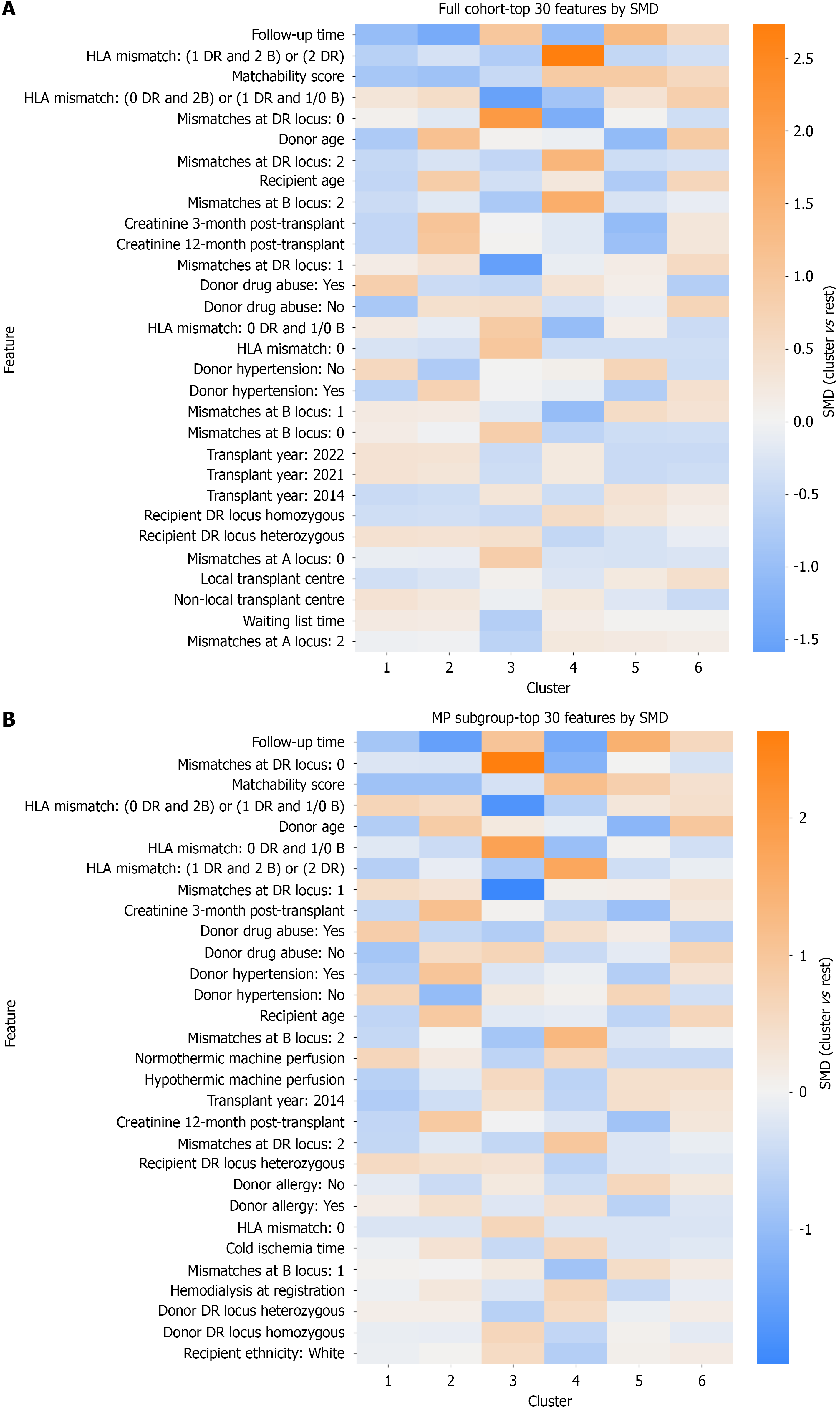
Figure 6 Standardized mean difference heatmaps for cluster characterization.
Heatmaps displaying the top 30 clinical features with the largest absolute standardized mean difference (SMD) across clusters for the full cohort (n = 15904) and the machine perfusion subgroup (n = 544). Features include demographic, clinical, and transplant-related variables from both donors and recipients, ranked from top to bottom by maximum absolute SMD across all clusters. Each cell represents the SMD of a given feature in one cluster compared to all other clusters combined. The color scale ranges from blue (negative SMD, feature value lower than average) through white (SMD approximately 0) to orange (positive SMD, feature value higher than average). Columns represent the six patient clusters; rows represent individual features. SMD values ≥ 0.3 or ≤ -0.3 are generally considered clinically meaningful differences. A: The full cohort; B: The machine perfusion subgroup. SMD: Standardized mean difference; HLA: Human leukocyte antigen; MP: Machine perfusion.
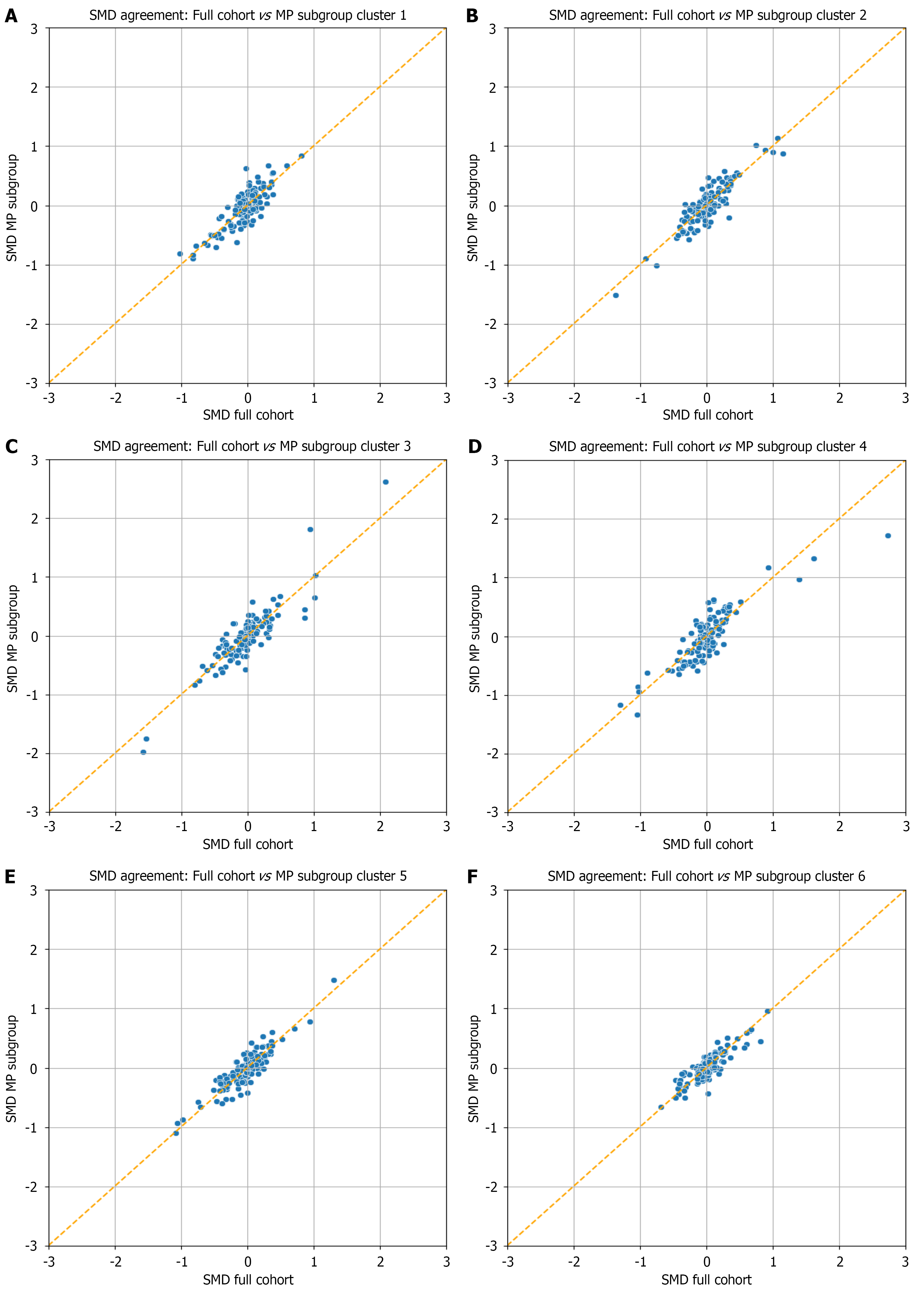
Figure 7 Cross-dataset Standardized mean difference profile agreement between matched clusters.
Scatter plots comparing standardized mean difference (SMD) profiles between corresponding clusters in the full cohort (X-axis) and machine perfusion subgroup (Y-axis) for cluster 1, cluster 2, cluster luster 3, cluster luster 4, cluster luster 5, and cluster luster 6 each point represents a single clinical feature’s SMD value in the matched cluster pair. Optimal cluster correspondence between datasets was determined using the Hungarian algorithm to maximize phenotypic similarity based on SMD profiles. The orange dashed line (Y = X) represents perfect agreement. Points closer to this line indicate consistent feature effect sizes across datasets, while deviations suggest differential phenotypic patterns. Phenotypic alignment was quantified using Pearson correlation coefficients and mean absolute differences between matched SMD profiles. A: Cluster 1; B: Cluster 2; C: Cluster 3; D: Cluster 4; E: Cluster 5; F: Cluster 6. MP: Machine perfusion; SMD: Standardized mean difference.
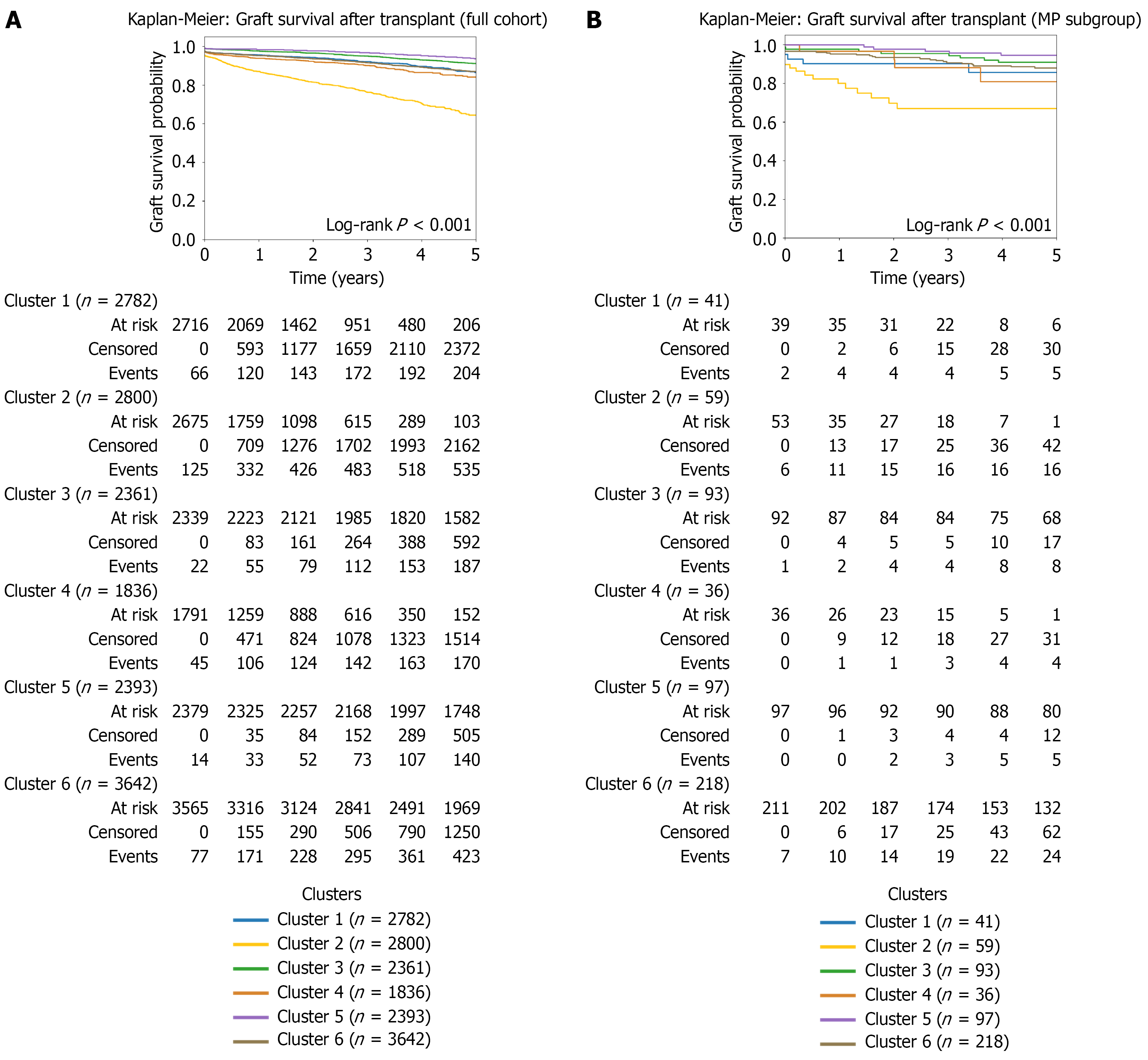
Figure 8 Graft survival Kaplan-Meier curves for the full cohort (n = 15904) and the machine perfusion subgroup (n = 544).
Time zero represents the date of transplantation, with patients followed for up to 5 years. The y-axis shows overall survival probability. Numbers at risk are displayed below each panel. Survival differences between clusters were evaluated using the log-rank test; P values are displayed. Cluster 2 exhibited the steepest graft survival decline in both datasets. The machine perfusion subgroup showed the highest graft failure rate, with all events occurring within the first 2.07 years post-transplant. A: The full cohort; B: The machine perfusion subgroup. MP: Machine perfusion.
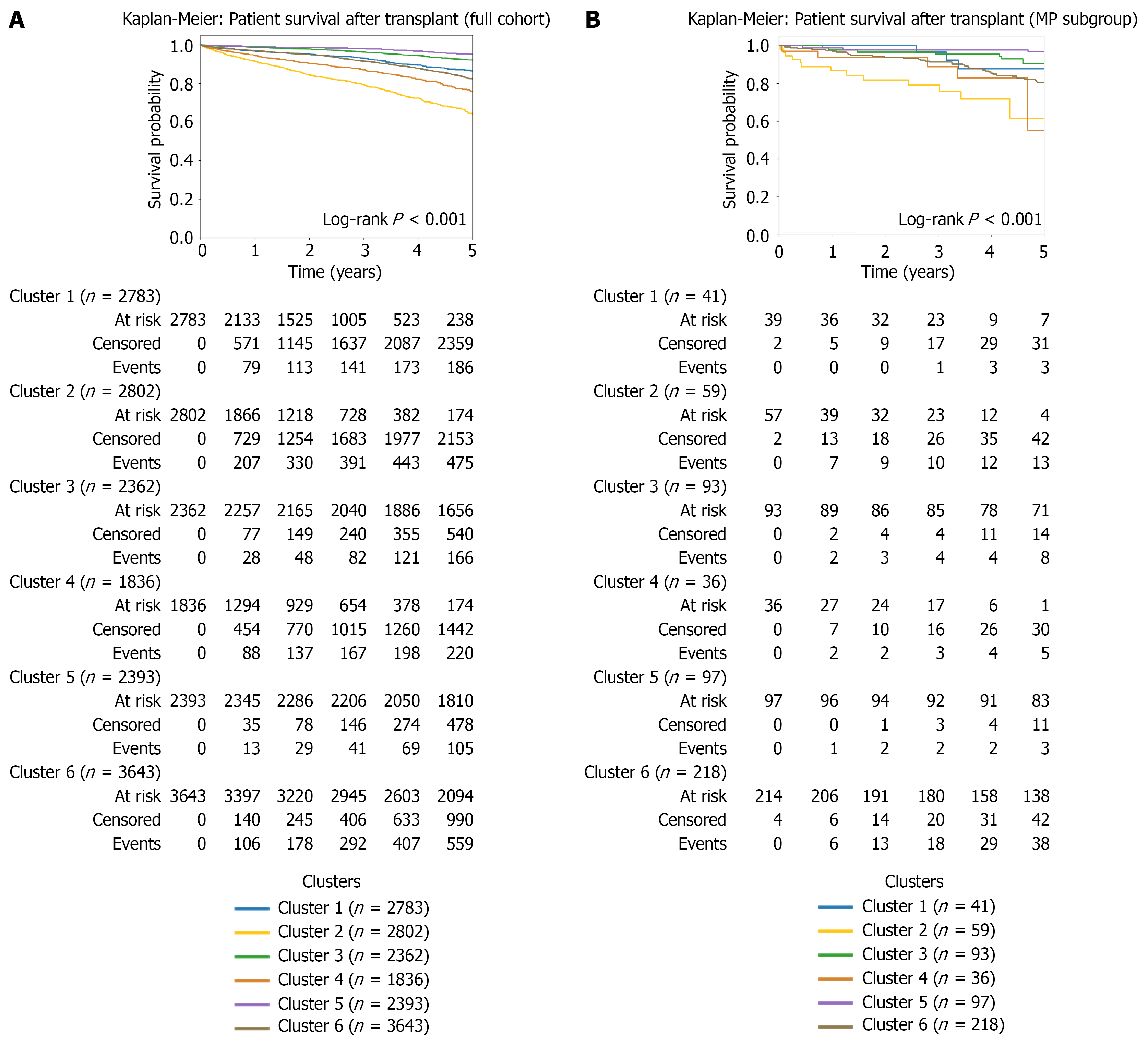
Figure 9 Patient survival Kaplan-Meier curves for the full cohort (n = 15904) and the machine perfusion subgroup (n = 544).
Time zero represents the date of transplantation, with patients followed for up to 5 years. The y-axis shows overall survival probability. Numbers at risk are displayed below each panel. Survival differences between clusters were evaluated using the log-rank test; P values are displayed. Cluster 4 showed a marked decrease in 5-year patient survival in the machine perfusion subgroup compared with the full cohort (57% vs 78%), making it the worst-performing cluster in this population. A: The full cohort; B: The machine perfusion subgroup. MP: Machine perfusion.
- Citation: Castellanos De Brigard J, Rangganata E, Papalois VE. Machine perfusion distribution across clinical phenotypes in kidney transplantation: A national cohort study using unsupervised clustering. World J Transplant 2026; 16(3): 121821
- URL: https://www.wjgnet.com/2220-3230/full/v16/i3/121821.htm
- DOI: https://dx.doi.org/10.5500/wjt.121821