Copyright
©The Author(s) 2024.
World J Clin Oncol. Feb 24, 2024; 15(2): 329-355
Published online Feb 24, 2024. doi: 10.5306/wjco.v15.i2.329
Published online Feb 24, 2024. doi: 10.5306/wjco.v15.i2.329
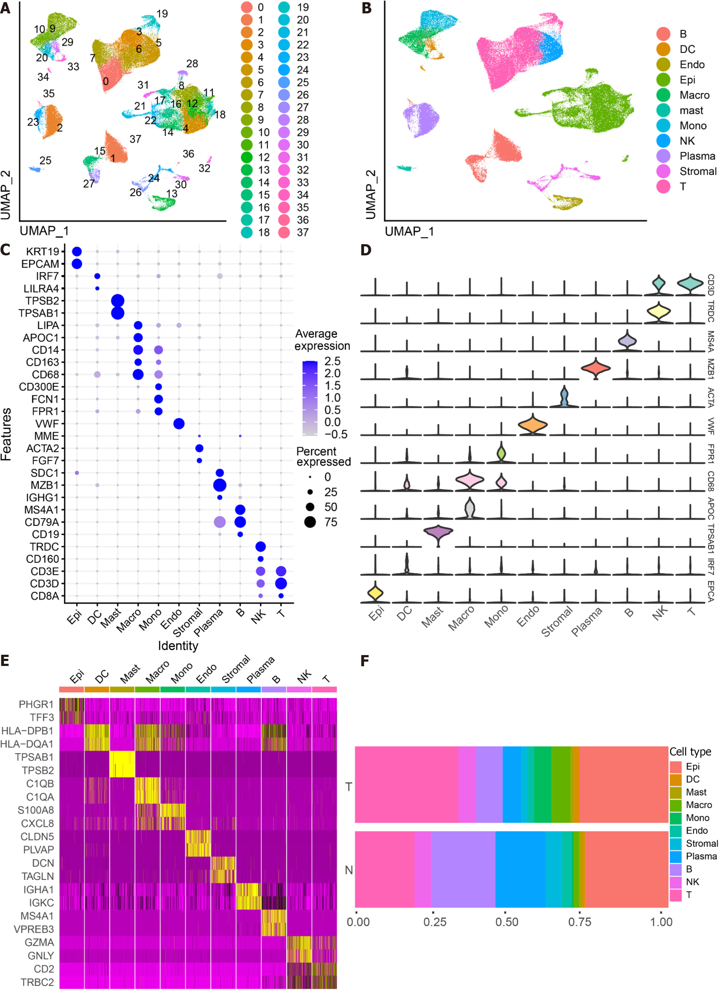
Figure 1 Identifies 11 cell clusters with different annotations based on single-cell RNA sequencing-seq data, revealing a high degree of cellular heterogeneity in colorectal cancer cells.
A: Selection of 88 samples from the GSE178341 dataset, followed by quality control, resulted in the inclusion of 115489 cells in the analysis, which were classified into 38 independent clusters. Different colors denote distinct clusters; B: Uniform Manifold Approximation and Projection distribution highlighting different cell types; C: Dot plot depicting cell type marker genes. Circle size corresponds to the proportion of gene expression in the cell cluster, with darker colors indicating higher average expression; D: Violin plot illustrating differential genes for each cell type; E: Heatmap showcasing the top 2 differential genes for each cell type; F: Proportion of each cell population in different samples, including epithelial cells (Epi, 27.79%), myeloid cells (DC, 1.55%; Macrophage, Macro, 4.86%; Monocyte, Mono, 4.16%), mast cells (Mast, 1.11%), endothelial cells (Endo, 2.28%), Stromal cells (Stroma, 3.03%), plasma (Plasma, 8.75%), B cells (B, 11.85%), NK cells (NK, 5.58%), and T cells (T, 29.02%).
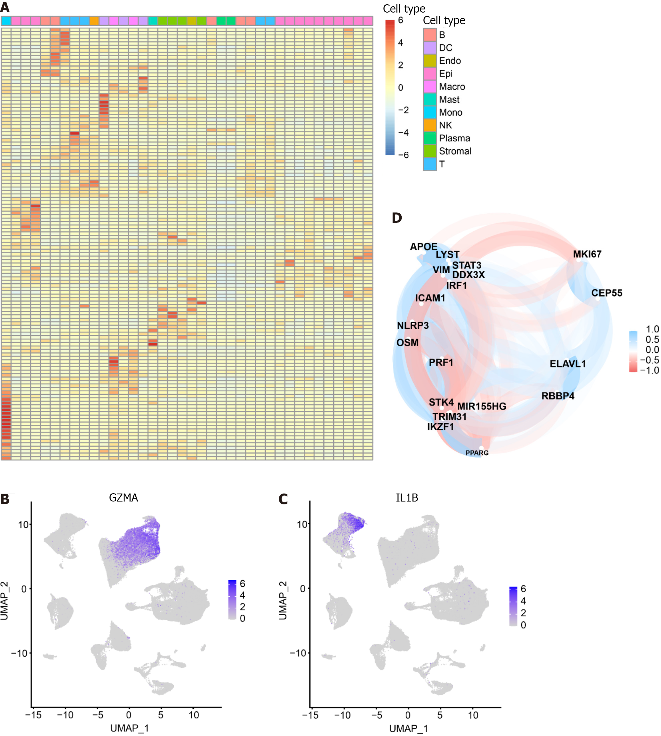
Figure 2 Heat map of 125 pyroptosis-related genes in cell types.
The heat map depicts the expression of 125 pyroptosis-related genes across 11 cell types: T cells, NK cells, B cells, Plasma, Epithelial cells, Myeloid cells (DC, Macrophage, Monocyte), Stromal cells, Mast cells, and Endothelial cells. A: The color gradient from blue to red represents the gradual increase in gene expression; B: Specific expression of GZMA in the cluster where NK cells and T cells are located; C: Specific expression of IL-1B in Monocytes; D: Correlation analysis between pyroptosis-related genes in intersecting cells. Blue represents a negative correlation, while red represents a positive correlation.
Figure 3 CellChat and GSVA.
A: Graph illustrating the quantity and strength of interactions among primary cell clusters; B: Uniform Manifold Approximation and Projection plots displaying 27 subsets. The accompanying legend identifies the subgroups; C: Analysis of cell communication within the 27 subsets; D: Examination of the SPP1 signaling pathway interaction within each cluster; E: Interactions originating from a subset of gamma-delta T cells (T05). The X-axis represents the cell pair, and the Y-axis represents the receptor-ligand pair; F: Interactions of other cell subsets with gamma-delta T cells (T05) subsets; G: Interactions involving key cell subsets (M01, T05, FB2, Plasmablasts, Schwann, and EpiT); H: Presentation of significantly distinct signaling pathways in each cell subset, with the cell subset on the X-axis and the pathway name on the Y-axis. Colors ranging from blue to red indicate higher enrichment of the cell subset.
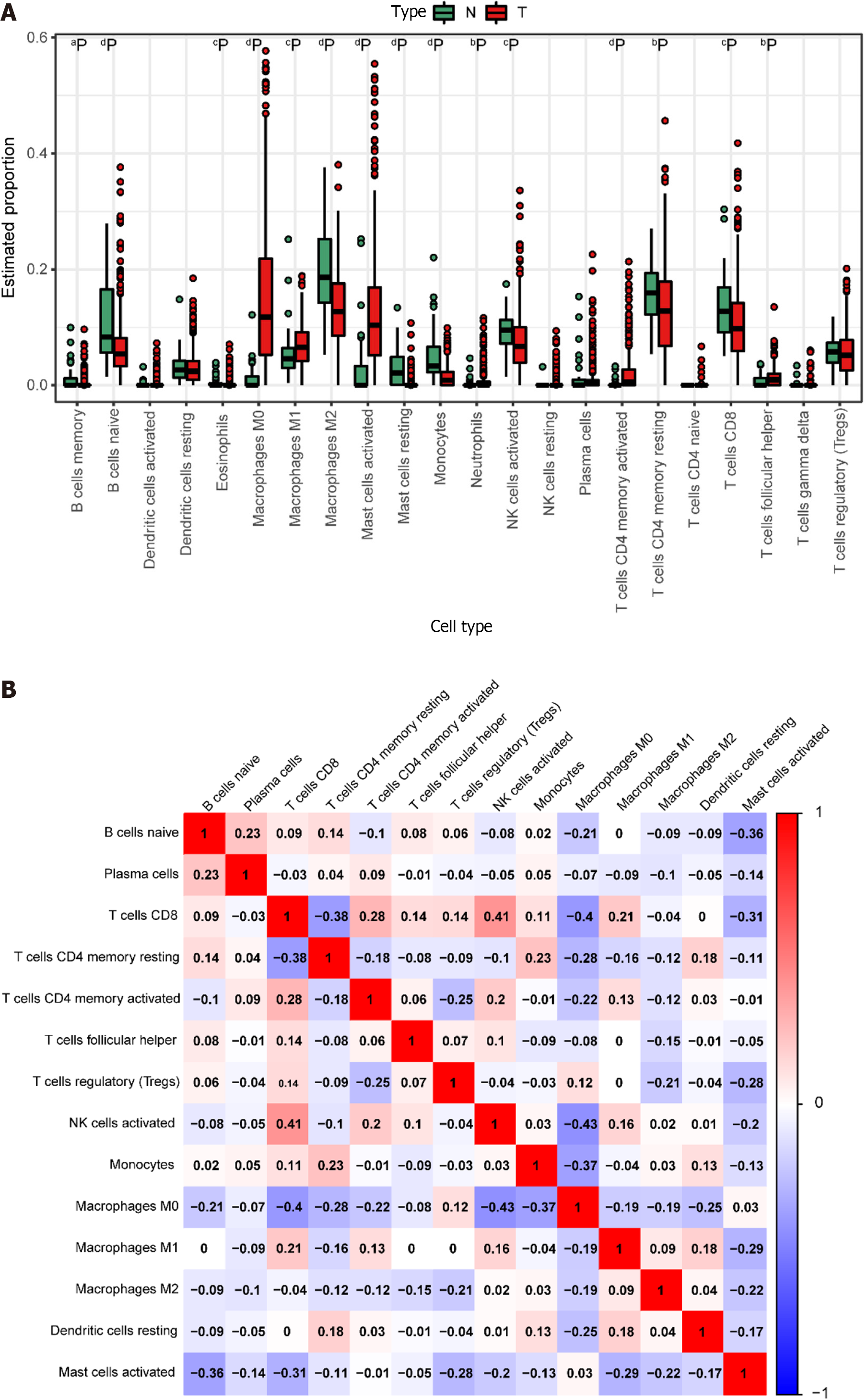
Figure 4 Immune cell prediction from The Cancer Genome Atlas Dataset.
A: Disparities in different immune cell types between tumor and normal samples in the The Cancer Genome Atlas (TCGA) dataset. Normal samples are denoted in green, and tumor samples are denoted in red. Significance levels are indicated as follows: aP < 0.05; bP < 0.01; cP < 0.001; dP < 0.0001; B: Heatmap illustrating the correlation among highly expressing immune cells in the TCGA dataset. The color scale of blue, white, and red denotes the strength of correlation, with darker colors signifying stronger correlations. Red indicates a positive correlation, while blue indicates a negative correlation.
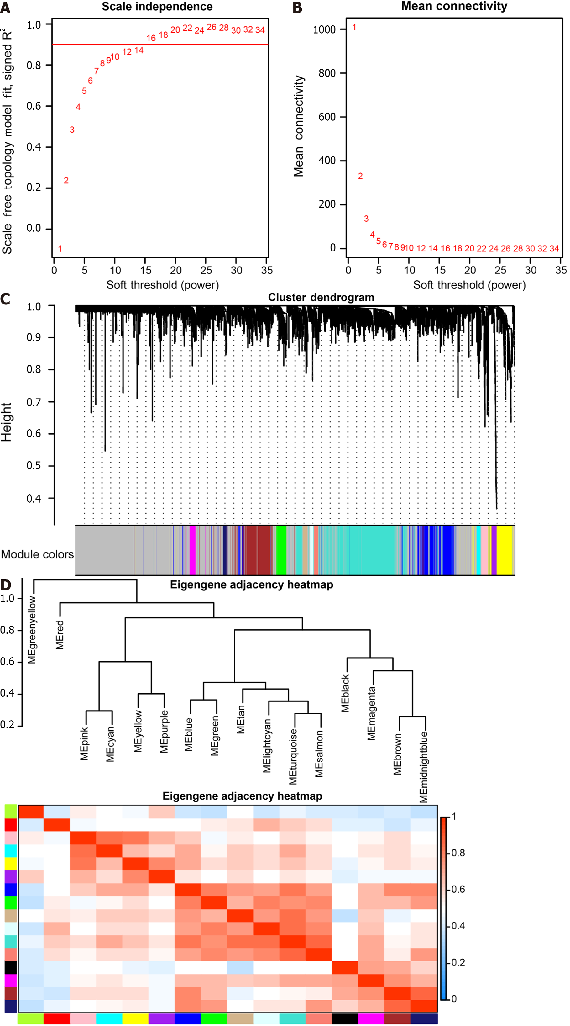
Figure 5 Weighted co-expression network analysis co-expression identifies cell type-dependent modules.
A: Analysis of the Scale-free Fit Index for soft threshold power (β) in the range of 1-34; B: Assessment of the Average Connectivity across soft-threshold powers (β) ranging from 1 to 34; C: Hierarchical clustering tree depicting genes based on their topological overlap; D: Correlation plot illustrating relationships between modules.
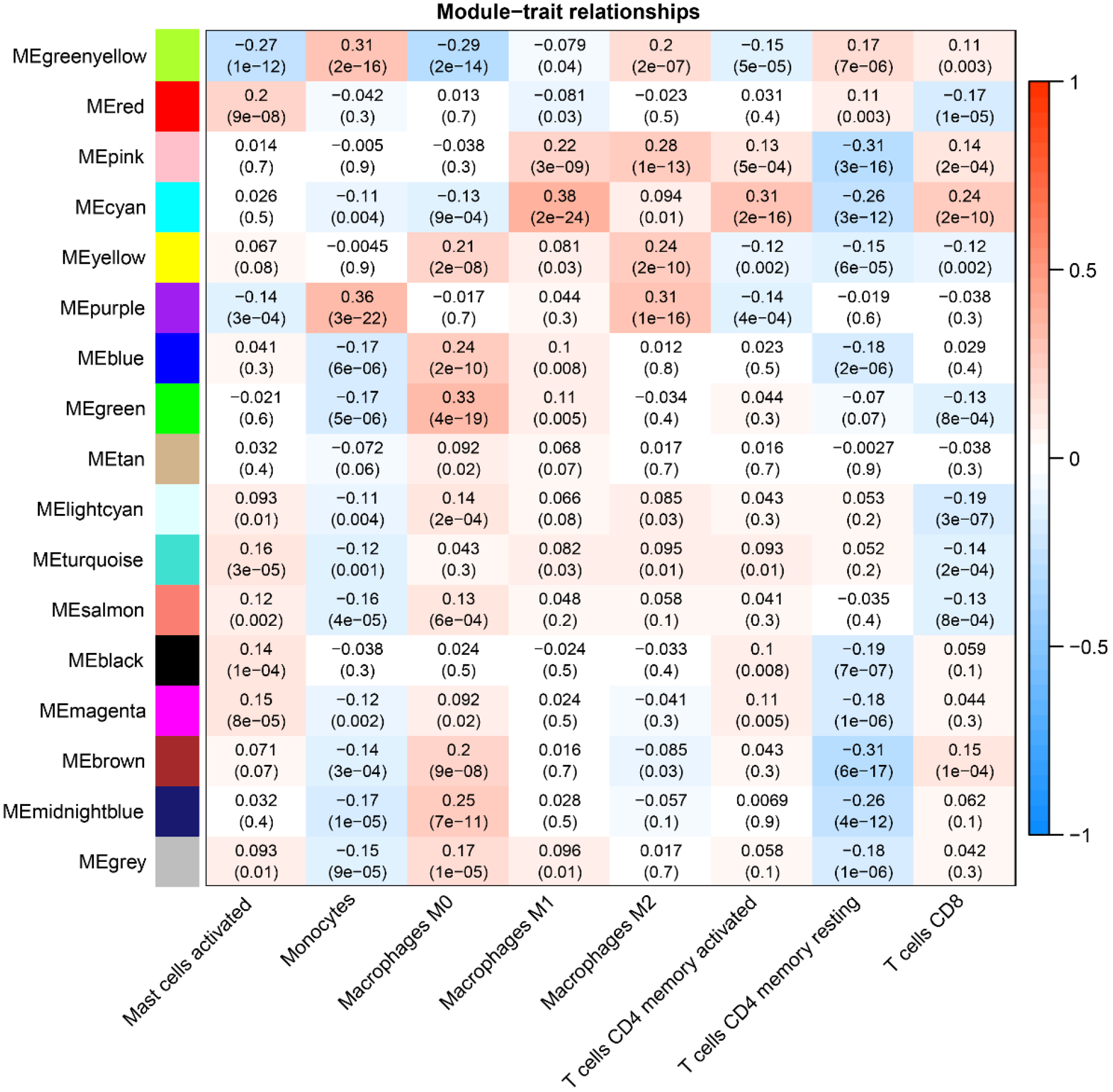
Figure 6 Weighted co-expression network analysis Co-expression Modules and Cell Types.
The X-axis represents cell types provided by CIBERSORTx, while the Y-axis represents the Weighted co-expression network analysis co-expression modules.
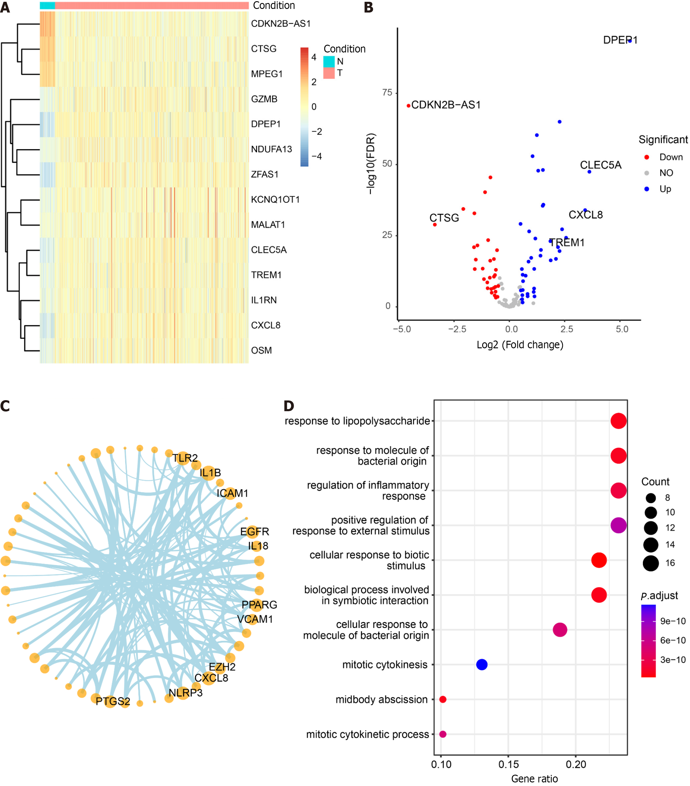
Figure 7 Differential analysis, correlation, and enrichment analysis of pyroptosis-related genes.
A: Heatmap illustrating the expression profiles of the top 14 differential pyroptosis-related genes. Colors range from blue to red, indicating a gradual increase in expression levels. The color bar above distinguishes (non-colorectal cancer) non-CRC tissues (N) in blue and CRC tissues (T) in red; B: Volcano plot depicting the results of CRC vs non-CRC differential analysis; C: Correlation network diagram highlighting highly connected pyroptotic genes; D: Results of Gene Ontology enrichment analysis for 125 pyroptosis-related genes. The bubble plot displays the top 10 most significant enriched functions. The X-axis represents Gene Ratio, and the color of the bubbles ranges from blue to red, with red indicating more significant enrichment. The Y-axis denotes the name of the pathway.
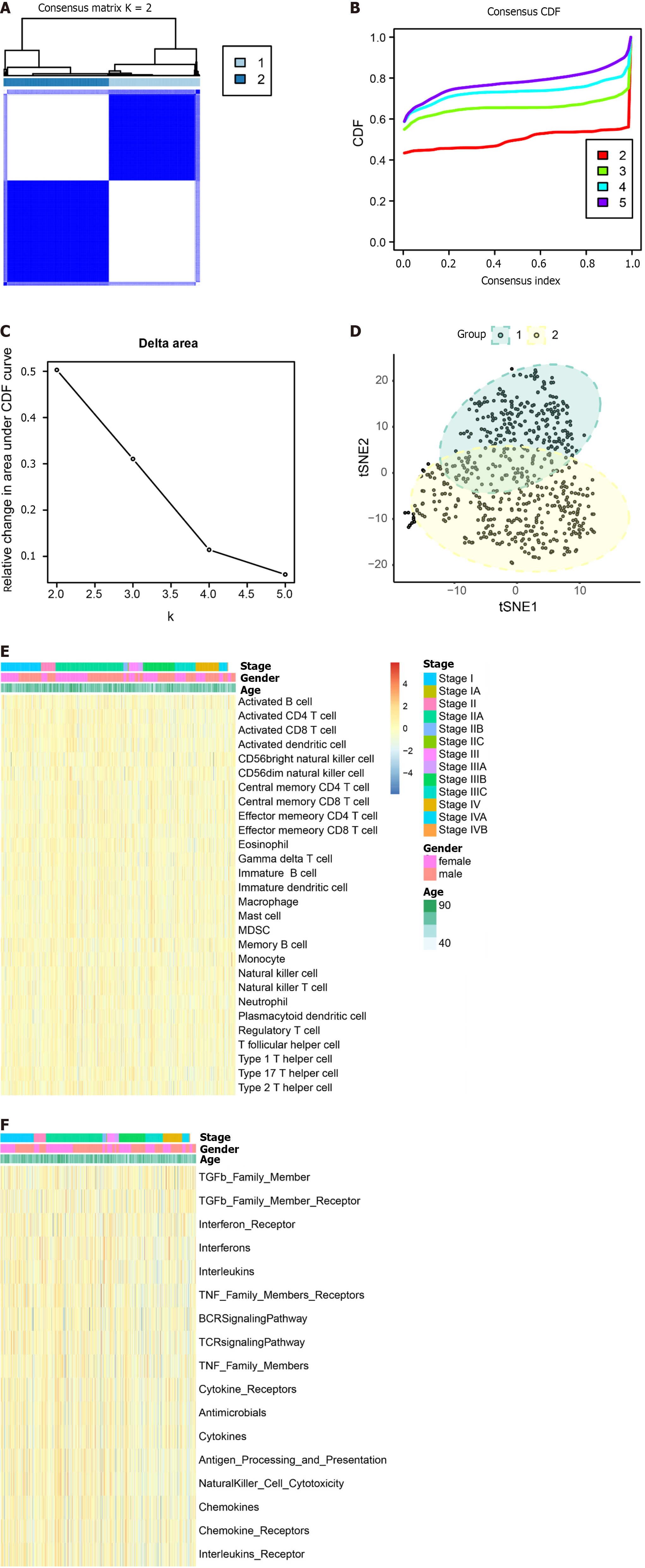
Figure 8 Exploring typing by consensus clustering and single-sample gene set enrichment analysis.
A: Heatmap depicting the concordance clustering matrix, with values ranging from 0 (impossible to cluster together) to 1 (always clustered together). Shades of white to dark blue represent the scale of concordance; B and C: Consistent CDF plot and Delta Area Plot; D: Cluster analysis using tSNE algorithm; E: Single-sample gene set enrichment analysis (ssGSEA) of immune cells. Legend includes tumor stage, gender, and age; F: ssGSEA of immune function. Legend includes tumor stage, gender, and age.
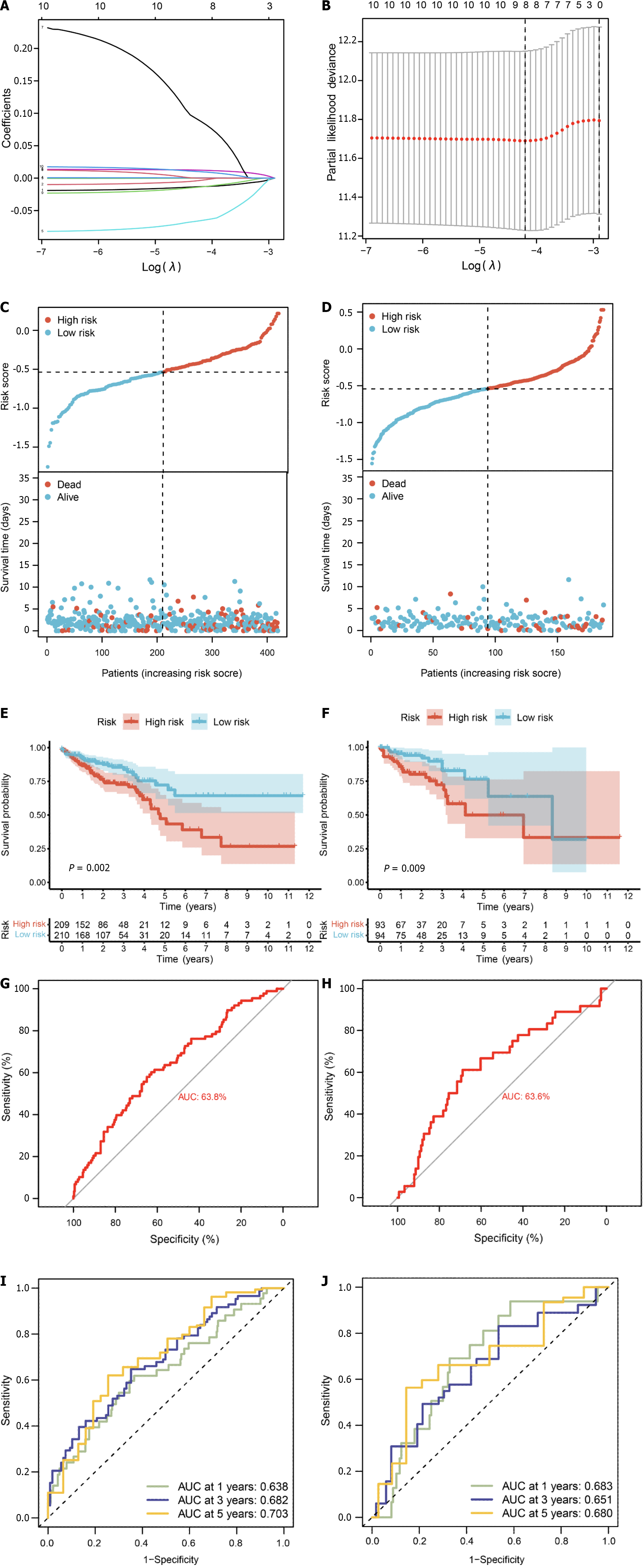
Figure 9 Prognostic model based on pyroptosis-related genes.
A: Construction of a fitting model using LASSO regression, illustrating changes in the lambda value of 10 pyroptosis-related genes significantly associated with prognosis. The X-axis represents the Log λ value, and the Y-axis represents the coefficient; B: Cross-validation analysis determining the optimal lambda value for the fitted model. The X-axis represents the logized lambda value, the Y-axis represents the error of the model, and the dashed line on the left signifies the lambda value minimizing the error and the number of screened features; C: Risk map of the training set, where red dots represent high-risk patients, and light blue represents low-risk patients; D: Risk map of the test set; E: Survival curve of the training set (P = 0.002), where a smaller P value indicates higher accuracy; F: Survival curve of the test set (P = 0.009); G: Receiver operating characteristic (ROC) curve of the training set [area under the curve (AUC) = 63.8%], where a higher AUC signifies greater accuracy; H: ROC curve for the test set (AUC = 63.6%); I: ROC curve for 1-, 3-, and 5-year calculated from the risk score in the training set; J: ROC curve for 1-, 3-, and 5-year calculated from the risk score in the test set.
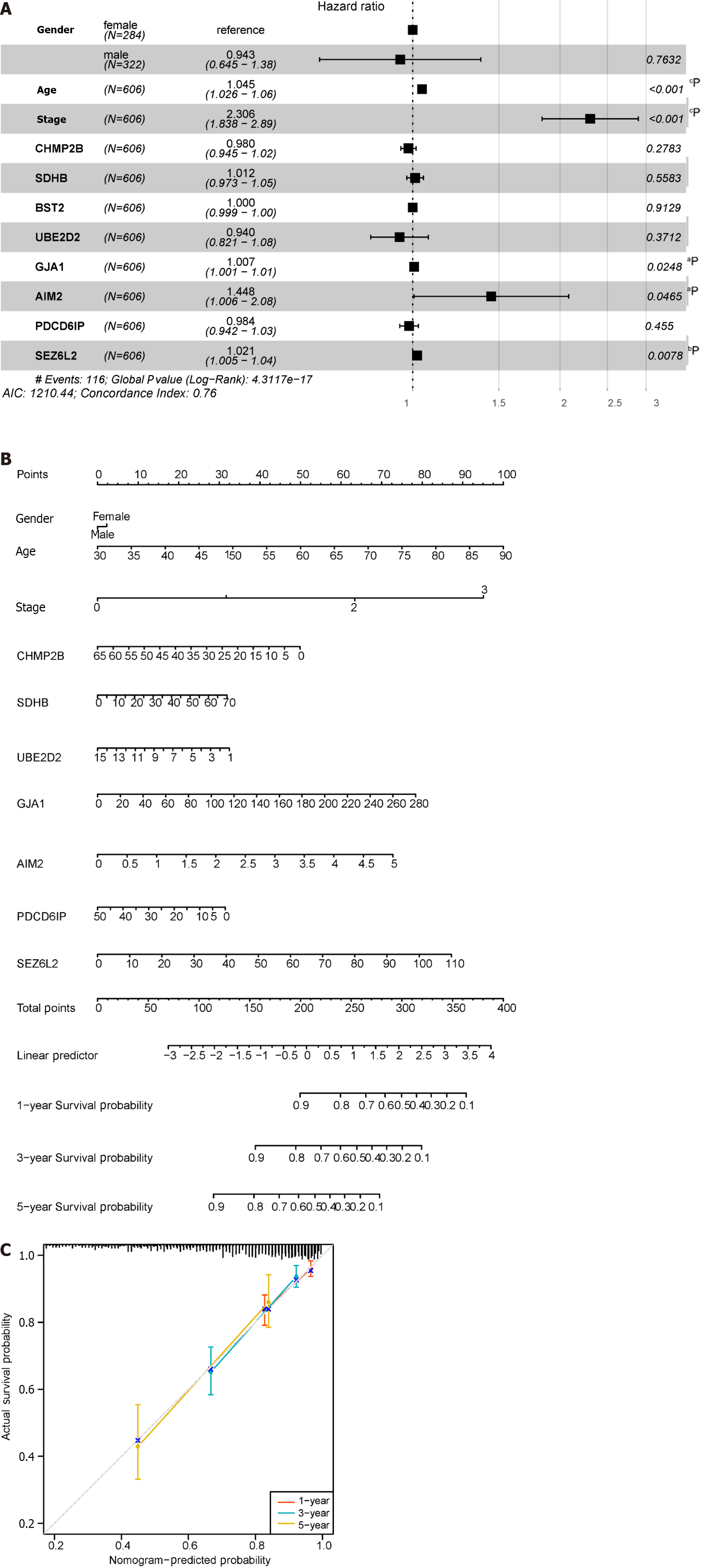
Figure 10 Construction of the nomogram.
A: Forest plot illustrating the influence of clinicopathological features; B: Nomogram integrating multi-omics data with clinicopathological features; C: Calibration curve of the overall survival nomogram, where the diagonal dashed line represents the ideal nomogram. aP < 0.05; bP < 0.01; cP < 0.001; dP < 0.0001.
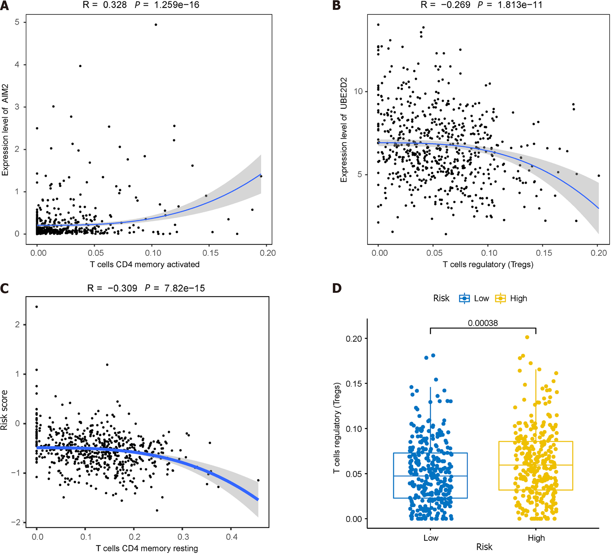
Figure 11 Immunoassays of prognostic models.
A: Positive correlation between AIM2 gene expression and the abundance of activated memory CD4+ T cells; B: Inverse correlation between UBE2D2 gene expression and the cellular abundance of regulatory T cells (Tregs); C: Correlation of immune cell infiltration with high and low-risk groups; D: Significant differences observed in the abundance of Tregs between the high and low-risk groups.
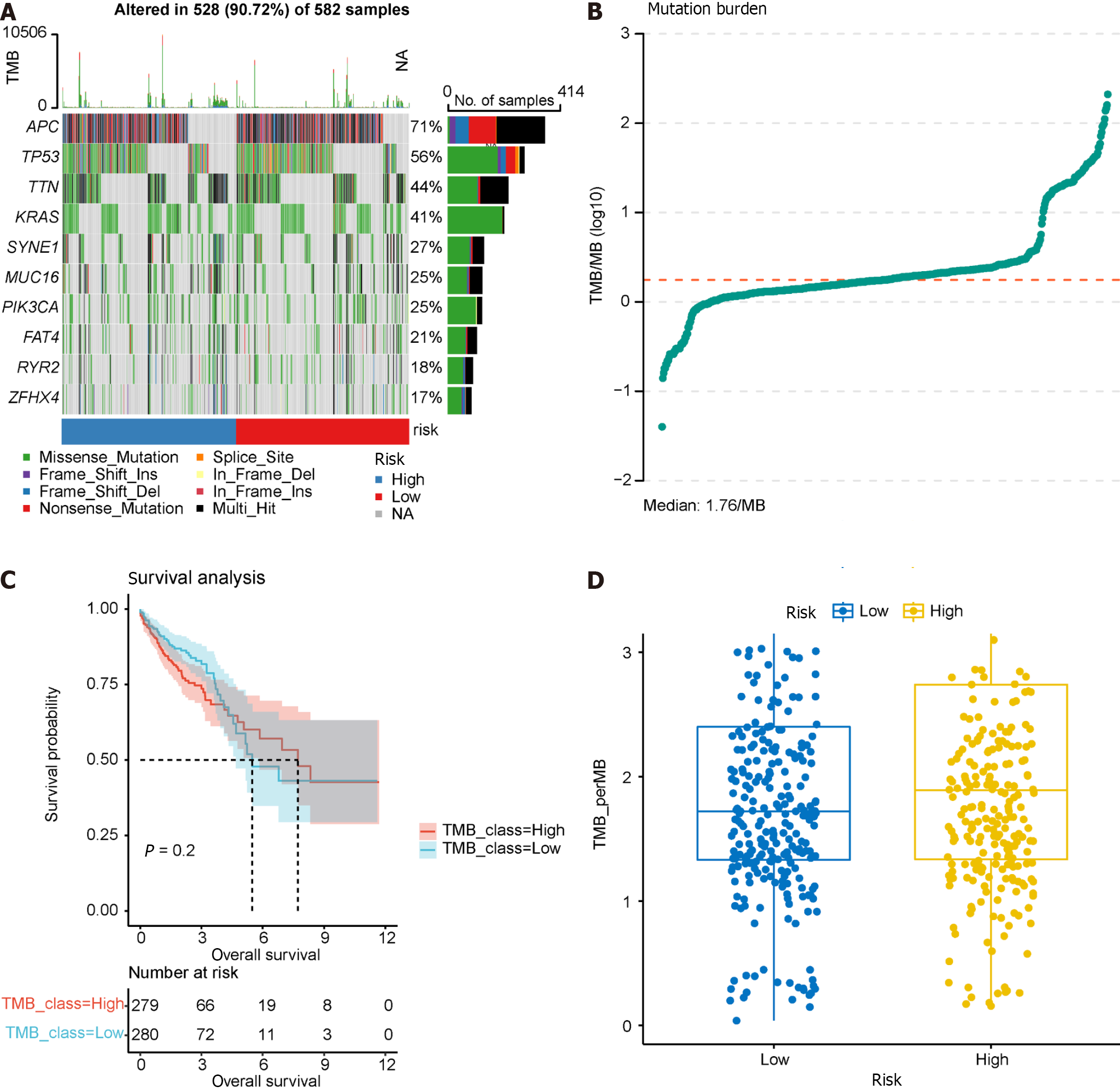
Figure 12 Tumor mutation burden analysis.
A: Waterfall plot illustrating the top 10 frequently mutated genes; B: Dot plot presenting the results of tumor mutation burden analysis, with the median tumor mutational burden at 1.78/Mb; C: Survival analysis of high and low tumor mutation burden groups; D: Comparison of tumor mutation burden between high and low prognostic risk groups.
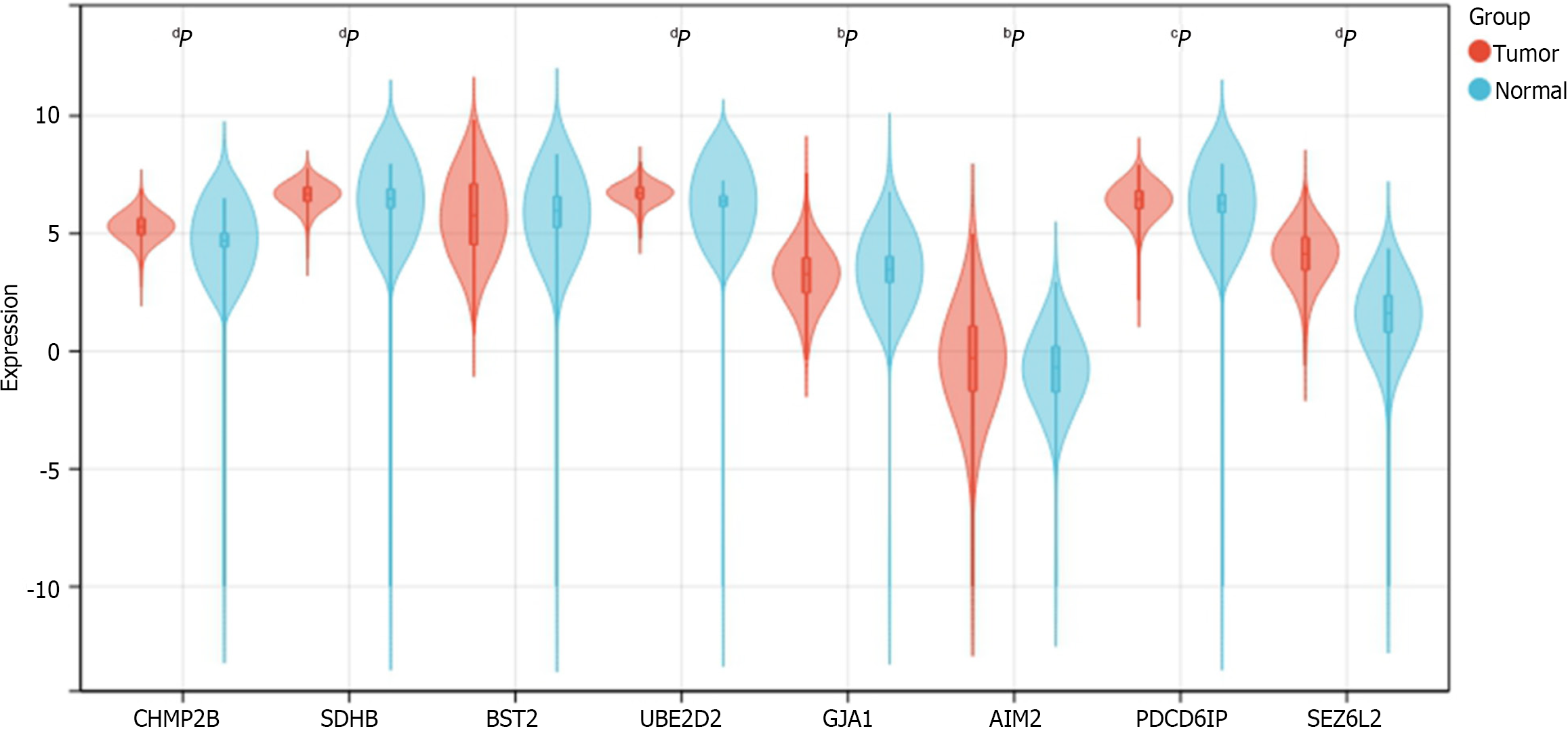
Figure 13 Expression of 8 prognosis-related genes in normal and tumor samples from The Cancer Genome Atlas-COADREAD.
aP < 0.05; bP < 0.01; cP < 0.001; dP < 0.0001. CHMP2B, SDHB, UBE2D2, GJA1, AIM2, PDCD6IP, and SEZ6L2 exhibited significant differential expression between colorectal cancer and normal samples. No significant expression difference was found for BST2.
- Citation: Zhu LH, Yang J, Zhang YF, Yan L, Lin WR, Liu WQ. Identification and validation of a pyroptosis-related prognostic model for colorectal cancer based on bulk and single-cell RNA sequencing data. World J Clin Oncol 2024; 15(2): 329-355
- URL: https://www.wjgnet.com/2218-4333/full/v15/i2/329.htm
- DOI: https://dx.doi.org/10.5306/wjco.v15.i2.329


