Copyright
©The Author(s) 2025.
World J Radiol. Aug 28, 2025; 17(8): 109373
Published online Aug 28, 2025. doi: 10.4329/wjr.v17.i8.109373
Published online Aug 28, 2025. doi: 10.4329/wjr.v17.i8.109373
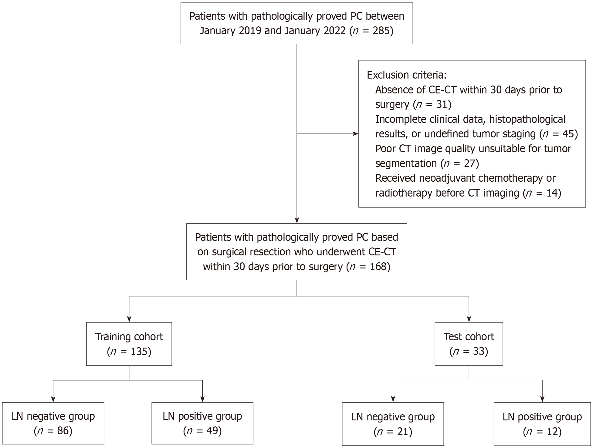
Figure 1 Flowchart of patient selection for the study.
PC: Pancreatic cancer; CE-CT: Contrast-enhanced computed tomography; LN: Lymph node.
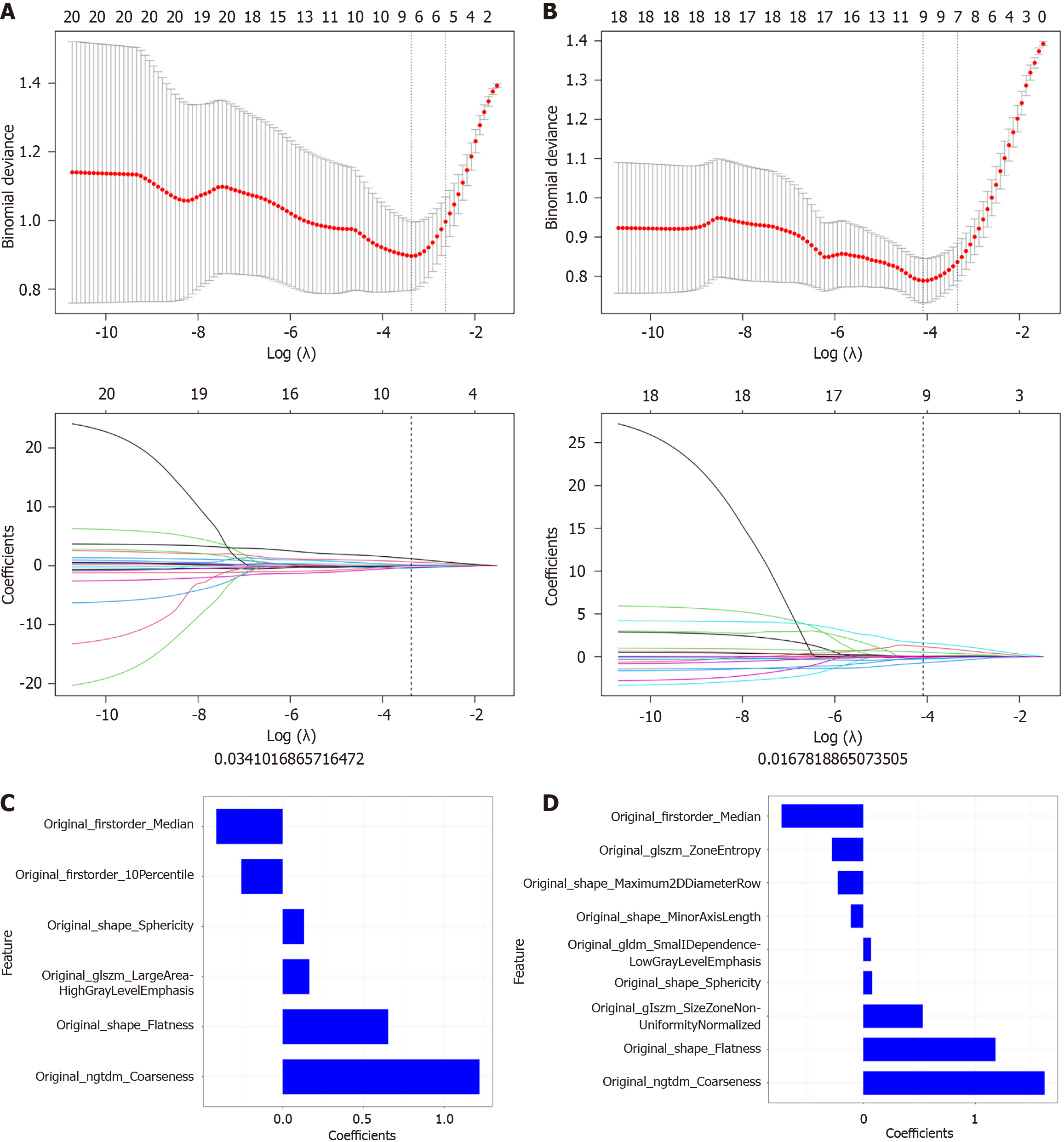
Figure 2 Radiomics feature selection and coefficient visualization using LASSO regression.
A and B: The optimal regularization parameter (λ) for the LASSO regression model was selected via 10-fold cross-validation in the training (A) and test (B) cohorts. The plots display binomial deviance against log(λ), with the vertical dashed line indicating the optimal log(λ) of -4. This resulted in 6 non-zero features for the training cohort and 9 for the test cohort; C and D: The cor
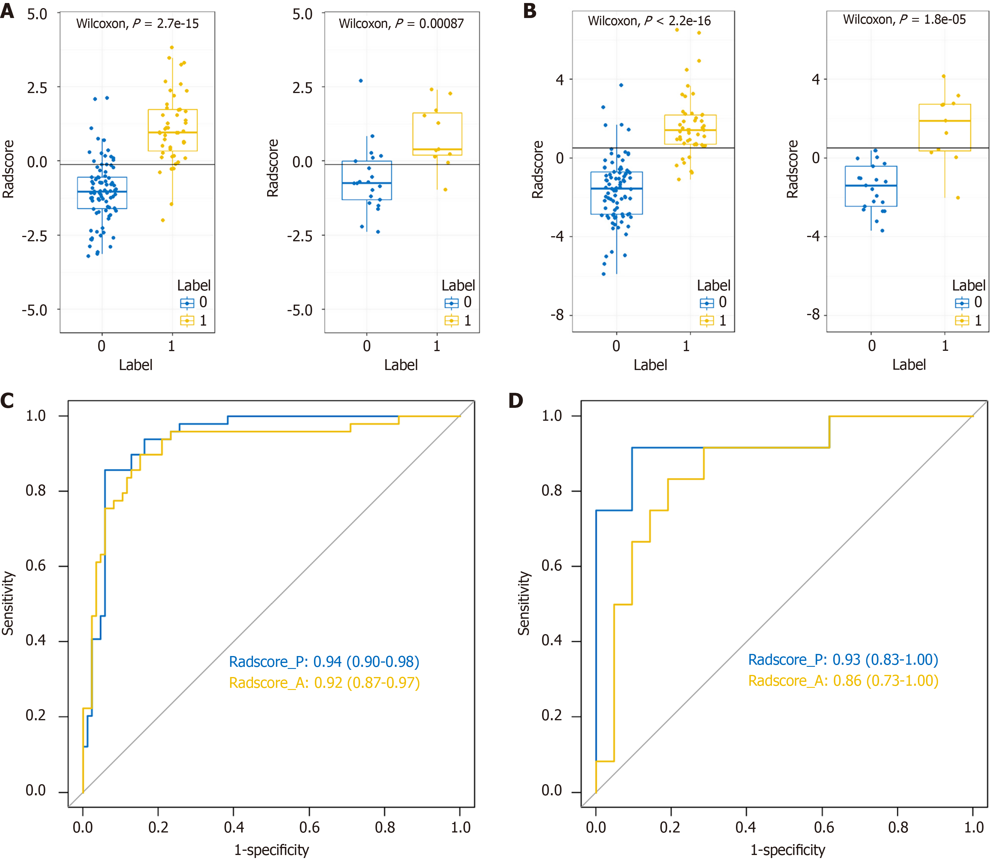
Figure 3 Diagnostic performance of the Radscore model.
A and B: Distribution of Radscore values for predicting LNM in the training (A) and test (B) cohorts. Blue dots represent patients without LNM, and yellow dots represent those with LNM; C and D: Receiver operating characteristic curves of the Radscore model for the training (C) and test (D) cohorts. Radscore_A refers to the model derived from arterial phase computed tomography images, while Radscore_P refers to the model derived from portal venous phase images. The area under the curve was used to evaluate model performance.
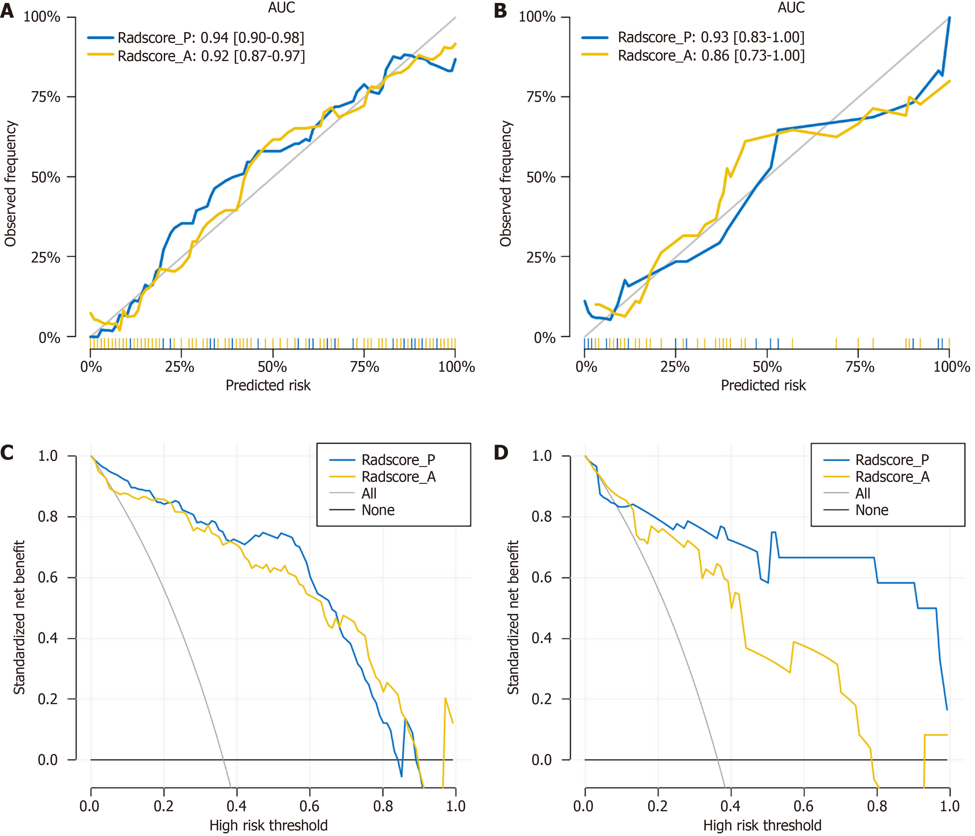
Figure 4 Calibration and decision curve analysis of the Radscore model.
A and B: Calibration curves for the Radscore model in the training (A) and test (B) cohorts. The gray diagonal line represents perfect prediction. The blue and yellow dotted lines show the calibration performance of Radscore_P (portal venous phase) and Radscore_A (arterial phase), respectively; C and D: Decision curve analysis for the Radscore model in the training (C) and test (D) cohorts. The X-axis indicates the threshold probability, and the Y-axis shows the net clinical benefit. The gray and black lines represent treat-all and treat-none strategies, respectively. The radiomics models, particularly Radscore_P, provided higher net benefit than Radscore_A across most threshold ranges in the test cohort (D). AUC: Area under the curve.
- Citation: Ren S, Qin B, Daniels MJ, Zeng L, Tian Y, Wang ZQ. Developing and validating a computed tomography radiomics strategy to predict lymph node metastasis in pancreatic cancer. World J Radiol 2025; 17(8): 109373
- URL: https://www.wjgnet.com/1949-8470/full/v17/i8/109373.htm
- DOI: https://dx.doi.org/10.4329/wjr.v17.i8.109373


