















Copyright: ©Author(s) 2026.
World J Diabetes. Oct 15, 2026; 17(10): 124271
Published online Oct 15, 2026. doi: 10.4239/wjd.124271
Published online Oct 15, 2026. doi: 10.4239/wjd.124271
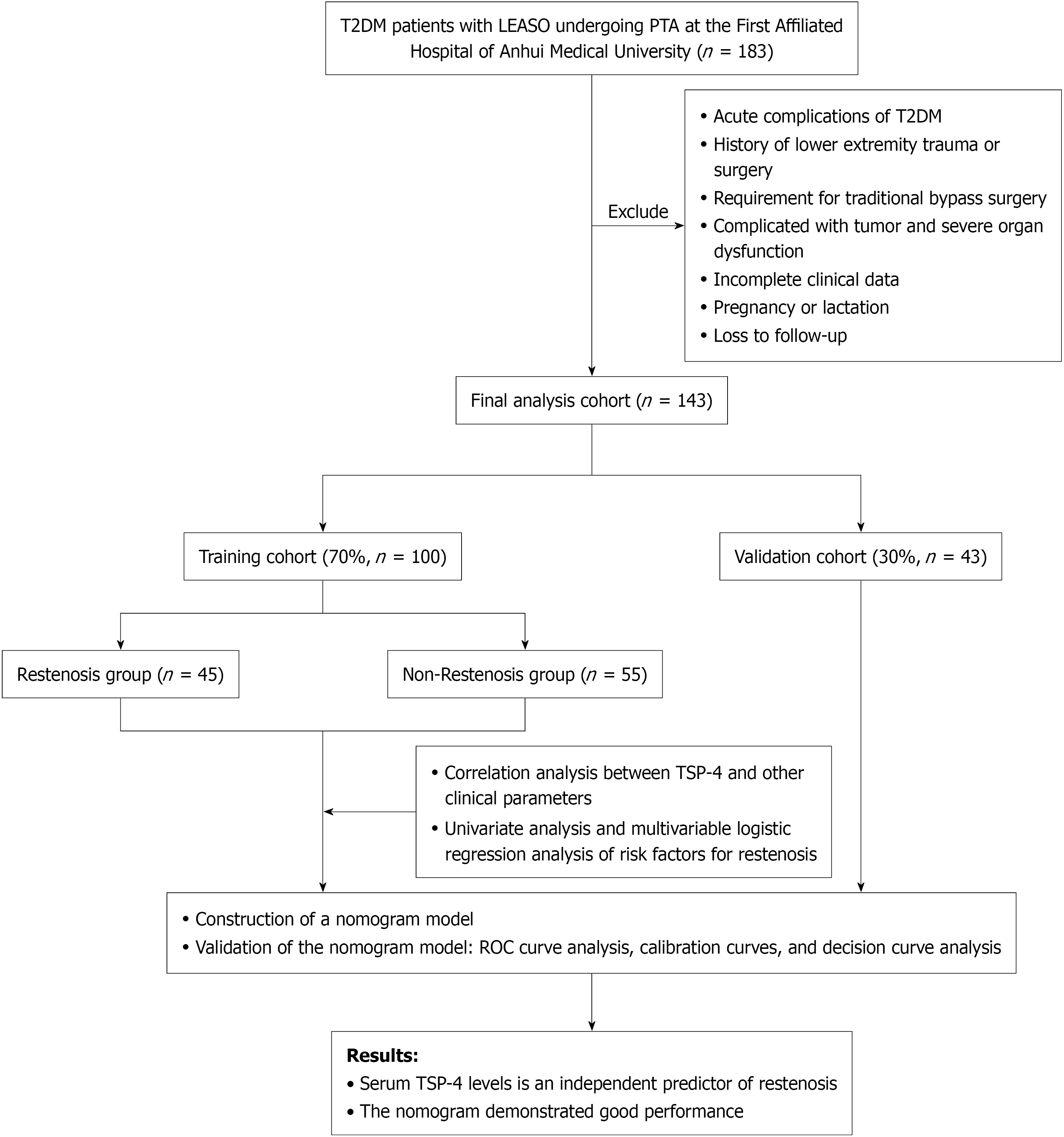
Figure 1 Study design and patient flow.
Of 183 initially enrolled patients, 143 were finally analyzed after exclusions and loss to follow-up and randomly allocated to a training cohort and a validation cohort. The training cohort was divided into the restenosis and non-restenosis groups. Risk factors were analyzed, and a nomogram was developed and validated. T2DM: Type 2 diabetes mellitus; LEASO: Lower extremity arteriosclerosis obliterans; PTA: Percutaneous transluminal angioplasty; TSP-4: Thrombospondin-4; ROC: Receiver operating characteristic.
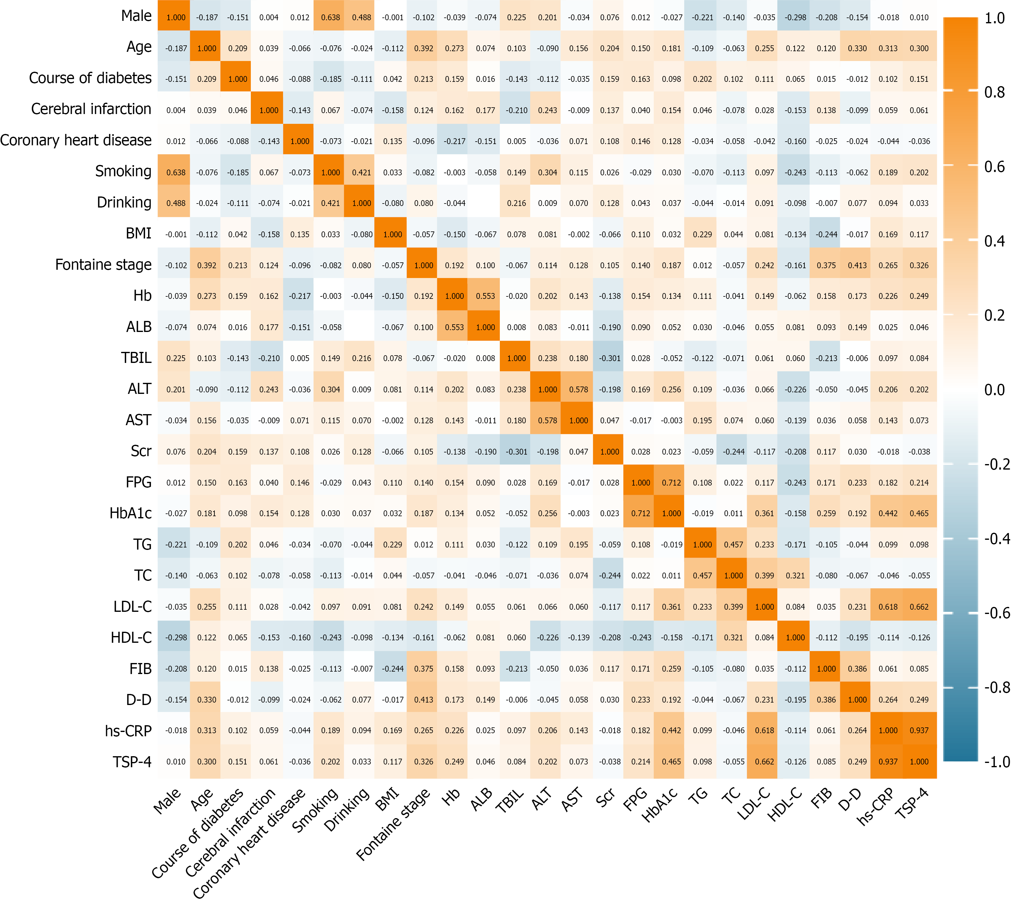
Figure 2 Spearman correlation heatmap of thrombospondin-4 and other clinical parameters in type 2 diabetes mellitus patients with lower extremity arteriosclerosis obliterans.
Positive correlations appear in yellow, negative correlations in blue. Color intensity scales with the magnitude of the relationship. BMI: Body mass index; Hb: Hemoglobin; ALB: Albumin; TBIL: Total bilirubin; ALT: Alanine aminotransferase; AST: Aspartate aminotransferase; Scr: Serum creatinine; FPG: Fasting plasma glucose; HbA1c: Glycated hemoglobin A1c; TG: Triglycerides; TC: Total cholesterol; LDL-C: Low-density lipoprotein cholesterol; HDL-C: High-density lipoprotein cholesterol; FIB: Fibrinogen; D-D: D-dimer; hs-CRP: High-sensitivity C-reactive protein; TSP-4: Thrombospondin-4.
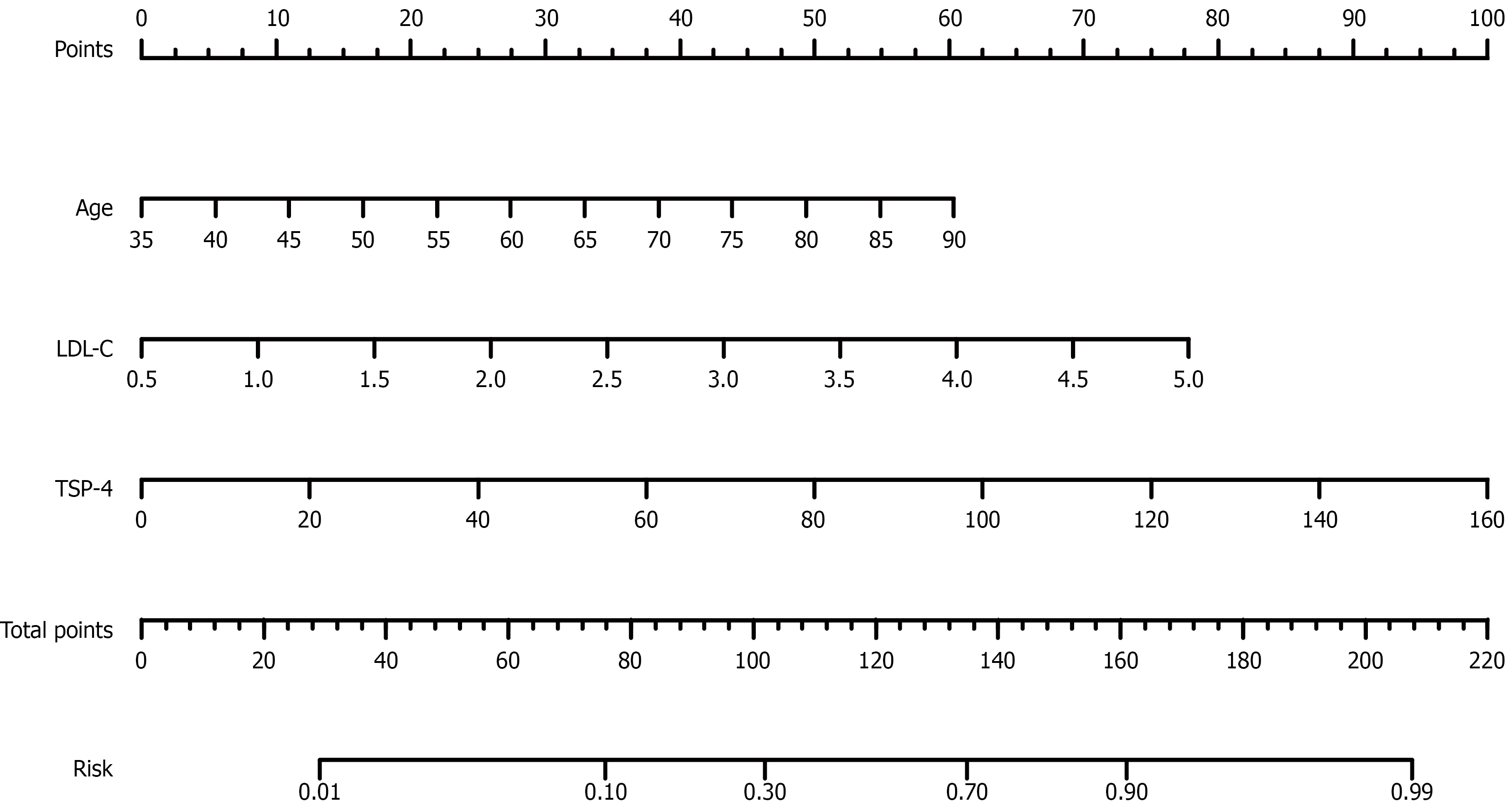
Figure 3 Nomogram of interventional restenosis risk in type 2 diabetes mellitus patients complicated by lower extremity arteriosclerosis obliterans.
The nomogram incorporates age, low-density lipoprotein cholesterol, and thrombospondin-4. The total points of the three predictors correspond to the predicted probability of restenosis. LDL-C: Low-density lipoprotein cholesterol; TSP-4: Thrombospondin-4.
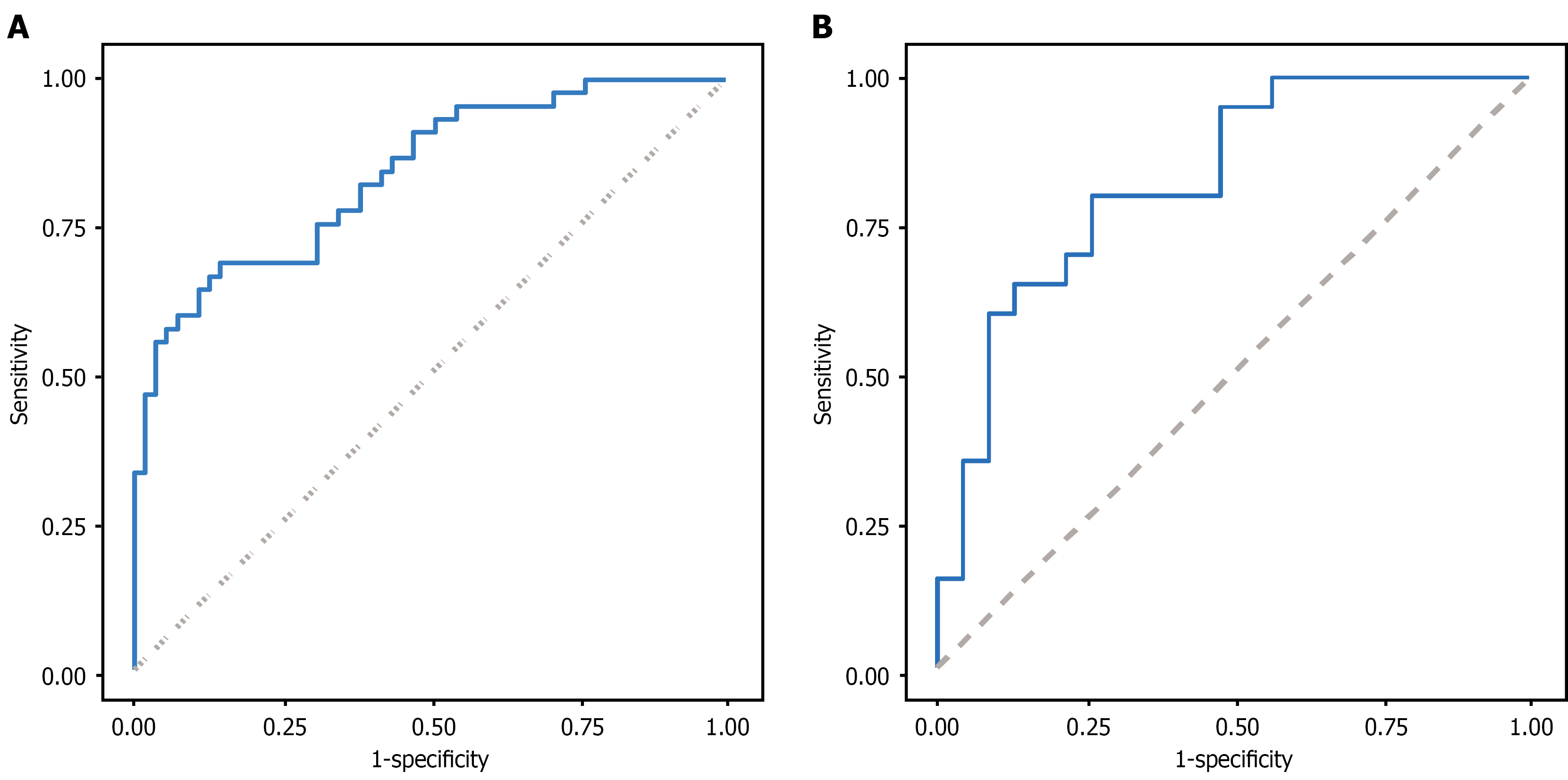
Figure 4 Receiver operating characteristic curve analysis of the prediction model.
A: Training cohort; B: Validation cohort. In the training cohort, the area under the curve was 0.839 (95% confidence interval: 0.762-0.916). In the validation cohort, the area under the curve was 0.826 (95% confidence interval: 0.703-0.950).
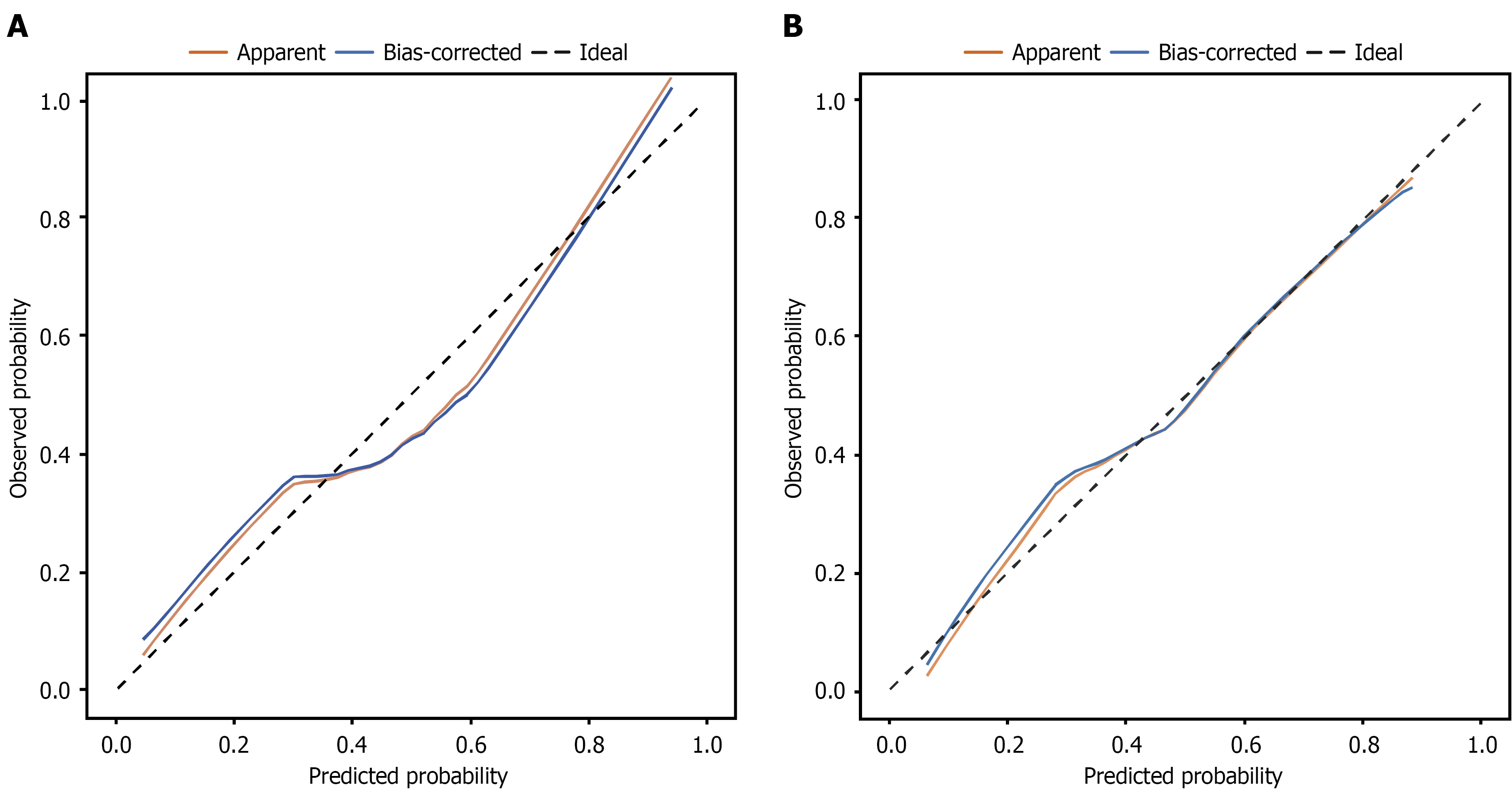
Figure 5 Calibration plots of the predictive model.
A: Training cohort; B: Validation cohort. The black diagonal line represents the ideal curve. The yellow curve is the observed curve, and the blue curve is the bias-corrected calibration curve after 500 bootstrap iterations.
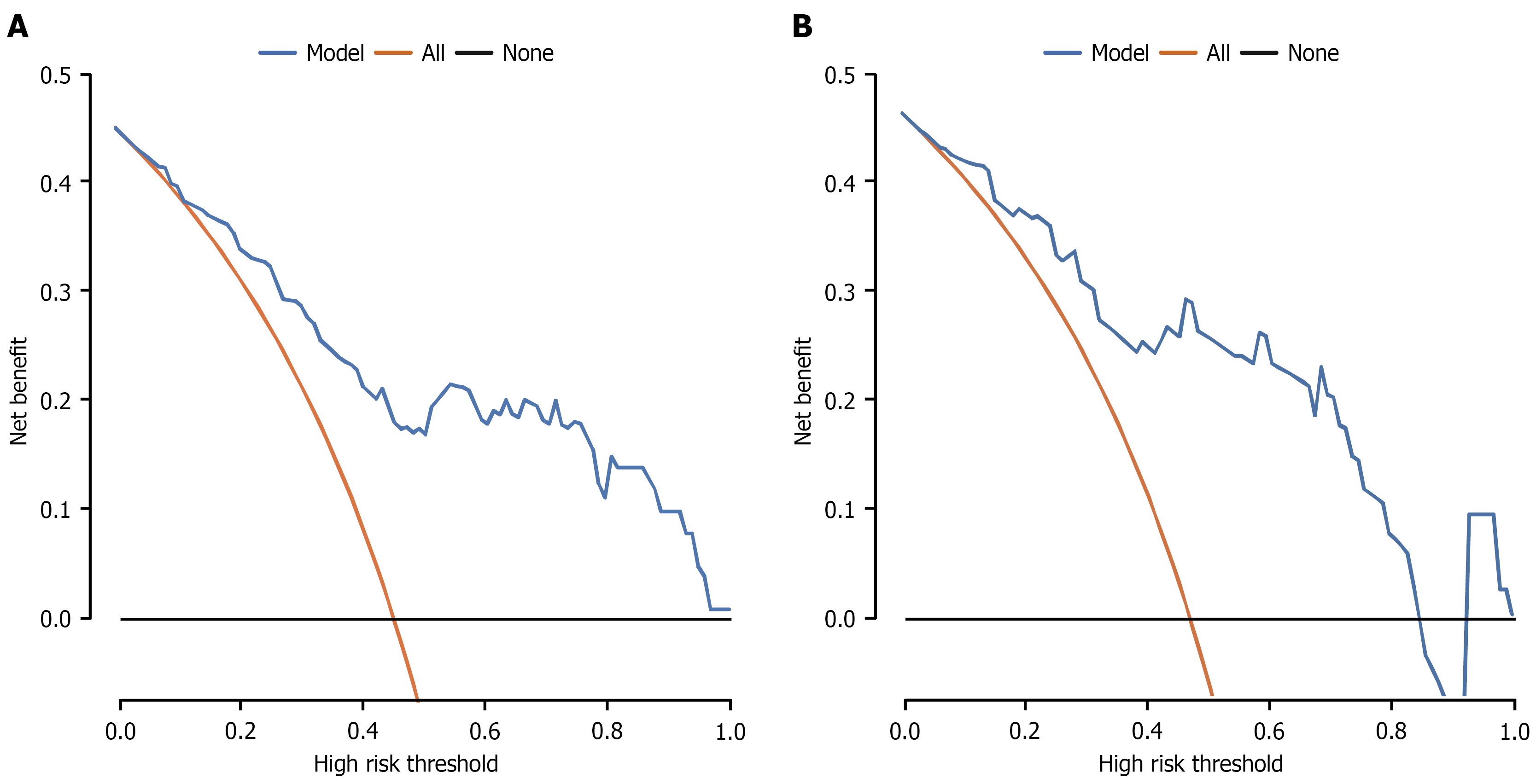
Figure 6 Decision curve analysis of the prediction model.
A: Training cohort; B: Validation cohort. Yellow curve: Treat all strategy; Black horizontal line: Treat none strategy; Blue curve: Nomogram.
- Citation: Hu D, Lin XY, Zhao TQ, Ji H, Chen MW, Zhao XT. Clinical significance of serum thrombospondin-4 for interventional restenosis in diabetes patients complicated by lower extremity arteriosclerosis obliterans. World J Diabetes 2026; 17(10): 124271
- URL: https://www.wjgnet.com/1948-9358/full/v17/i10/124271.htm
- DOI: https://dx.doi.org/10.4239/wjd.124271