Copyright
©The Author(s) 2021.
World J Clin Cases. Nov 6, 2021; 9(31): 9440-9451
Published online Nov 6, 2021. doi: 10.12998/wjcc.v9.i31.9440
Published online Nov 6, 2021. doi: 10.12998/wjcc.v9.i31.9440
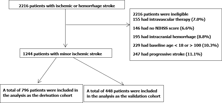
Figure 1 Flow diagram.
NIHSS: National Institutes of Health Stroke Scale.
Figure 2 Least absolute shrinkage and selection operator regression analysis.
Demographic and clinical feature selection using the Least absolute shrinkage and selection operator binary logistic regression model is shown. A: Optimal parameter (lambda) selection in the least absolute shrinkage and selection operator (LASSO) model used fivefold cross-validation via minimum criteria. The partial likelihood deviance (binomial deviance) curve was plotted vs log (lambda). Dotted vertical lines are drawn at the optimal values by using the minimum criteria and the 1 standard error (SE) of the minimum criteria (the 1-SE criteria); B: LASSO coefficient profiles of the 27 features. A coefficient profile plot is produced against the log (lambda) sequence. Then a vertical line is drawn at the value selected using fivefold cross-validation, where optimal lambda results in seven features with nonzero coefficients.
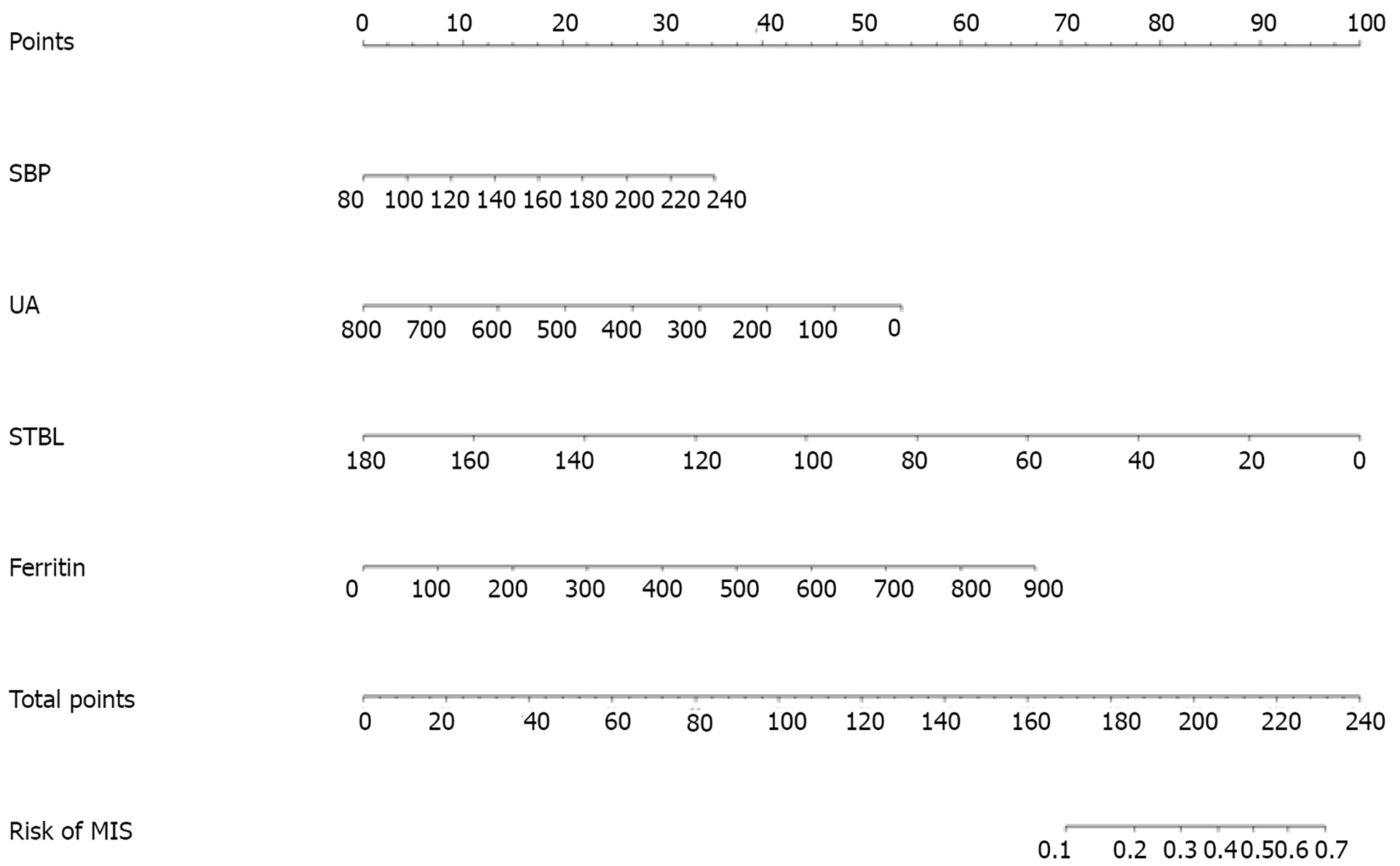
Figure 3 Nomogram for relapse prediction during hospitalization after minor ischemic stroke in Chinese patients.
SBP: Systolic blood pressure; UA: Uric acid; STBL: Serum total bilirubin.
Figure 4 Area under the receiver operating characteristic curve.
A: Area under the receiver operating characteristic curve (AUC-ROC) of the nomogram in the training cohort; B: AUC-ROC of the nomogram in the validation cohort. AUC-ROC: Area under the receiver operating characteristic curve.
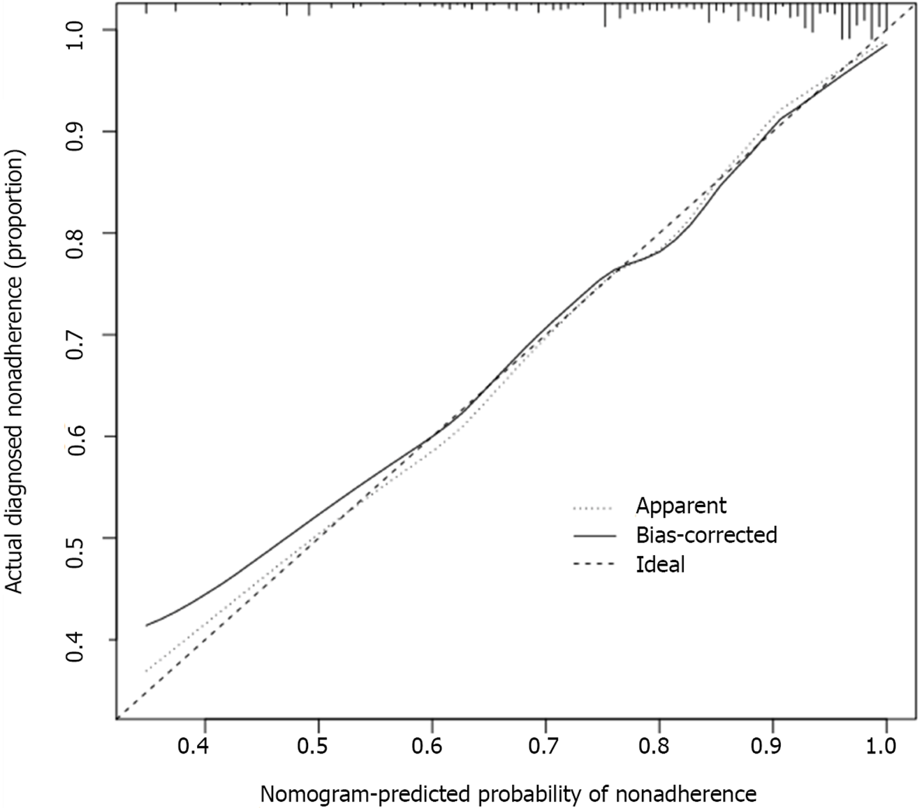
Figure 5 Calibration curves of nomogram prediction in the cohorts.
The x-axis represents the predicted risk for relapse during hospitalization after minor ischemic stroke; the y-axis denotes the actual relapse during hospitalization after minor ischemic stroke. The diagonal dotted line indicates a perfect prediction by an ideal model. The solid line represents the performance of the nomogram, of which a closer fit to the diagonal dotted line shows a better prediction.
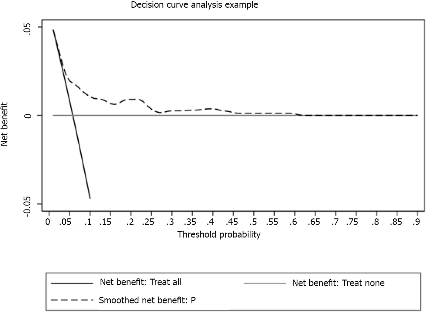
Figure 6 Decision curve analysis assessment of the nonadherence nomogram.
The y-axis measures the net benefit, whereas the dotted line represents relapse after minor ischemic stroke risk in the nomogram. The thin solid line represents the assumption that relapse had occurred in none of the patients during their hospitalization. The thin thick solid line represents the assumption that all patients had relapsed during their hospitalization. The decision curve shows that at threshold probabilities of a patient and a doctor of 5% and 60%, respectively, using the nomogram developed in the present study to predict relapse during hospitalization after minor ischemic stroke risk adds more benefit than the intervention-all-patients scheme or the intervention-none scheme.
- Citation: Yu XF, Yin WW, Huang CJ, Yuan X, Xia Y, Zhang W, Zhou X, Sun ZW. Risk factors for relapse and nomogram for relapse probability prediction in patients with minor ischemic stroke. World J Clin Cases 2021; 9(31): 9440-9451
- URL: https://www.wjgnet.com/2307-8960/full/v9/i31/9440.htm
- DOI: https://dx.doi.org/10.12998/wjcc.v9.i31.9440


