Copyright
©The Author(s) 2022.
World J Diabetes. Mar 15, 2022; 13(3): 224-239
Published online Mar 15, 2022. doi: 10.4239/wjd.v13.i3.224
Published online Mar 15, 2022. doi: 10.4239/wjd.v13.i3.224
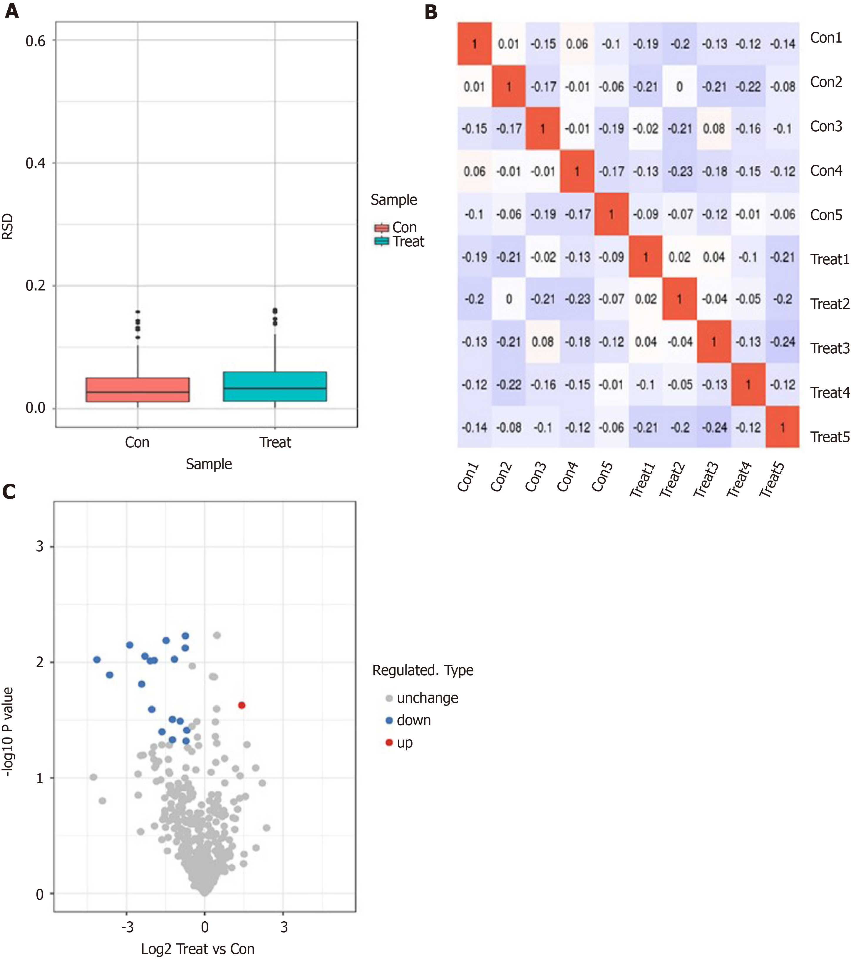
Figure 1 Identification of dapagliflozin treatment-associated differentially abundant proteins in serum samples from type 2 diabetic patients by label-free proteomics.
A: Box plot of relative standard deviation (RSD) distribution of repeated samples using quantified proteins. A box plot drawn by the RSD of the quantitative protein value between replicate samples is shown. The smaller the overall RSD value is, the better the quantitative repeatability is; B: Heatmap of Pearson correlation coefficients from all quantified proteins between each pair of samples is shown; C: The volcano plot demonstrated differentially expressed proteins. The horizontal axis is the relative quantitative value of the protein after Log2 Logarithmic conversion, and the vertical axis is the value of the difference significance test P value after -Log10 Logarithmic conversion. The red dots in the figure indicate proteins with significantly differentially upregulated expression, and blue dots indicate proteins with significantly differentially down-regulated expression.
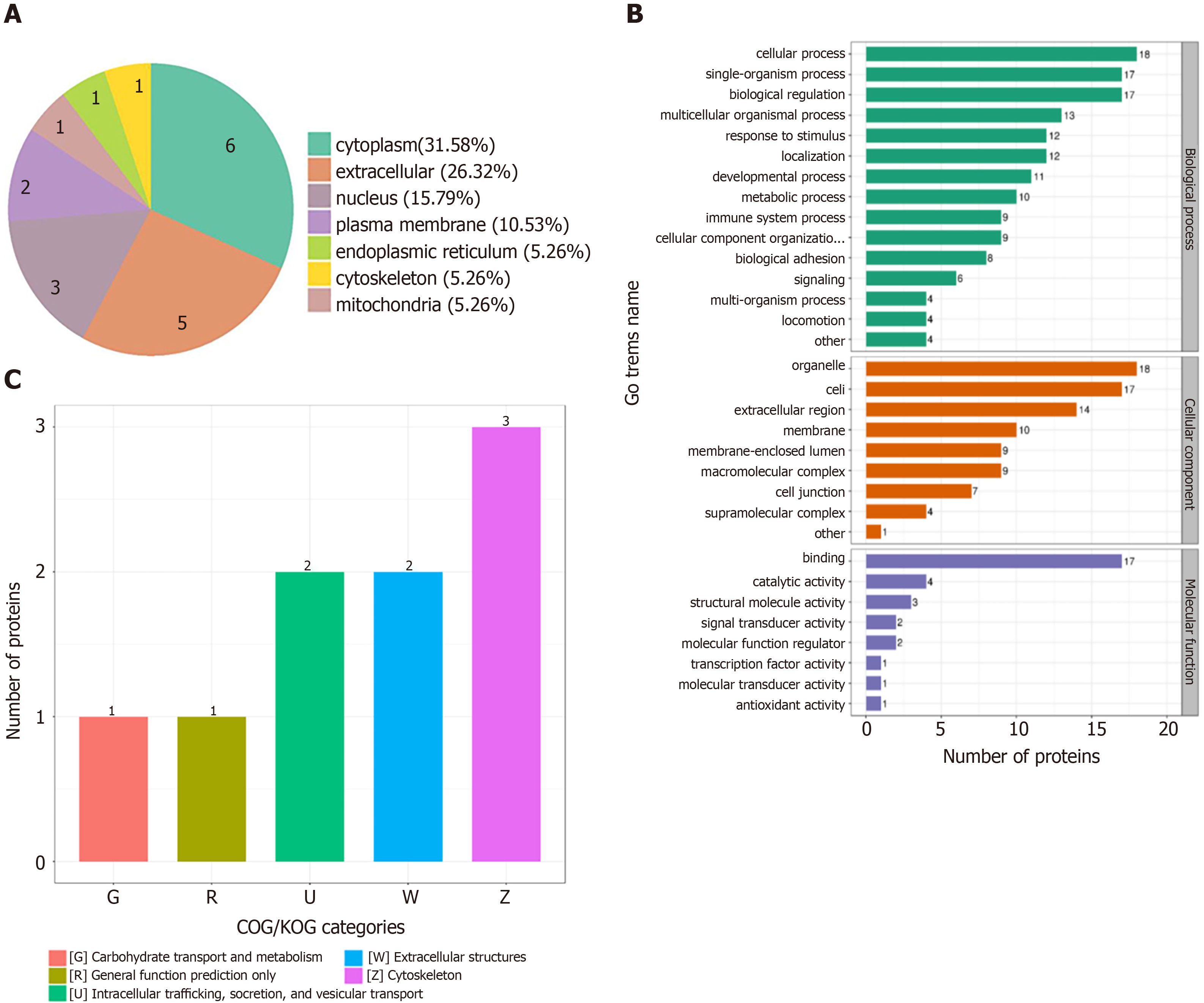
Figure 2 Annotation analysis of 19 differentially expressed proteins by subcellular localization, EuKaryotic Orthologous Groups, Gene Ontology, and Kyoto Encyclopedia of Genes and Genomes annotations.
A: Subcellular localization chart of differentially expressed proteins; B: Statistical distribution chart of differentially expressed proteins under each Gene Ontology category (2nd Level); C: EuKaryotic Orthologous Groups functional classification chart of differentially expressed proteins.
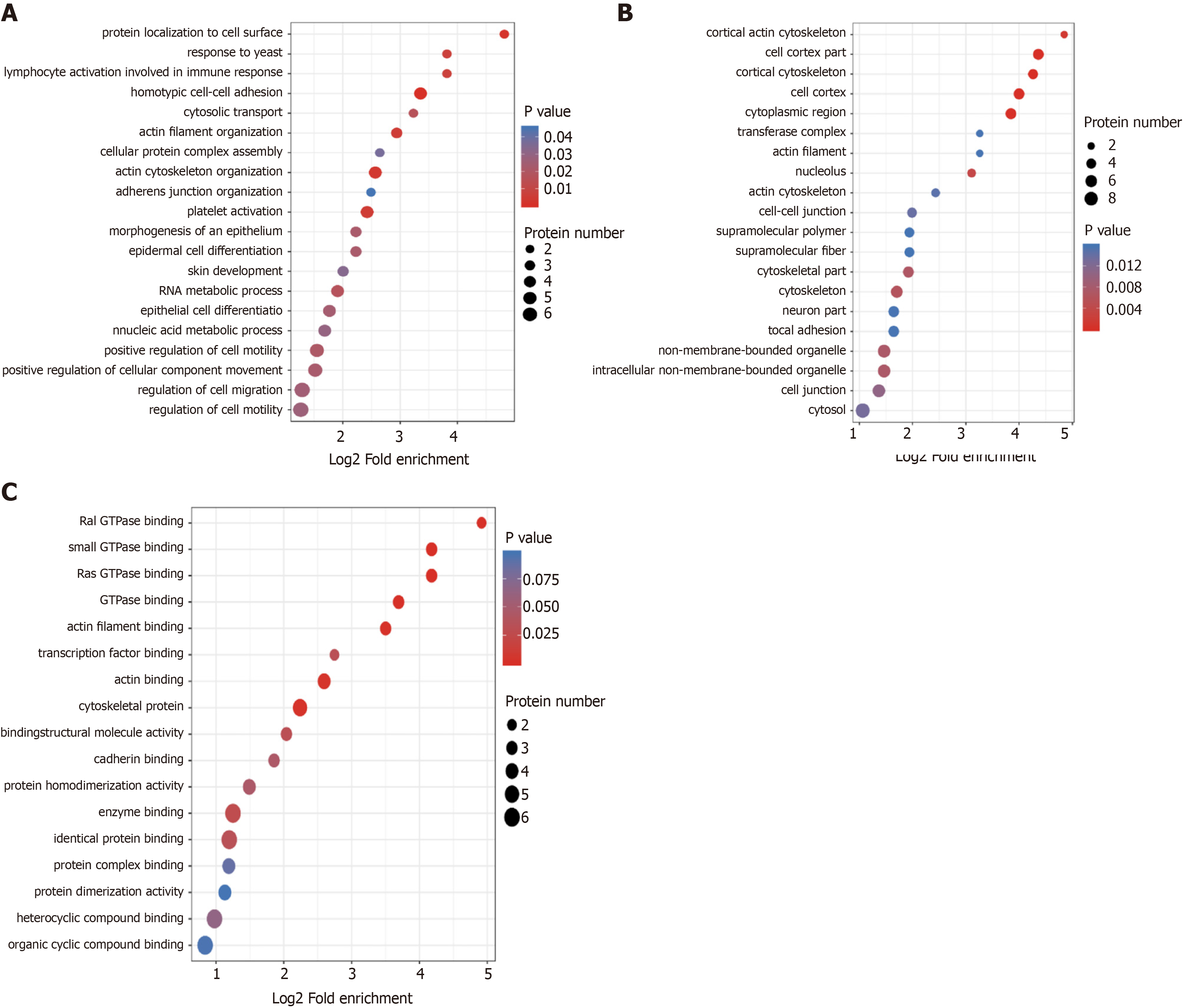
Figure 3 Gene Ontology enrichment bubble plots of differentially expressed proteins in three categories.
A-C: The Gene Ontology enrichment bubble plots in the categories of biological process (A), cellular component (B), and molecular function (C) are shown. The bubble chart shows the results of the top 20 categories with the most significant enrichment. In the bubble chart, the vertical axis is the function classification or pathway, and the horizontal axis is the value after Log2 conversion of the ratio of the differential protein in the functional type compared to the ratio of the identified protein. The circle’s color indicates the P value of enrichment significance, and the size of the circle indicates the number of differential proteins in the functional class or pathway.
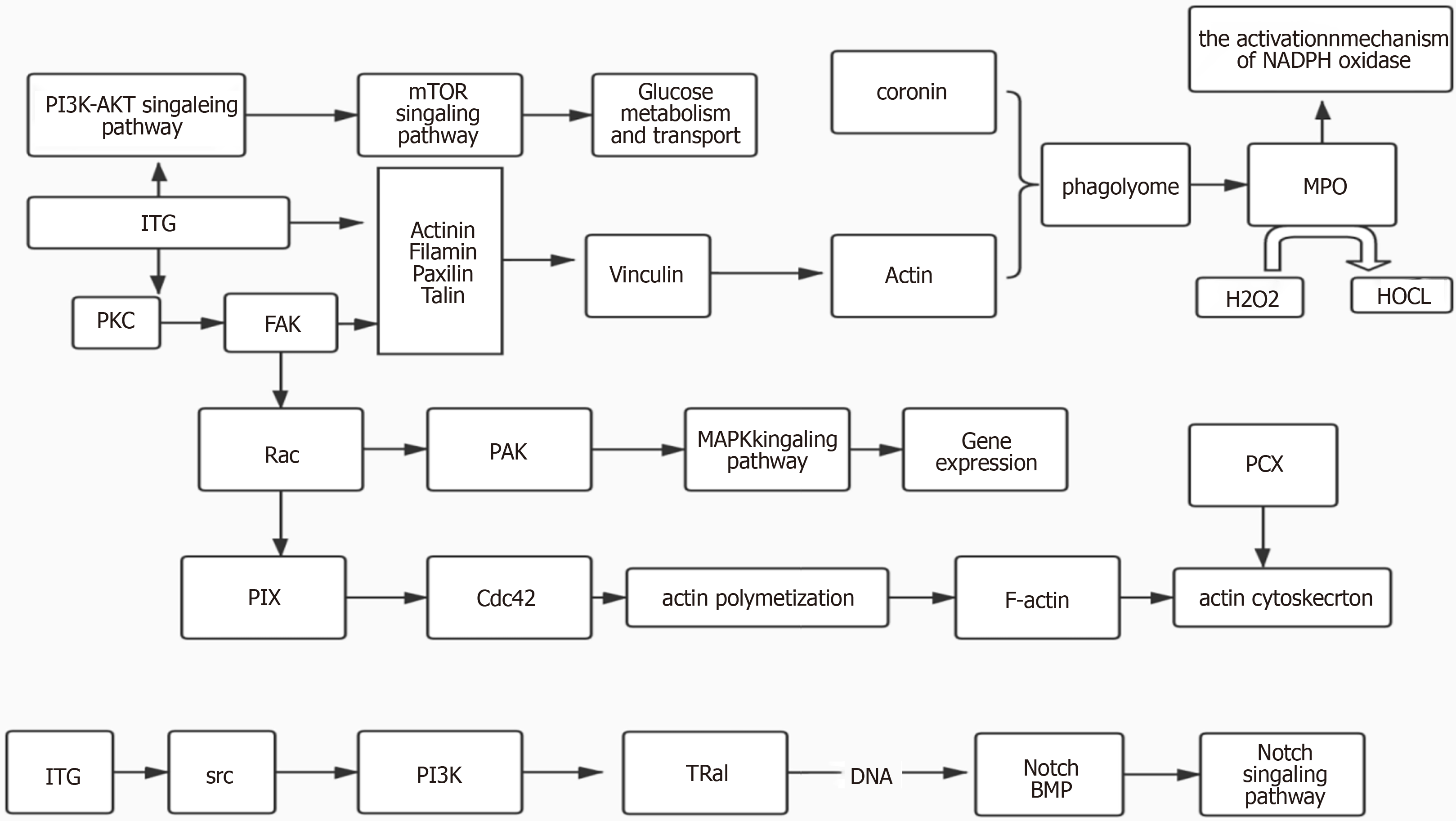
Figure 4 Treemap chart shows the interaction among differentially expressed proteins.
Kyoto Encyclopedia of Genes and Genomes pathway enrichment analysis identified a protein-protein interaction network among the integrin protein, myeloperoxidase, and podocalyxin.
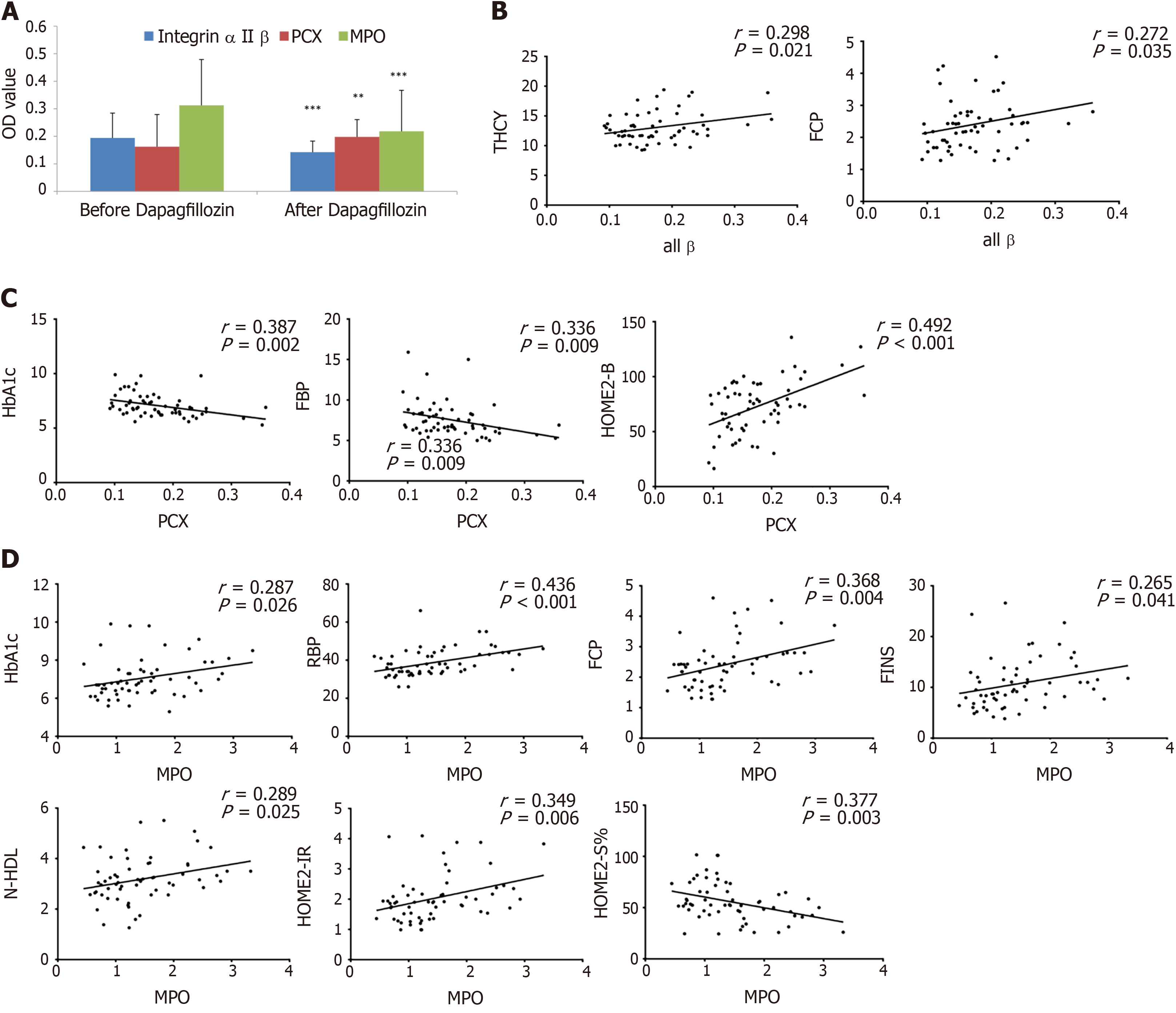
Figure 5 Correlation analyses of the expression levels of three differentially expressed proteins and clinical indexes of type 2 diabetic patients.
A: The levels of three differentially abundant proteins, including myeloperoxidase (MPO), alpha II B integrin, and podocalyxin (PCX) proteins in serum samples of patients before and after dapagliflozin treatments were evaluated by enzyme linked immunosorbent assay. n = 20 for each group. aP < 0.05, bP < 0.01, cP < 0.001, between the indicated groups; B-D: Dot plots show the Pearson correlations between the levels of alpha II B integrin (B), PCX (C), and MPO (D) proteins and some clinical indexes in patients before and after dapagliflozin treatments.
- Citation: Zhao YX, Borjigin S, Yan ZL. Functional annotation and enrichment analysis of differentially expressed serum proteins in patients with type 2 diabetes after dapagliflozin. World J Diabetes 2022; 13(3): 224-239
- URL: https://www.wjgnet.com/1948-9358/full/v13/i3/224.htm
- DOI: https://dx.doi.org/10.4239/wjd.v13.i3.224


