Copyright
©The Author(s) 2022.
World J Diabetes. Mar 15, 2022; 13(3): 224-239
Published online Mar 15, 2022. doi: 10.4239/wjd.v13.i3.224
Published online Mar 15, 2022. doi: 10.4239/wjd.v13.i3.224
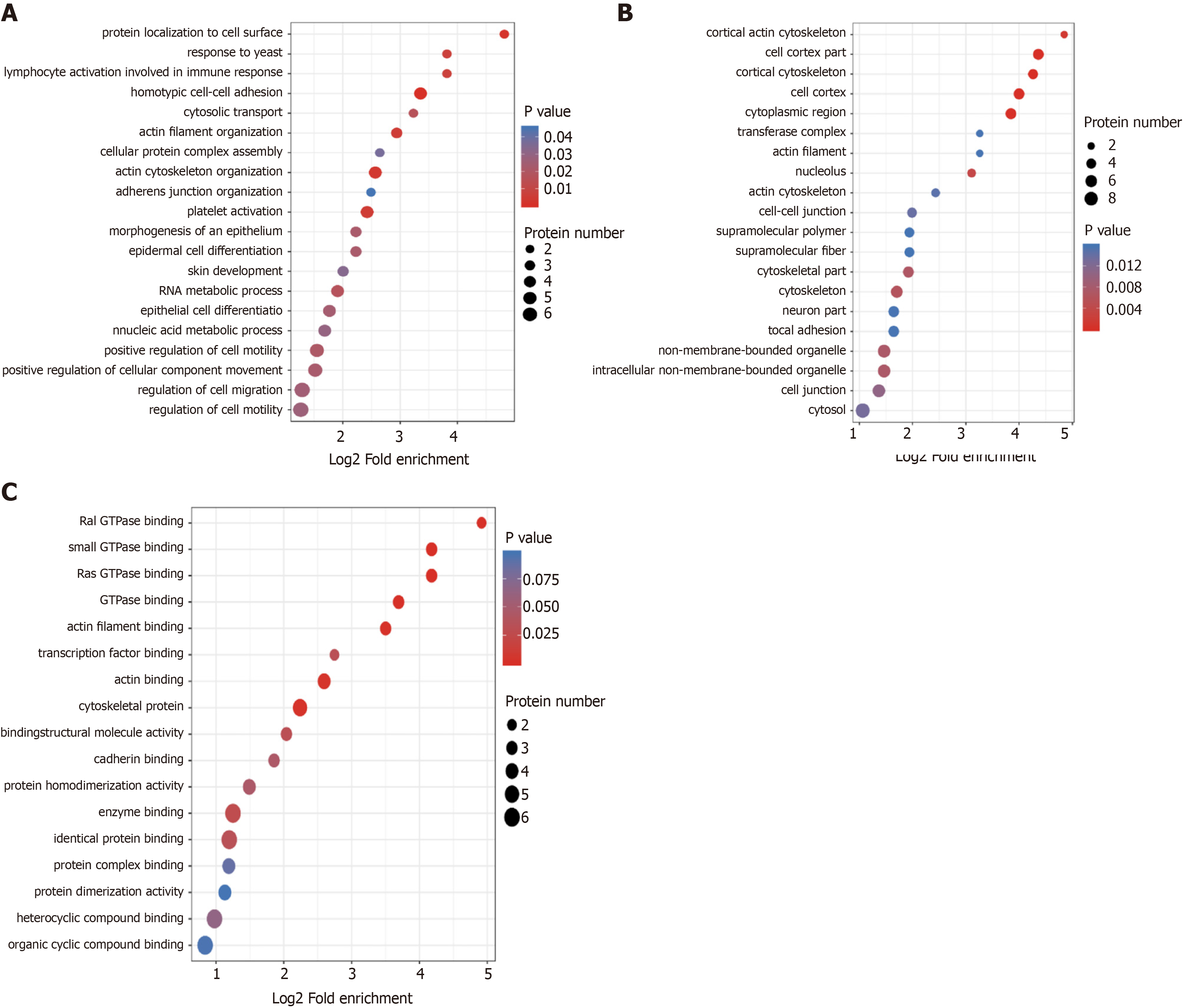
Figure 3 Gene Ontology enrichment bubble plots of differentially expressed proteins in three categories.
A-C: The Gene Ontology enrichment bubble plots in the categories of biological process (A), cellular component (B), and molecular function (C) are shown. The bubble chart shows the results of the top 20 categories with the most significant enrichment. In the bubble chart, the vertical axis is the function classification or pathway, and the horizontal axis is the value after Log2 conversion of the ratio of the differential protein in the functional type compared to the ratio of the identified protein. The circle’s color indicates the P value of enrichment significance, and the size of the circle indicates the number of differential proteins in the functional class or pathway.
- Citation: Zhao YX, Borjigin S, Yan ZL. Functional annotation and enrichment analysis of differentially expressed serum proteins in patients with type 2 diabetes after dapagliflozin. World J Diabetes 2022; 13(3): 224-239
- URL: https://www.wjgnet.com/1948-9358/full/v13/i3/224.htm
- DOI: https://dx.doi.org/10.4239/wjd.v13.i3.224


