Copyright
©2014 Baishideng Publishing Group Inc.
World J Clin Oncol. Dec 10, 2014; 5(5): 931-965
Published online Dec 10, 2014. doi: 10.5306/wjco.v5.i5.931
Published online Dec 10, 2014. doi: 10.5306/wjco.v5.i5.931
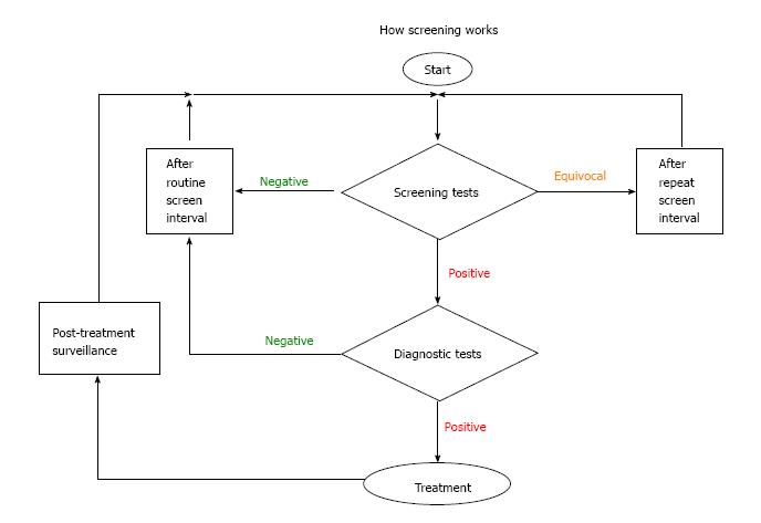
Figure 1 A simplified flow diagram of the relationship between screening and diagnosis showing that screening generally has not 2 but 3 outcomes: positive, negative and equivocal, which is managed by time and re-testing.
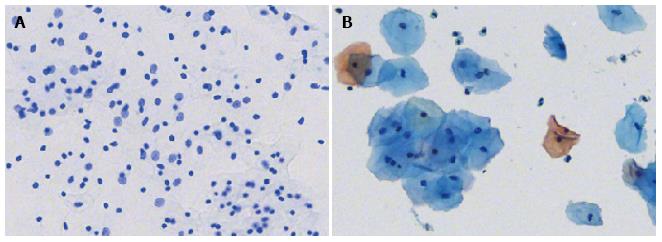
Figure 2 Liquid based cervical samples stained with A: Feulgen thionin and B: Pap stain.
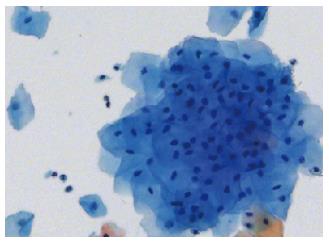
Figure 3 Liquid based cytology cervical sample example of a cell cluster obscured by cytoplasm.
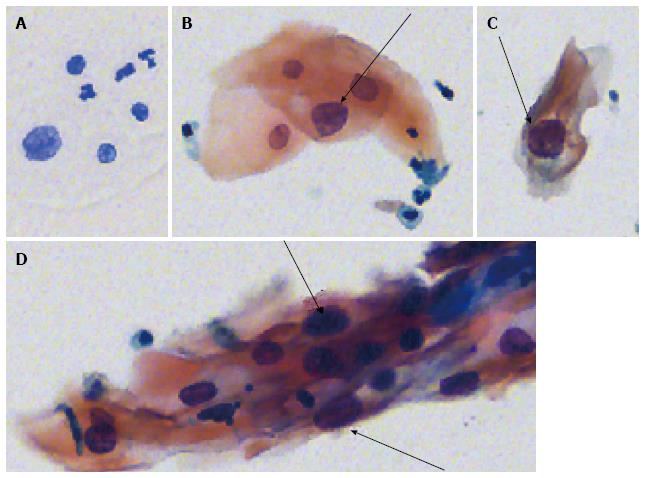
Figure 4 Abnormal cell nuclei.
A: Feulgen thionin stained; B, C, D: Pap stained (arrows).
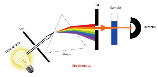
Figure 5 Basic principle of a spectrometer.
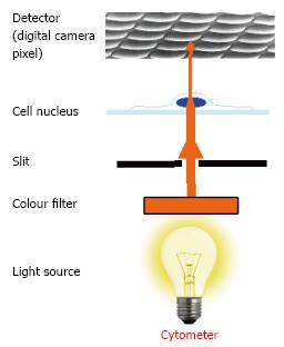
Figure 6 Basic principle of an image cytometer.
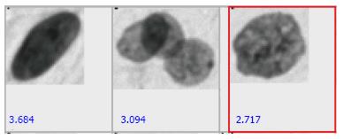
Figure 7 Gallery of potentially aneuploid cell nuclei.
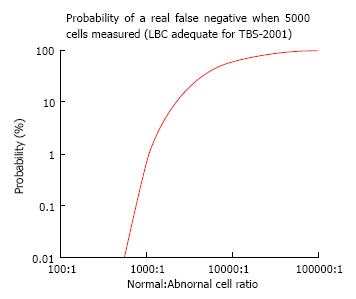
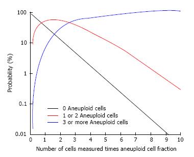
Figure 8 The probability of a real false negative occurring given that 5000 epithelial cells are measured.
Figure 9 General relationship between number of cells measured and the probability of a real false negative.
The red line is considered “equivocal”.
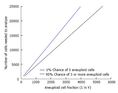
Figure 10 Given an aneuploid cell fraction, how many cells must be measured to get 1% chance of a real false negative or a 95% chance of a positive test result.
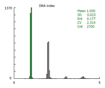
Figure 11 DNA index for pig hepatocytes for DNA linearity calibration.
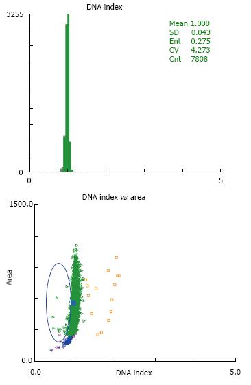
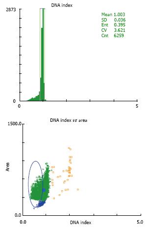
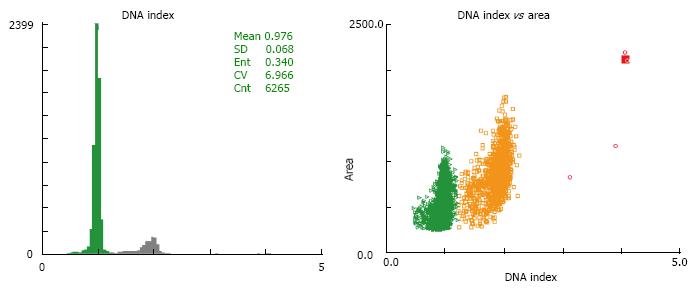
Figure 12 Typical DNA ploidy data for sample taken from a healthy cervix.
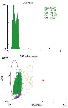
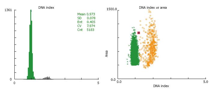
Figure 13 Typical DNA ploidy data for sample taken from a cervix without removing excess secretions or discharge.
Figure 14 DNA ploidy data for sample taken from a cervix infected with trichomonas vaginalis without removing excess secretions or discharge.
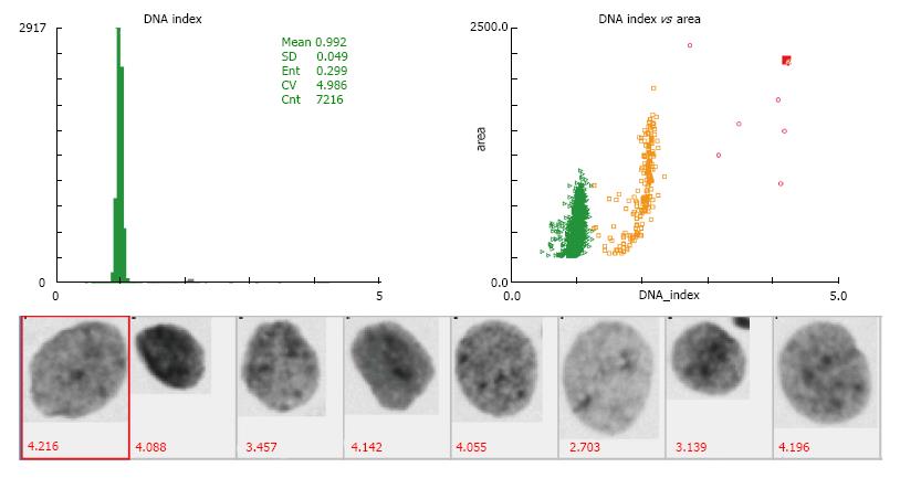
Figure 15 DNA ploidy data from a typical positive case with several aneuploid nuclei with DI > 2.
5, the aneuploid nucleus gallery is shown with measured DI indicated in red.
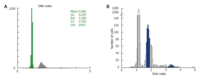
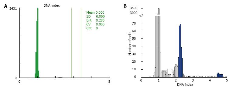
Figure 16 DNA ploidy histograms of aneuploid stemline at DI = 1.
6. A: Full histogram; B: Histogram with broken vertical scale.
Figure 17 DNA ploidy histograms of a rare aneuploid stemline at DI = 2.
3. A: Full histogram; B: Histogram with broken vertical scale.
Figure 18 DNA ploidy data of a high proliferation case which also shows high DI aneuploid cells.
Figure 19 DNA ploidy data of a case with “equivocal” proliferation and no high DI aneuploid cells.
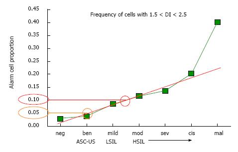
Figure 20 Original data from British Columbia Cancer Agency used to formulate the “proliferation” rules, based on measurement of > 500 samples.
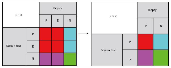
Figure 21 Mapping of 3 × 3 to 2 × 2 tables for sensitivity, specificity and negative predictive value.
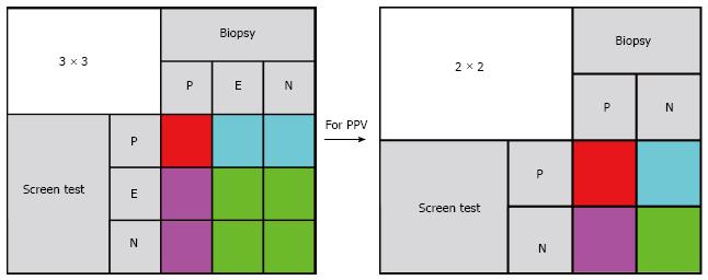
Figure 22 Mapping of 3 × 3 to 2 × 2 tables for positive predictive value.
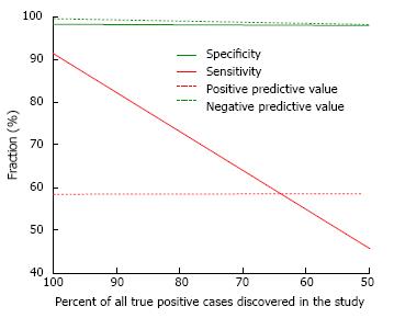
Figure 23 Effect of uncorrected verification bias on test performance indicators.
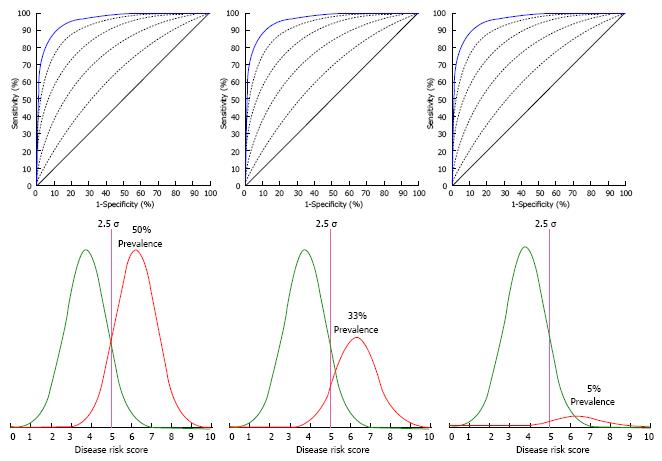
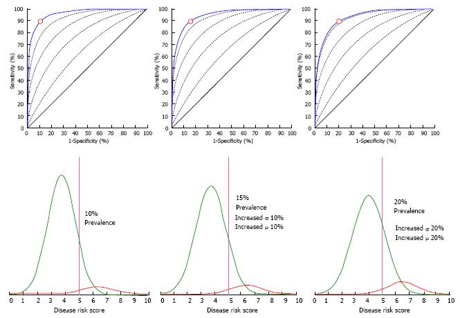
Figure 24 Sensitivity and specificity are independent of disease prevalence when the change in prevalence is only a scalar multiplier that does not change position, width or shape of the population distribution.
Figure 25 “Real life” changes in disease prevalence are usually accompanied by changes in both positive and negative population distribution positions, widths and shapes which do change the sensitivity and specificity.
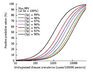
Figure 26 Positive predictive value at 100% test sensitivity as a function of undiagnosed disease prevalence for various high values of test specificity.
- Citation: Garner D. Clinical application of DNA ploidy to cervical cancer screening: A review. World J Clin Oncol 2014; 5(5): 931-965
- URL: https://www.wjgnet.com/2218-4333/full/v5/i5/931.htm
- DOI: https://dx.doi.org/10.5306/wjco.v5.i5.931


