Copyright
©The Author(s) 2024.
World J Clin Oncol. Feb 24, 2024; 15(2): 208-242
Published online Feb 24, 2024. doi: 10.5306/wjco.v15.i2.208
Published online Feb 24, 2024. doi: 10.5306/wjco.v15.i2.208
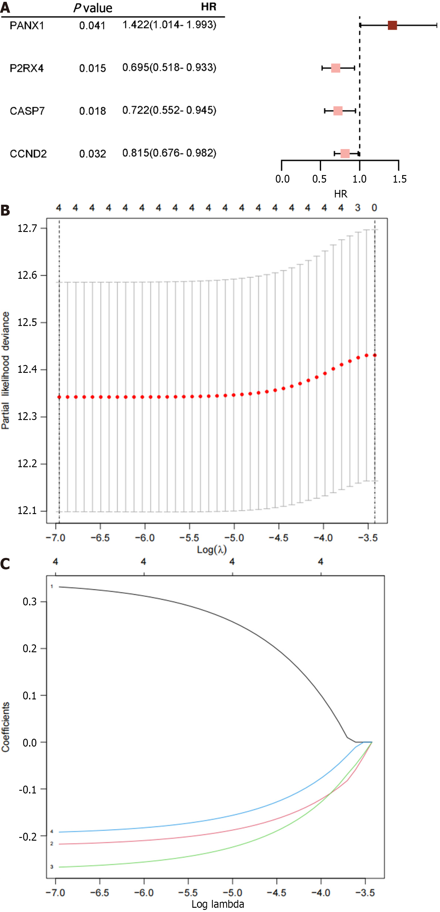
Figure 1 Illustrates the results obtained from the analyses.
A: Four ATP-induced cell death-related mRNAs are presented with P < 0.05 along with their corresponding risk ratios derived from the univariate Cox proportional hazard regression analysis; B: The process of tuning parameter (λ) selection for overall survival-related mRNAs in the Least Absolute Shrinkage and Selection Operator (LASSO) model is shown; C: The four chosen mRNAs' LASSO coefficient spectra, and the vertical line shows the coefficient values that the LASSO algorithm chose. HR: Hazard ratio.
Figure 2 Illustrates the Cancer Genome Atlas Breast Cancer dataset entire dataset's risk score distribution and expression heat map.
A1-A3: Total risk score; B1-B3: Training set risk score; C1-C3: Test set risk score; D1-D3: External validation cohort risk score; A1, B1, C1 and D1: The risk score distribution is illustrated, with pink dots representing the low-risk group and red dots representing the high-risk group. The vertical dotted line represents the median risk score cut-off point; A2, B2, C2 and D2: Displays the survival time and survival status of all patients; A3, B3, C3 and D3: Shows the expression patterns of the four selected genes from the ATP-induced cell death signature.
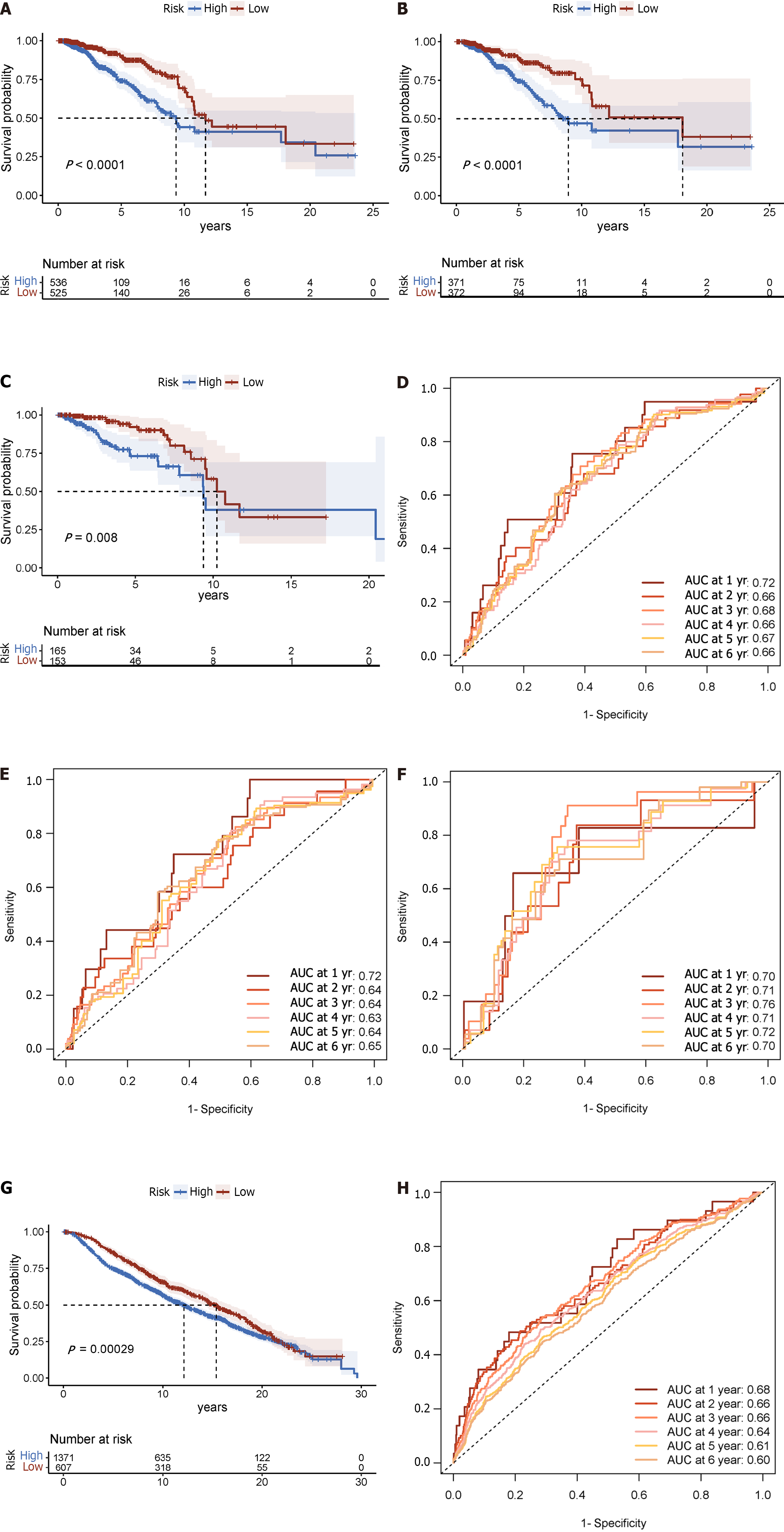
Figure 3 Displays time-varying receiver operating characteristic curves and Kaplan-Meier survival analyses.
A: In the complete dataset, the Kaplan-Meier survival analysis curve revealed a substantial difference in overall survival (OS) among the low-risk and high-risk groups; B: As well as in the training; C: Validation cohorts; D: The time-varying receiver operating characteristic curve area under the curve values for the total dataset; E: Training group; F: Validation group at 5 yr of OS were 0.67, 0.64, and 0.72, respectively; G: Kaplan-Meier survival analysis; H: Receiver operating characteristic curve over time.
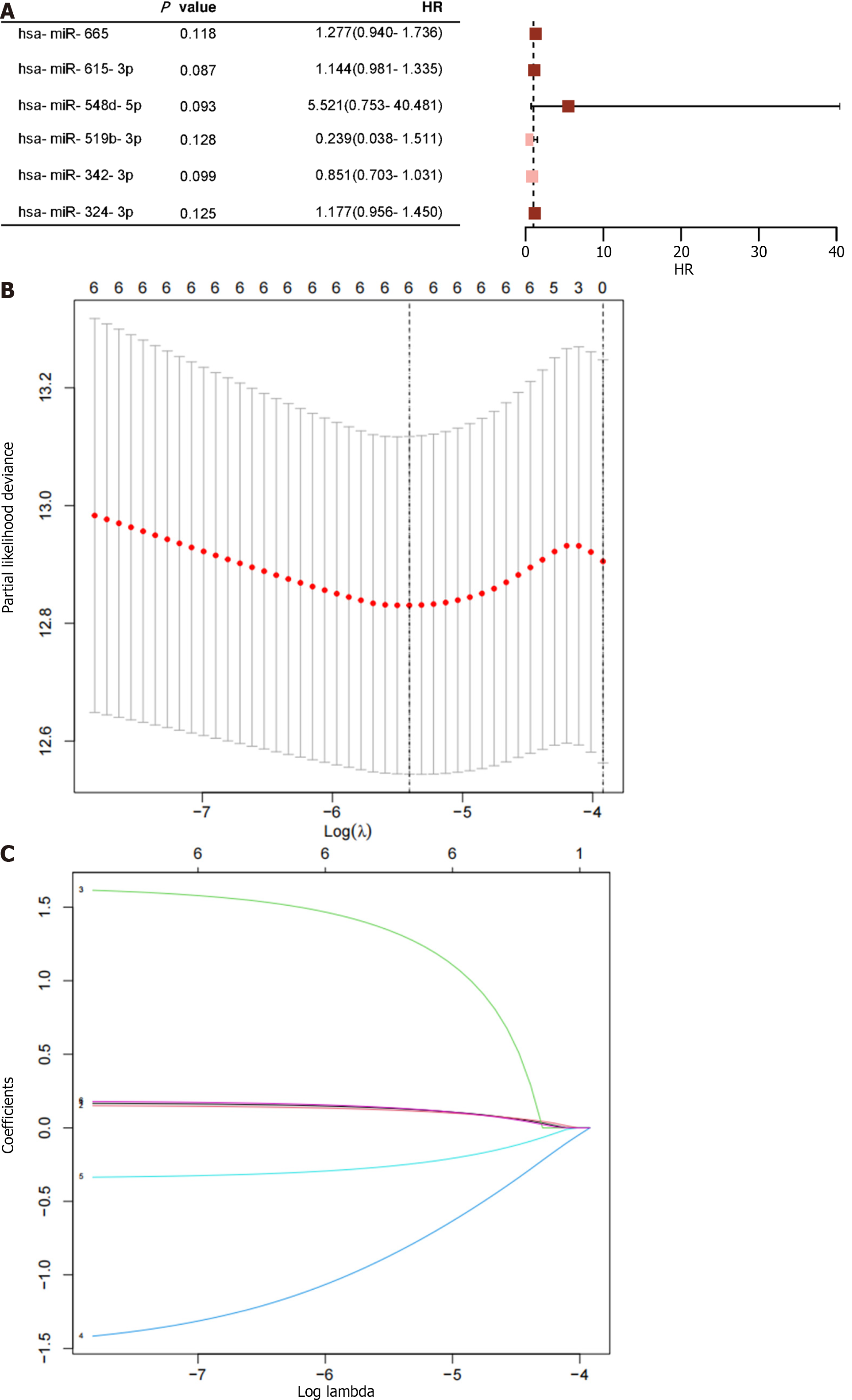
Figure 4 Displays the results of the analysis on ATP-induced cell death-related microRNAs.
A: Four microRNAs with P < 0.05 are provided, along with the risk ratios calculated using univariate Cox proportional hazard regression; B: Shows the selection process of tuning parameters (λ) for the overall survival-related miRNA using the Least Absolute Shrinkage and Selection Operator (LASSO) model; C: The four miRNAs' LASSO coefficient spectra are illustrated, with the vertical line reflecting the coefficient chosen using LASSO. HR: Hazard ratio.
Figure 5 Risk score distribution and expression heat map for the entire Cancer Genome Atlas Breast Cancer dataset.
A1-A3: Total risk score; B1-B3: Training set risk score; C1-C3: Test set risk score; D1-D3: External validation cohort risk score; A1, B1, C1 and D1: The risk score distribution is illustrated, with pink dots representing the low-risk group and red dots representing the high-risk group. The vertical dotted line represents the median risk score cut-off point; A2, B2, C2 and D2: Shows the patient's survival time and status; A3, B3, C3 and D3: Presents the heat maps depicting the expression levels of four selected ATP-induced cell death signature microRNAs.
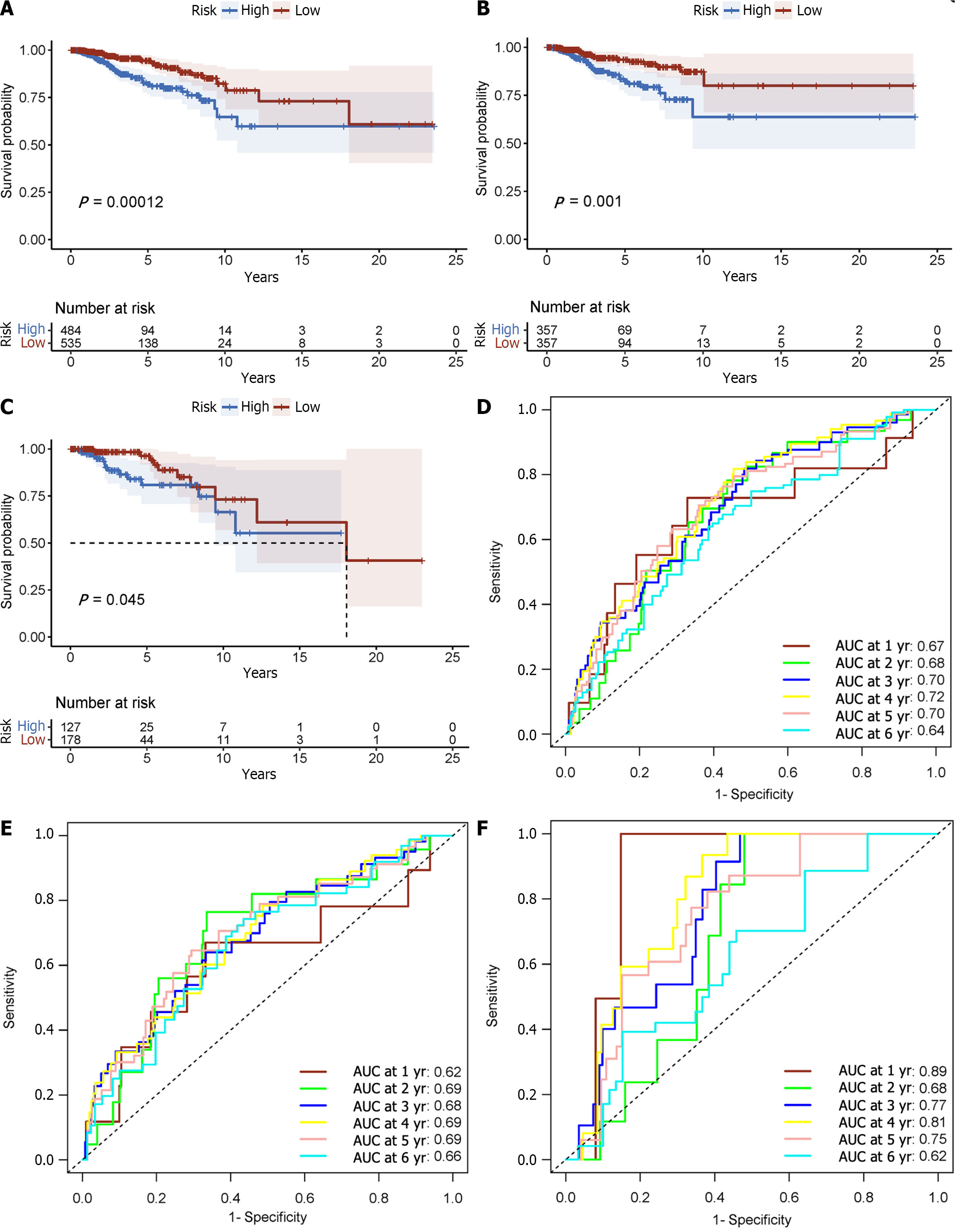
Figure 6 Displays the Kaplan-Meier survival analysis as well as the receiver operating characteristic curve over time.
A: In the total data set; B: Training cohort; C: Validation cohort, the Kaplan-Meier curve shows that the low-risk group had longer overall survival (OS) than the high-risk group; D: Time-varying receiver operating characteristic curve area under the curve for 5-yr OS was 0.70 for the total data set; E: 0.69 for the training group; F: 0.75 for the validation group. These findings illustrate the prognostic model's power in predicting patient outcomes.
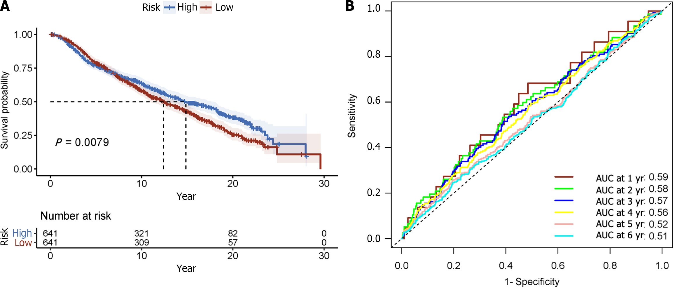
Figure 7 Displays time-varying receiver operating characteristic curves and Kaplan-Meier survival analyses.
A: Kaplan-Meier survival analysis; B: Receiver operating characteristic curve over time.
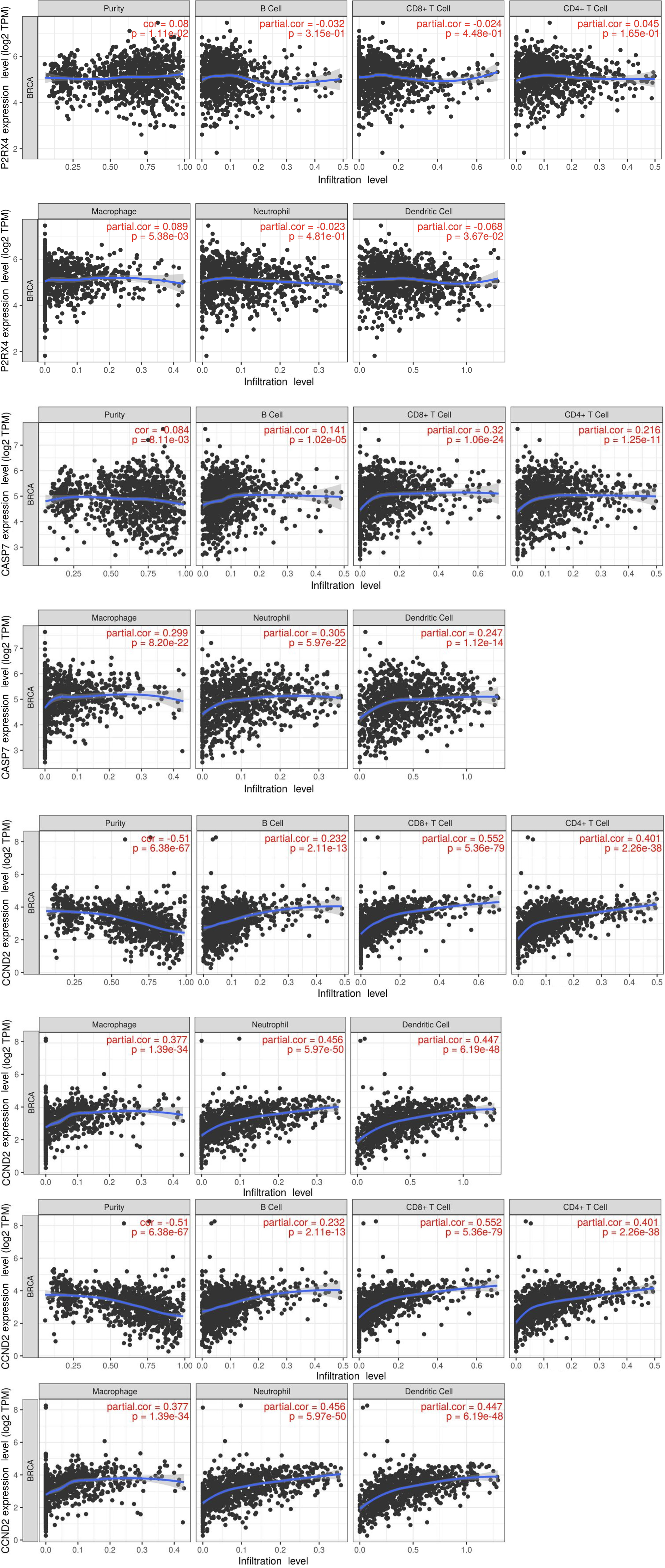
Figure 8 Correlation between mRNA and immune-infiltrated population.
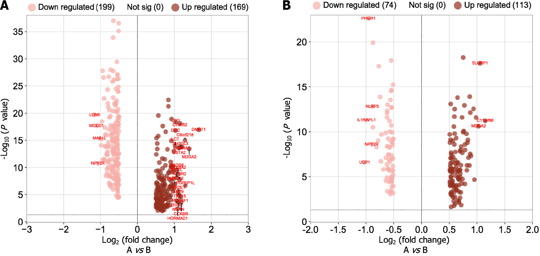
Figure 9 Volcano map of differential gene expression.
A: Analysis of high-low risk difference in gene prognosis model; B: Analysis of high-low risk difference in the microRNA prognosis model.
Figure 10 Gene Ontology and Kyoto Encyclopedia of Genes and Genomes enrichment analysis.
A and E: Biological process (BP) enrichment results; B and F: Cell component (CC) enrichment results; C and G: Molecular function (MF) enrichment results; D and H: Kyoto Encyclopedia of Genes and Genomes enrichment results.
Figure 11 Gene Ontology and Kyoto Encyclopedia of Genes and Genomes enrichment analysis.
A and E: Biological process (BP) enrichment results; B and F: Cell component (CC) enrichment results; C and G: Molecular function (MF) enrichment results; D and H: Kyoto Encyclopedia of Genes and Genomes (KEGG) enrichment results.
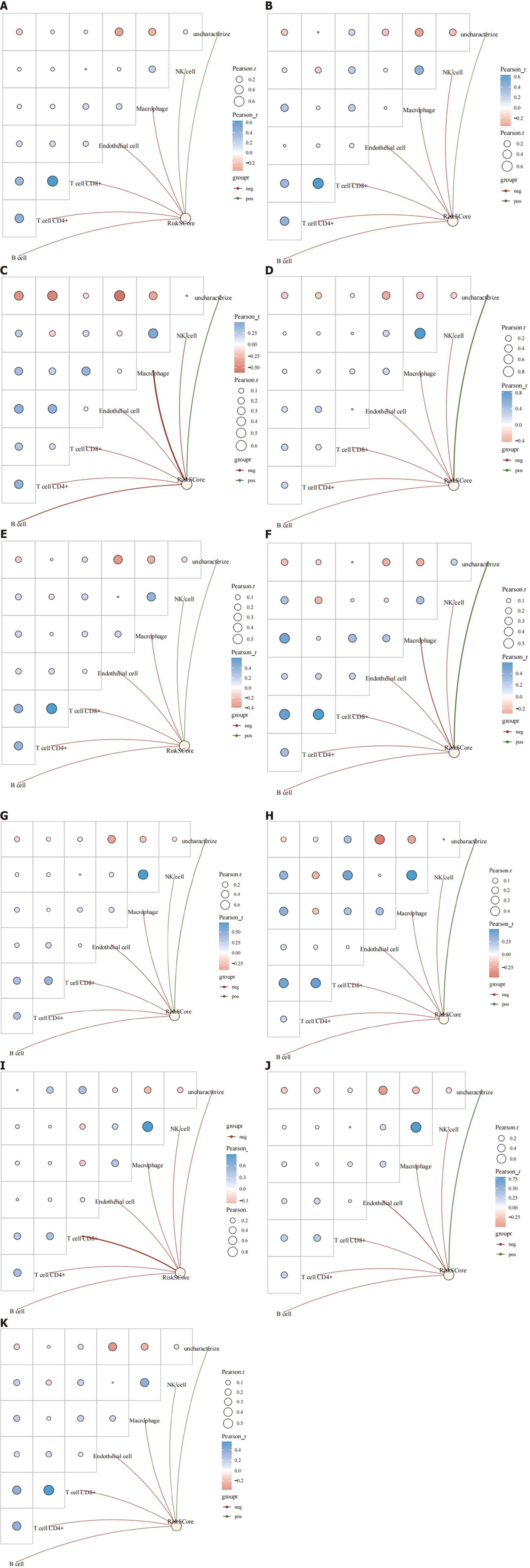
Figure 12 Immune infiltration analysis of risk scores in different breast cancer types.
A: Human epidermal growth factor receptor 2-positive (HER2+); B: HER2-; C: Estrogen receptor-positive (ER+); D: ER-; E: progesterone receptor-positive (PR+); F: PR-; G: Luminal A; H: Luminal B; I: HER2-enriched; J: Basal-like; K: Normal-like.
- Citation: Zhang HL, Doblin S, Zhang ZW, Song ZJ, Dinesh B, Tabana Y, Saad DS, Adam Ahmed Adam M, Wang Y, Wang W, Zhang HL, Wu S, Zhao R, Khaled B. Elucidating the molecular basis of ATP-induced cell death in breast cancer: Construction of a robust prognostic model. World J Clin Oncol 2024; 15(2): 208-242
- URL: https://www.wjgnet.com/2218-4333/full/v15/i2/208.htm
- DOI: https://dx.doi.org/10.5306/wjco.v15.i2.208


