Copyright
©The Author(s) 2021.
World J Gastroenterol. Jul 7, 2021; 27(25): 3913-3924
Published online Jul 7, 2021. doi: 10.3748/wjg.v27.i25.3913
Published online Jul 7, 2021. doi: 10.3748/wjg.v27.i25.3913
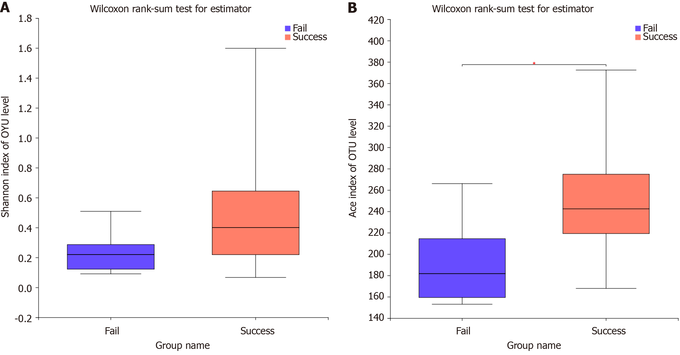
Figure 1 Alpha diversity analysis.
A: Shannon index; B: Ace index.
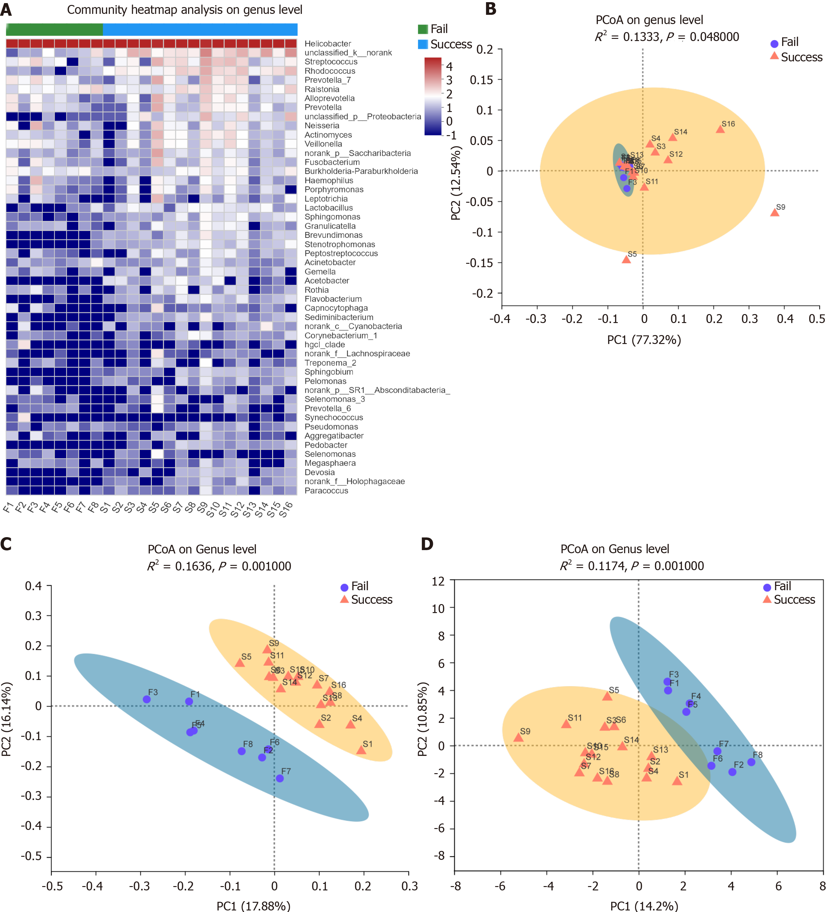
Figure 2 Beta diversity analysis.
A: Heatmap; B: Weighted UniFrac; C: Unweighted UniFrac; D: Binary Euclidean. Points with different colors or shapes represent samples from different groups. The closer the two points are, the more similar the species composition is.
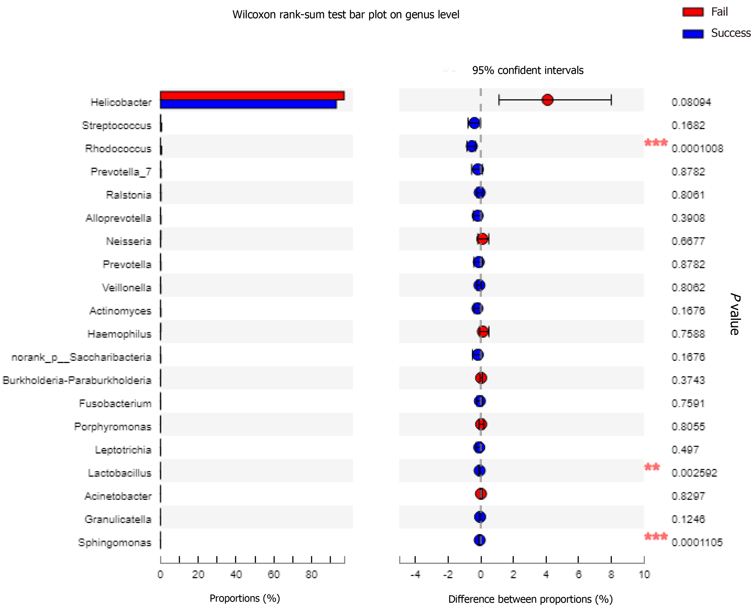
Figure 3 Genus-level differences between the success group and the failure group.
The analysis includes the 20 most abundant genera.
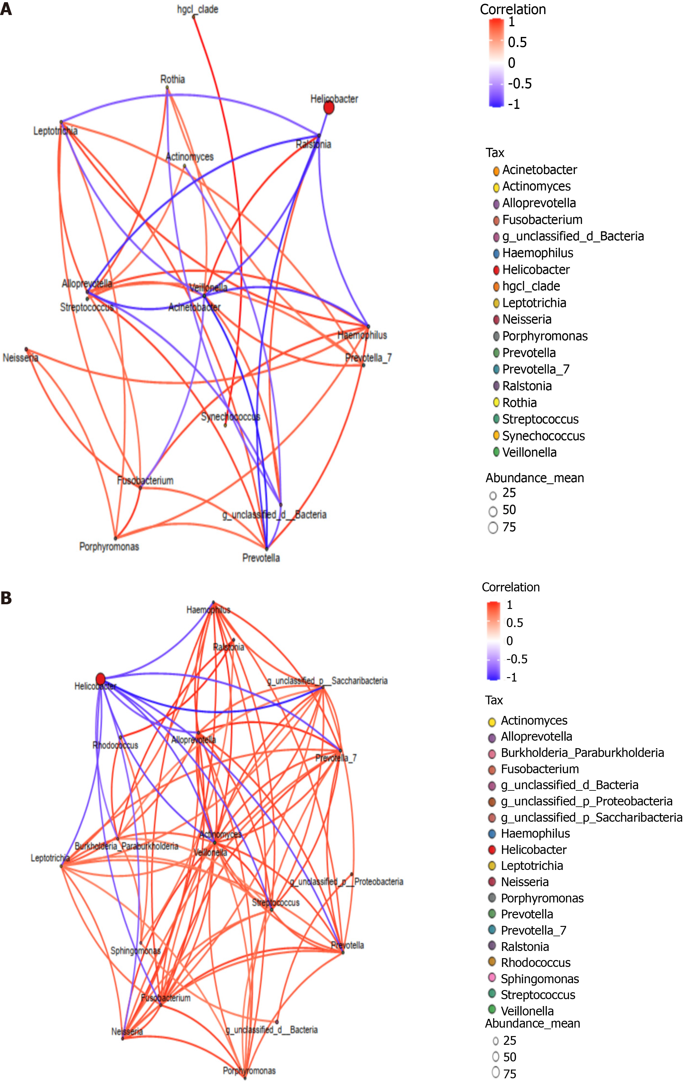
Figure 4 Single factor correlation network analysis including the 20 most abundant genera.
A: Failure group; B: Success group. Each circle represents a species. Red and blue line represent positive and negative correlations. The thickness of the lines represents the correlation coefficient.
- Citation: Niu ZY, Li SZ, Shi YY, Xue Y. Effect of gastric microbiota on quadruple Helicobacter pylori eradication therapy containing bismuth. World J Gastroenterol 2021; 27(25): 3913-3924
- URL: https://www.wjgnet.com/1007-9327/full/v27/i25/3913.htm
- DOI: https://dx.doi.org/10.3748/wjg.v27.i25.3913


