Copyright
©The Author(s) 2017.
World J Gastroenterol. Nov 14, 2017; 23(42): 7584-7593
Published online Nov 14, 2017. doi: 10.3748/wjg.v23.i42.7584
Published online Nov 14, 2017. doi: 10.3748/wjg.v23.i42.7584
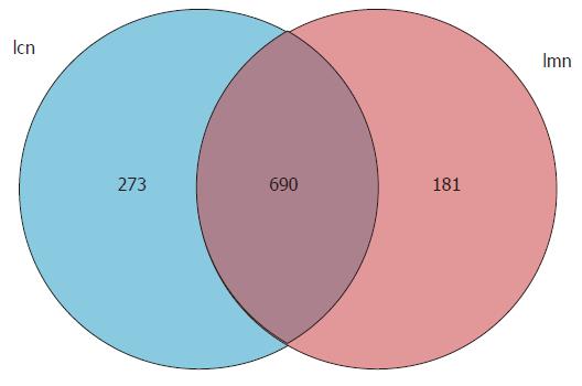
Figure 1 Venn diagram of operational taxonomic units based on the sequences with over 97% similarity under a similar level of clustering.
lcn: Control group; lmn: Model group.
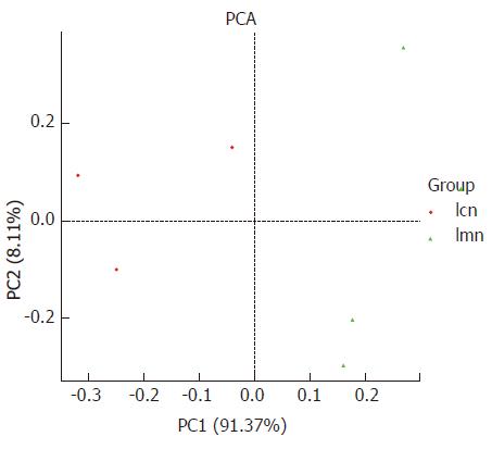
Figure 2 Principal component analysis diagram of bacterial lactase gene similarity at genus level based on DNA sequence data.
Each point in the figure represents a sample. Points with the same color belong to the same group. The closer the distance between two points, the smaller the difference in the microbial community. lcn: Control group; lmn: Model group;PCA: principal component analysis.
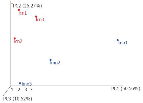
Figure 3 Three-dimensional sorting graph of samples based on weighted UniFrac principal coordinates analysis.
Each point in the figure represents a sample. Points with the same color belong to the same group. The closer the distance between two points, the smaller the difference in the microbial community. lcn1-3 were control groups 1-3, and lmn1-3 were model groups 1-3.
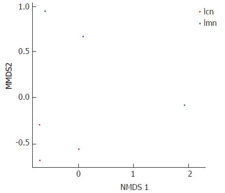
Figure 4 Two-dimensional map of samples based on weighted UniFrac nonmetric multidimensional scaling analysis.
Each point in the figure represents a sample. Points with the same color belong to the same group. The closer the distance between two points, the smaller the difference in the microbial community. lcn: Control group; lmn:Model group.
Figure 5 Species evolution and abundance information.
The pie chart of each branch point of the classification tree shows the abundance of the classification unit in each sample. The larger the fan area, the higher the corresponding abundance of the taxon became. lcn: Control group; lmn: Model group.
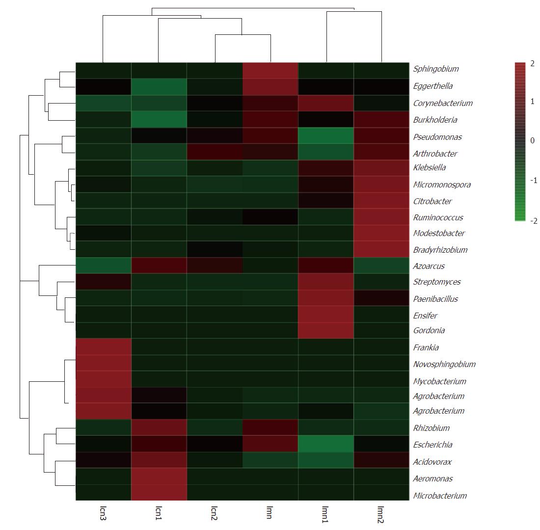
Figure 6 Heatmap analysis at genus level combined with cluster analysis.
lcn1-3 were control groups 1-3, and lmn1-3 were model groups 1-3.
- Citation: Long CX, He L, Guo YF, Liu YW, Xiao NQ, Tan ZJ. Diversity of bacterial lactase genes in intestinal contents of mice with antibiotics-induced diarrhea. World J Gastroenterol 2017; 23(42): 7584-7593
- URL: https://www.wjgnet.com/1007-9327/full/v23/i42/7584.htm
- DOI: https://dx.doi.org/10.3748/wjg.v23.i42.7584


