Copyright
©2008 The WJG Press and Baishideng.
World J Gastroenterol. Apr 7, 2008; 14(13): 2010-2022
Published online Apr 7, 2008. doi: 10.3748/wjg.14.2010
Published online Apr 7, 2008. doi: 10.3748/wjg.14.2010
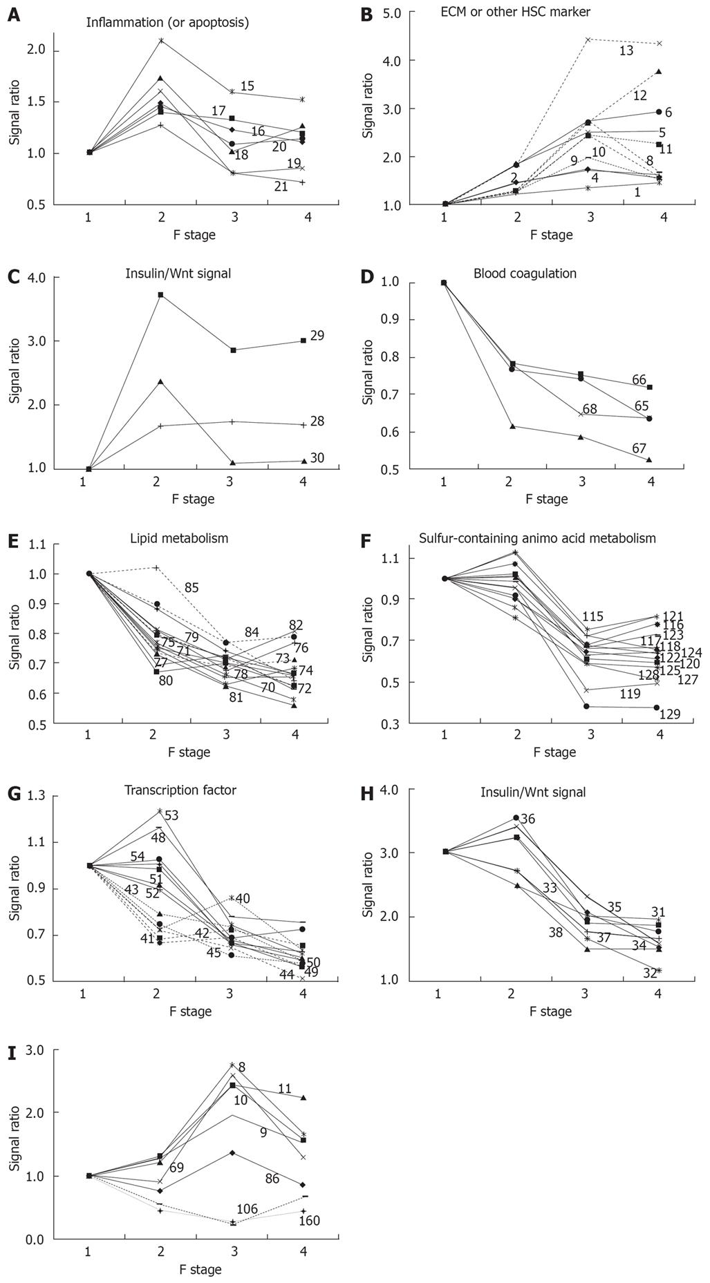
Figure 1 Clusters of genes in functional categories.
The characteristic behavior of gene clusters for each functional category is shown separately in Figure 1A-I. The numbers in each figure refer to the serial number of genes in Table 1. The expression ratio relative to the F1 stage is plotted in each graph. A: Inflammation gene cluster with a peak at F2; B: ECM gene cluster showing increased expression along with fibrosis progression; C: Insulin/Wnt signaling gene cluster with increased expression in the early phase of fibrosis; D: Blood coagulation factor gene cluster showing decreased expression along with fibrosis progression; E: Lipid metabolism gene
cluster showing decreased expression along with fibrosis progression; F: Sulfurcontaining amino acid metabolism gene cluster showing a synchronous decrease in expression from F2 to F3; G: Two transcription factor gene clusters showing sequential decreases in expression; H: Insulin/Wnt signaling gene cluster showing decreased expression from F2 to F3; I: A gene cluster showing a peak or bottom at F3.
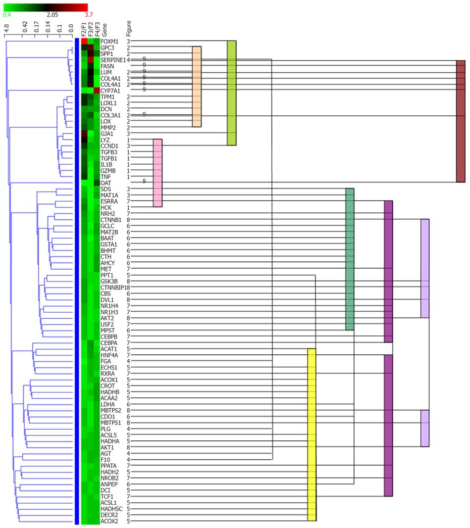
Figure 2 Comparison between statistical clustering analysis and functional cluster.
All genes in Figure 1 were subjected to hierarchical clustering analysis using Genowiz™. Statistical clustering of the expression ratio between neighboring F stages for the genes in Table 1 was combined with functional categories. The color coding in the center column shows the expression ratio between neighboring F stages for the genes in Table 1: Ratio increases from green to red. The left dendrogram shows the result of hierarchical clustering by Genowiz™ software. The numbers on the right of gene names indicate the subgraph numer in Figure 1, which represents functional categories, and the same numbers are tied with color bars.
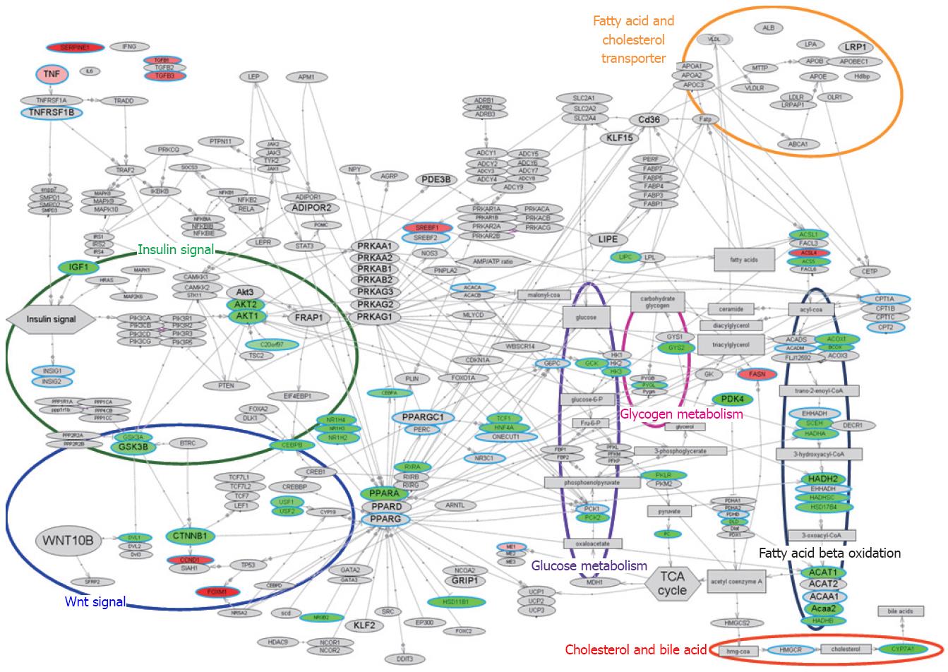
Figure 3 Molecular network associated with lipid metabolism.
Gene expression changes in pathways related to lipid metabolism, illustrated with bioSpace Explorer (a system for analysis of DNA microarray data for lipid metabolism; Pharma Frontier Co. Ltd / World Fusion Co. Ltd.; see texts for details). The bird’s-eye view of the lipid metabolism is displayed. The up-regulated and down-regulated gene expression ratios at F3 vs F1 in Table 1 are displayed in red and green, respectively, with the color gradation proportional to the ratio. Genes in Table 1 that did not show a statistically significant change in expression are indicated with a blue circle with gray background. An entry with a gray background only indicates no input data. Most of the entity names in Figure 2 are the same as the gene name in Table 1, but the names “C20orf97”, “SCEH”, “Acaa2”, and “ACS5” in Figure 2 refer to “TRIB3”, “ECHS1”, “ACAA2”, and “ACSL5”, respectively, in Table 1. These differences are due to the software used in bioSpace Explorer.
- Citation: Takahara Y, Takahashi M, Zhang QW, Wagatsuma H, Mori M, Tamori A, Shiomi S, Nishiguchi S. Serial changes in expression of functionally clustered genes in progression of liver fibrosis in hepatitis C patients. World J Gastroenterol 2008; 14(13): 2010-2022
- URL: https://www.wjgnet.com/1007-9327/full/v14/i13/2010.htm
- DOI: https://dx.doi.org/10.3748/wjg.14.2010


