Copyright
©The Author(s) 2022.
World J Gastroenterol. Oct 7, 2022; 28(37): 5420-5443
Published online Oct 7, 2022. doi: 10.3748/wjg.v28.i37.5420
Published online Oct 7, 2022. doi: 10.3748/wjg.v28.i37.5420
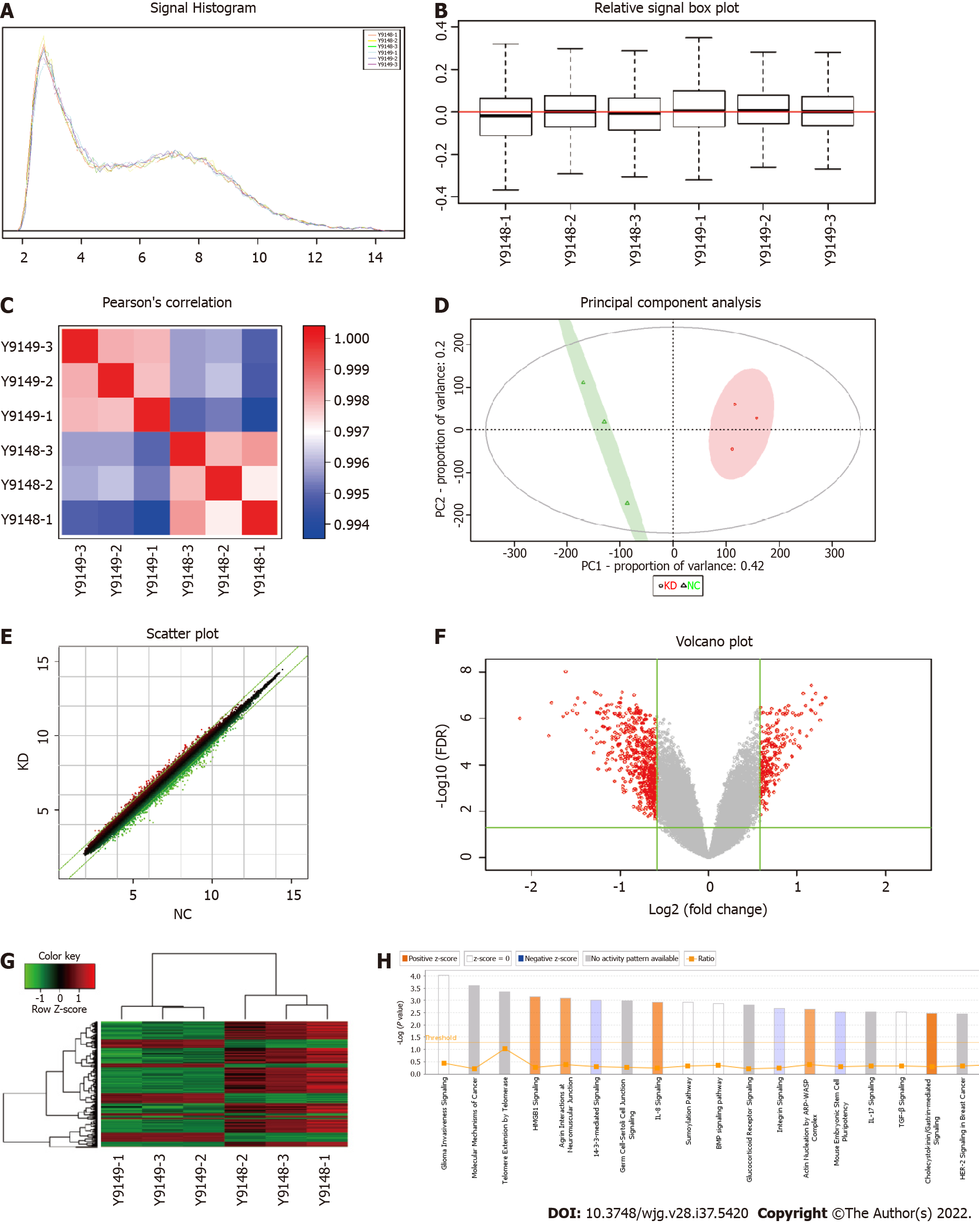
Figure 2 Screening of target genes by chip detection.
A: Signal strength distribution curve diagram, with the cross coordinates representing the probe signal strength range and the longitudinal coordinates representing the number of probe sets within the signal strength range; B: Relative line ram of the logarithmic signal strength, with the horizontal coordinate representing the sample name, the vertical coordinate indicating the relative logarithmic signal strength, the red line in the middle representing the average of the relative logarithmic signal strength of all samples, and the upper and lower horizontal lines representing the 90% confidence interval. The upper and lower edges represent the upper and lower quartiles, and the black line in the middle represents the median; C: Distribution diagram of the Pearson correlation coefficient among samples. The correlation coefficient indicates a positive correlation of the expression mode of genes in two subjects, and a negative value indicates an expression mode with a negative correlation. As the absolute value of the correlation coefficient approaches 1.0, the correlation increases; D: Principal component analysis. Red dots represent normal purpose cells with centromere protein K (CENPK) gene short hairpin RNA virus infection (KD) samples, and green dots represent normal purpose cells infected with CENPK negative control virus (NC) samples; E: Scatter diagram. The cross coordinate represents the NC group, and the vertical coordinate represents the KD group; F: Volcano map, where the cross coordinate is a difference multiple (the logarithmic change in the bottom 2); longitudinal significance false discovery rate (FDR) (of the difference in the bottom 10 Logarithmic change); significantly different genes screened by |fold change| ≥ 1.5 and FDR < 0.05 in red, and other genes with no significant difference in gray; G: Cluster analysis results. Each column represents a sample, and each row represents a differentially expressed gene; H: Statistics for the classical pathway enrichment analysis. The transverse coordinate is the path name and the longitudinal significance level of enrichment (negative logarithmic transformation in the bottom 10).
- Citation: Li X, Han YR, Xuefeng X, Ma YX, Xing GS, Yang ZW, Zhang Z, Shi L, Wu XL. Lentivirus-mediated short hairpin RNA interference of CENPK inhibits growth of colorectal cancer cells with overexpression of Cullin 4A. World J Gastroenterol 2022; 28(37): 5420-5443
- URL: https://www.wjgnet.com/1007-9327/full/v28/i37/5420.htm
- DOI: https://dx.doi.org/10.3748/wjg.v28.i37.5420


