Copyright
©The Author(s) 2016.
World J Gastroenterol. Apr 14, 2016; 22(14): 3860-3868
Published online Apr 14, 2016. doi: 10.3748/wjg.v22.i14.3860
Published online Apr 14, 2016. doi: 10.3748/wjg.v22.i14.3860
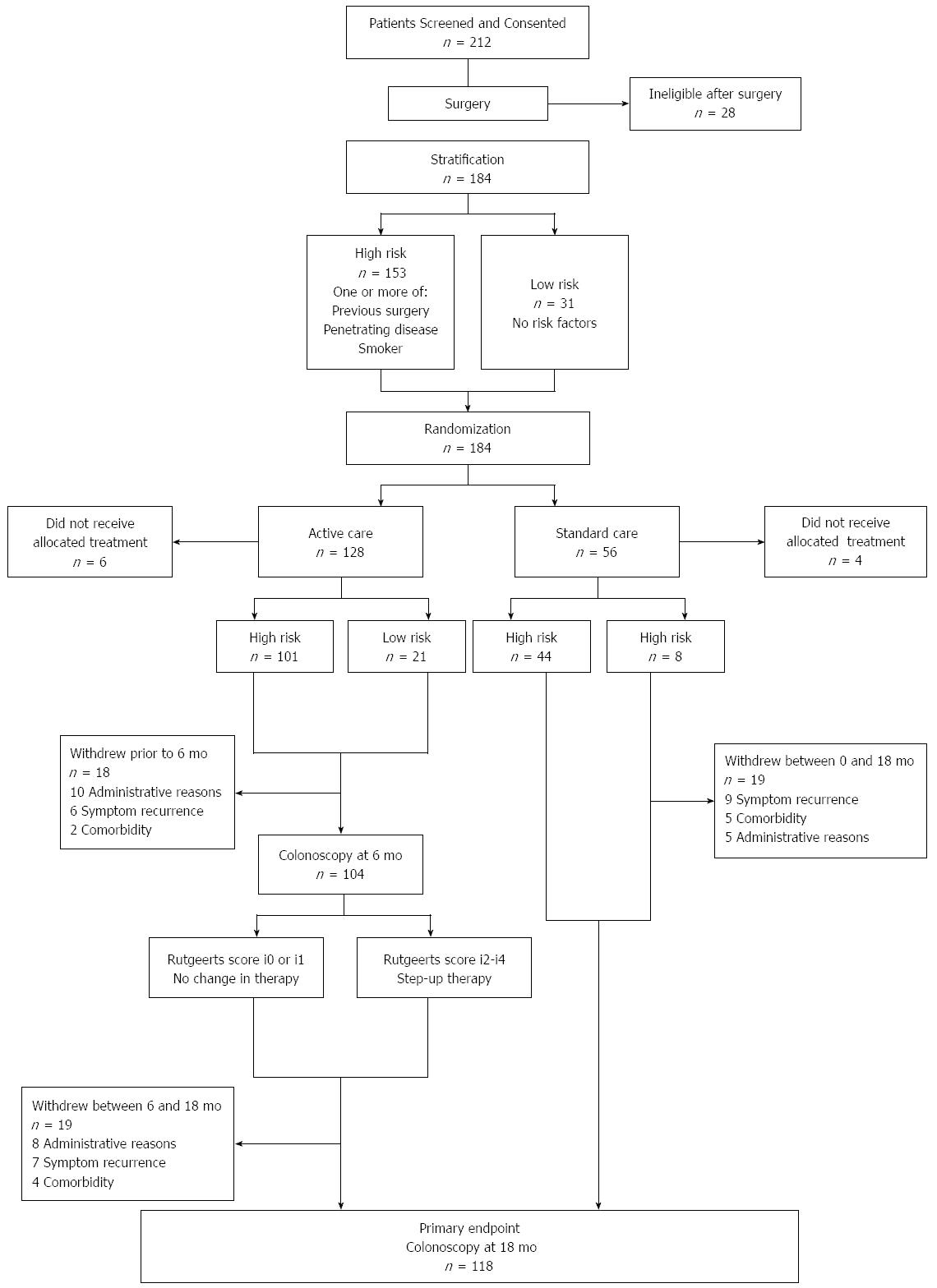
Figure 1 Consort diagram: The POCER Study.
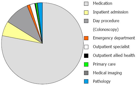
Figure 2 Distribution of costs in post-operative Crohn’s disease in this cohort.
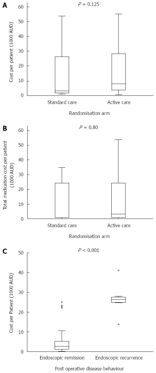
Figure 3 Active vs standard care arms.
Total cost of care (A) and medication cost (B) in post-operative Crohn’s disease in the standard versus active care arms. Total cost of care over twelve months for patients with endoscopic remission versus recurrence (C). Boxes indicate the median and 25th and 75th percentiles, whiskers indicate calculated maximum and minimum with circles indicating outliers.
- Citation: Wright EK, Kamm MA, Dr Cruz P, Hamilton AL, Ritchie KJ, Bell SJ, Brown SJ, Connell WR, Desmond PV, Liew D. Cost-effectiveness of Crohn’s disease post-operative care. World J Gastroenterol 2016; 22(14): 3860-3868
- URL: https://www.wjgnet.com/1007-9327/full/v22/i14/3860.htm
- DOI: https://dx.doi.org/10.3748/wjg.v22.i14.3860


