Copyright
©2014 Baishideng Publishing Group Co.
World J Gastroenterol. Feb 14, 2014; 20(6): 1574-1581
Published online Feb 14, 2014. doi: 10.3748/wjg.v20.i6.1574
Published online Feb 14, 2014. doi: 10.3748/wjg.v20.i6.1574
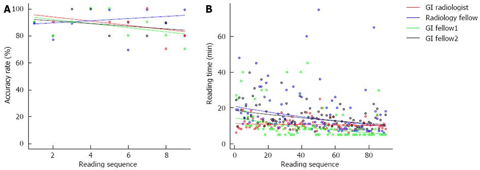
Figure 1 Graph shows the changes for each of the 4 readers over the reading sequence in the study.
A: Accuracy rate. Each point on the y axis, represents an average accuracy rate for each 10 patient data sets reviewed with the line representing the slope in the joinpoint regression model; B: Reading time. Each point on the graph represents the reading time for a patient scan. The line represents the slope in the joinpoint regression model depicting the change in reading time for each reader. GI: Gastroenterology.
- Citation: Rosenfeld G, Fu YTN, Quiney B, Qian H, Krygier D, Brown J, Vos P, Tiwari P, Telford J, Bressler B, Enns R. Does training and experience influence the accuracy of computed tomography colonography interpretation? World J Gastroenterol 2014; 20(6): 1574-1581
- URL: https://www.wjgnet.com/1007-9327/full/v20/i6/1574.htm
- DOI: https://dx.doi.org/10.3748/wjg.v20.i6.1574


