Copyright
©The Author(s) 2016.
World J Rheumatol. Jul 12, 2016; 6(2): 23-29
Published online Jul 12, 2016. doi: 10.5499/wjr.v6.i2.23
Published online Jul 12, 2016. doi: 10.5499/wjr.v6.i2.23
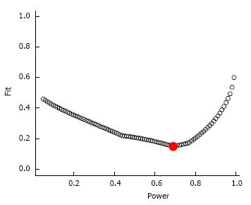
Figure 3 Diagnostic plot for power estimation.
This figure illustrates how close the expected P-curve is to the observed P-curve for each level of power between 5% and 99%. The Y-axis is the perfect fit distance for each level of power. The estimated power for exercise-induced changes in depressive symptoms data is 69%. The solid red circle is generally lower than the other markers, suggesting that the power estimate is a better fit than the alternatives. The flatter the curve, the less confidence in the power estimate. Alternatively, a V-shape suggests an ideal estimate of power.
- Citation: Kelley GA, Kelley KS. Exercise reduces depressive symptoms in adults with arthritis: Evidential value. World J Rheumatol 2016; 6(2): 23-29
- URL: https://www.wjgnet.com/2220-3214/full/v6/i2/23.htm
- DOI: https://dx.doi.org/10.5499/wjr.v6.i2.23


