
















©The Author(s) 2026.
World J Hematol. Jan 21, 2026; 12(1): 115355
Published online Jan 21, 2026. doi: 10.5315/wjh.v12.i1.115355
Published online Jan 21, 2026. doi: 10.5315/wjh.v12.i1.115355
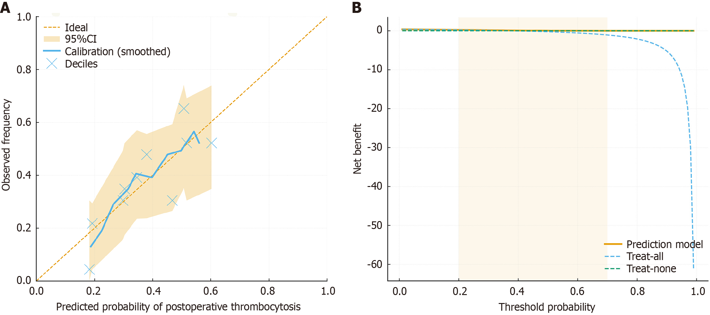
Figure 3 Curve for the prediction model.
A: Calibration curve for the prediction model. Calibration plot evaluating the agreement between predicted and observed probabilities of postoperative thrombocytosis. The solid line represents the model’s LOESS-smoothed calibration, while the dashed line indicates perfect prediction. The shaded band denotes the bootstrap-estimated 95% confidence interval across 800 resamples. Each bubble represents a decile of predicted probability, with bubble size proportional to sample density. The close alignment between the calibration curve and the ideal line indicates excellent model calibration; B: Decision curve analysis for the prediction model. Decision curve analysis assessing the net clinical benefit of the predictive model across a range of threshold probabilities. The orange curve (nomogram) demonstrates a consistently higher net benefit compared with the “treat-all” and “treat-none” strategies over thresholds between 0.2 and 0.7. This indicates that applying the model to guide postoperative risk management yields meaningful clinical benefit by identifying high-risk patients who may require closer monitoring or prophylactic intervention. CI: Confidence interval.
- Citation: Zhang T, Li ZC, Pan ZB, Qi SQ, Tang R. Nomogram-based prediction of post-splenectomy thrombocytosis in children with hereditary spherocytosis. World J Hematol 2026; 12(1): 115355
- URL: https://www.wjgnet.com/2218-6204/full/v12/i1/115355.htm
- DOI: https://dx.doi.org/10.5315/wjh.v12.i1.115355