
















©The Author(s) 2025.
World J Radiol. Dec 28, 2025; 17(12): 112911
Published online Dec 28, 2025. doi: 10.4329/wjr.v17.i12.112911
Published online Dec 28, 2025. doi: 10.4329/wjr.v17.i12.112911
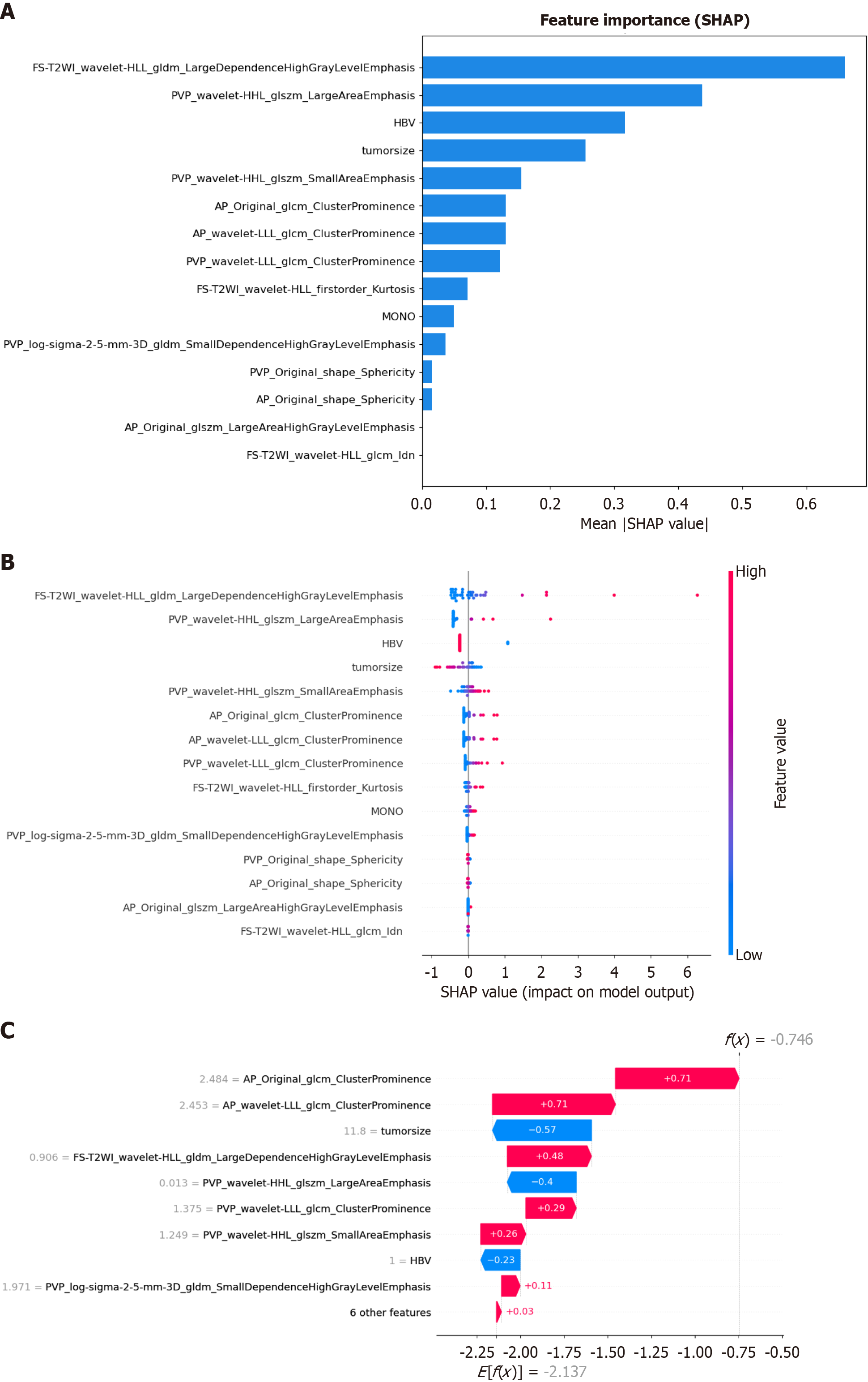
Figure 9 SHapley Additive exPlanations analysis diagram of each feature in the optimal model.
A: SHapley Additive exPlanations (SHAP) value bar graph, showing the mean absolute SHAP value of all the features, arranged in descending order of importance; B: SHAP value scatter graph, showing the average degree of influence of each feature in the model. The color of the dot represents the original value of the feature, with blue indicating a low value and red indicating a high value, and the position of the dot represents the SHAP value. A positive SHAP value indicates an increased risk of predicting poorly differentiated hepatocellular carcinoma, and vice versa. A higher value corresponds to a higher risk. Each point corresponds to a prediction for each patient; C: Waterfall diagram of a random sample. The calculation process of the degree of contribution of each feature in a single random sample to the prediction result and the final predicted value, which is represented by bars of different colors, with blue representing a negative value and red representing a positive value. SHAP: SHapley Additive exPlanations; FS-T2WI: Fat-suppressed T2-weighted imaging; PVP: Portal venous phase; AP: Arterial phase; LLL: Low-low-low frequency band; HBV: Hepatitis B virus; MONO: Monocyte count.
- Citation: Shi Y, Zhang P, Li L, Yang HM, Li ZM, Zheng J, Yang L. Interpretable model based on multisequence magnetic resonance imaging radiomics for predicting the pathological grades of hepatocellular carcinomas. World J Radiol 2025; 17(12): 112911
- URL: https://www.wjgnet.com/1949-8470/full/v17/i12/112911.htm
- DOI: https://dx.doi.org/10.4329/wjr.v17.i12.112911