Copyright
©The Author(s) 2022.
World J Hepatol. May 27, 2022; 14(5): 972-983
Published online May 27, 2022. doi: 10.4254/wjh.v14.i5.972
Published online May 27, 2022. doi: 10.4254/wjh.v14.i5.972
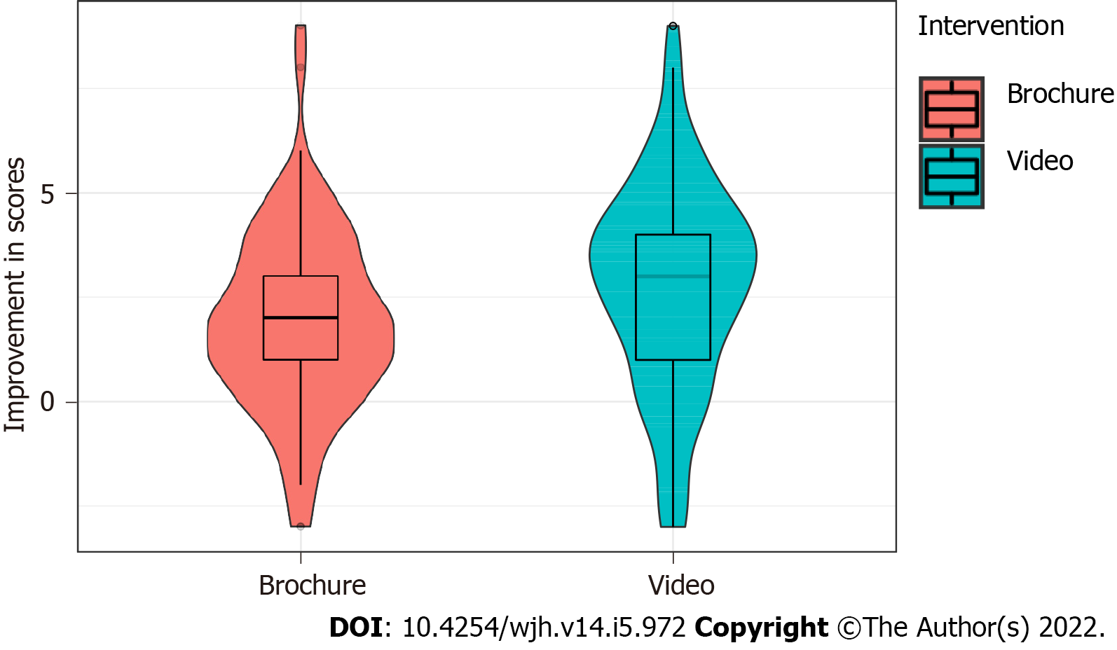
Figure 1 The distribution of improvement in scores calculated as the pre-intervention subtracted from the post-intervention for both interventions are illustrated in the violin plot wrapping a boxplot.
The box extends from the 25th to the 75th percentile with lines extending outward depicting the smallest value within 1.5 times the interquartile range (IQR) below the 25th percentile and largest value within 1.5 times the IQR above the 75th percentile. The dark line in the middle of the box illustrates the median values. Peach indicates the control site (brochure) and blue (video) the intervention site. The violin displays the density plot of the values, where the width indicates the frequency.
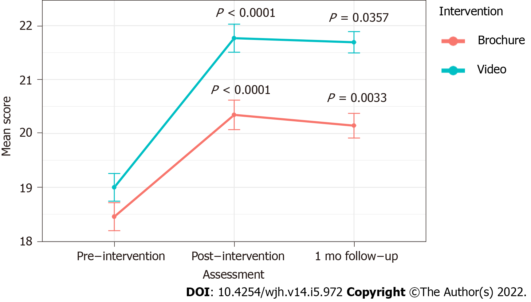
Figure 2 Illustrated are mean scores for the assessments obtained pre- and post- as well as after one month after the video (blue) and brochure (red/peach) educational interventions.
- Citation: Talal AH, Ding YX, Markatou M. Innovations in education: A prospective study of storytelling narratives to enhance hepatitis C virus knowledge among substance users. World J Hepatol 2022; 14(5): 972-983
- URL: https://www.wjgnet.com/1948-5182/full/v14/i5/972.htm
- DOI: https://dx.doi.org/10.4254/wjh.v14.i5.972


