Copyright
©The Author(s) 2015.
World J Meta-Anal. Feb 26, 2015; 3(1): 54-60
Published online Feb 26, 2015. doi: 10.13105/wjma.v3.i1.54
Published online Feb 26, 2015. doi: 10.13105/wjma.v3.i1.54
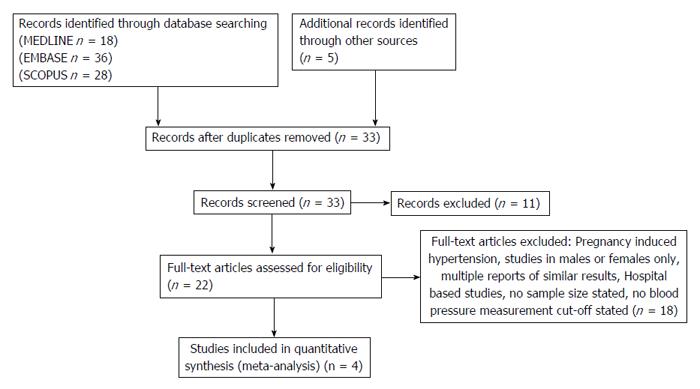
Figure 1 Flow diagram of the study selection process.
As shown in Figure 1, our initial search yielded 87 citations: 18 from MEDLINE, 36 from EMBASE, 28 from Scopus, and 5 from grey literature. After screening titles and abstracts, 22 studies were considered potentially eligible and retrieved in full text. Of these, 18 studies were subsequently excluded because they did not satisfy the inclusion criteria. Thus, four fully eligible studies were identified.
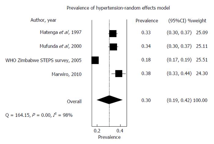
Figure 2 Forest plot of studies conducted from 1997 to 2010 on Hypertension prevalence.
The forest plot depicted in Figure 2 (above) represents a meta-analysis of studies that measured the prevalence of hypertension in Zimbabwe from 1997 to 2010. Individual studies with their unadjusted prevalence are represented by a black square and a horizontal line, which corresponds to the point estimate and 95%CI of prevalence. The size of the black square reflects the weight of the study in the meta-analysis. The diamond at the bottom represents the pooled estimate of all studies with its 95% confidence interval. In this case, Figure 2 indicates the pooled estimated prevalence of hypertension is 30% (95%CI: 19-42). The test for overall prevalence also indicates statistical significance (P < 0.0001).
- Citation: Mutowo MP, Mangwiro JC, Lorgelly P, Owen A, Renzaho AM. Hypertension in Zimbabwe: A meta-analysis to quantify its burden and policy implications. World J Meta-Anal 2015; 3(1): 54-60
- URL: https://www.wjgnet.com/2308-3840/full/v3/i1/54.htm
- DOI: https://dx.doi.org/10.13105/wjma.v3.i1.54


