Copyright
©The Author(s) 2022.
World J Clin Cases. Mar 6, 2022; 10(7): 2115-2126
Published online Mar 6, 2022. doi: 10.12998/wjcc.v10.i7.2115
Published online Mar 6, 2022. doi: 10.12998/wjcc.v10.i7.2115
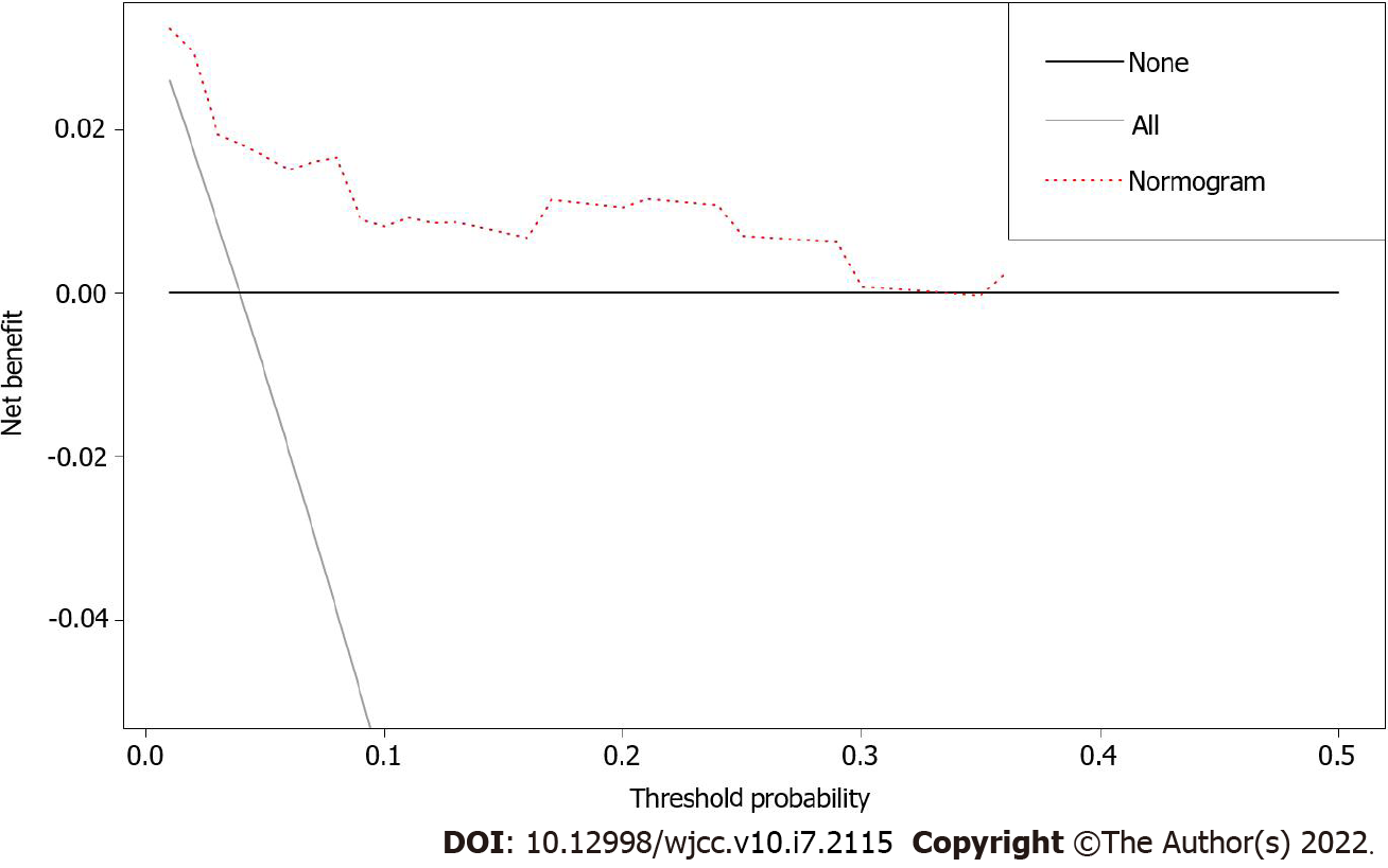
Figure 5 Decision curve analysis of the nomogram predicting overall survival.
The x-axis assumes the threshold probability, and the y-axis measures the net benefit. The black line represents that none of the patients died, whereas the gray line indicates that all patients died at a specific threshold probability. The red dashed line shows the net benefit of using the nomogram.
- Citation: Gong XQ, Zhang Y. Develop a nomogram to predict overall survival of patients with borderline ovarian tumors. World J Clin Cases 2022; 10(7): 2115-2126
- URL: https://www.wjgnet.com/2307-8960/full/v10/i7/2115.htm
- DOI: https://dx.doi.org/10.12998/wjcc.v10.i7.2115


