
















Copyright: ©Author(s) 2026.
World J Psychiatry. Jul 19, 2026; 16(7): 117803
Published online Jul 19, 2026. doi: 10.5498/wjp.117803
Published online Jul 19, 2026. doi: 10.5498/wjp.117803
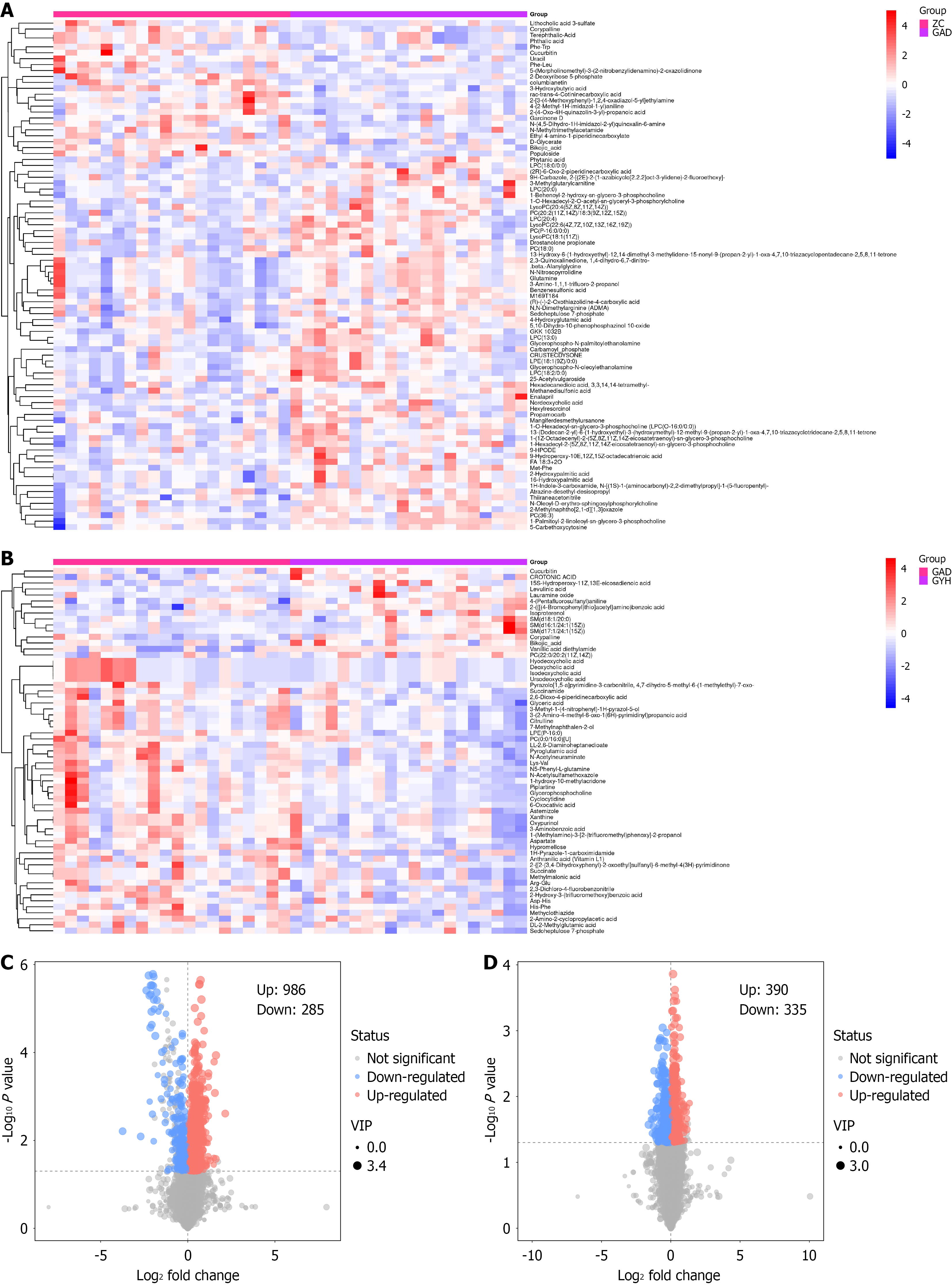
Figure 5 Heatmaps and volcano plots.
A and B: Heatmaps, where the horizontal coordinates represent different groupings of samples, the vertical coordinates represent all metabolites, and the color blocks at different positions represent the relative expression of metabolites at the corresponding positions; red indicates high expression of the substance content, and blue indicates low expression of the substance content. Figure A shows the comparison between the control group and the generalized anxiety disorder group before intervention, and Figure B shows the comparison between the generalized anxiety disorder group before intervention and after intervention; C and D: Volcano plots. Each point in the plots represents a detected metabolite: The horizontal axis denotes the fold change of each metabolite between groups, while the vertical axis denotes the P value derived from Student’s t-test. The color of each scatter point indicates the expression change trend of metabolites: Red represents upregulated metabolites, blue represents downregulated ones, and gray represents metabolites with no significant differences in expression. VIP: Variable importance in the projection.
- Citation: Zhang J, Li WB, Wang XX, Han TT, Dong S, Sang YN, Lu M, Guo XH. Congqi Shoushen Tuina Method for generalized anxiety disorder: Clinical outcomes and serum metabolomic profiles. World J Psychiatry 2026; 16(7): 117803
- URL: https://www.wjgnet.com/2220-3206/full/v16/i7/117803.htm
- DOI: https://dx.doi.org/10.5498/wjp.117803