
















Copyright: ©Author(s) 2026.
World J Psychiatry. Oct 19, 2026; 16(10): 122517
Published online Oct 19, 2026. doi: 10.5498/wjp.122517
Published online Oct 19, 2026. doi: 10.5498/wjp.122517
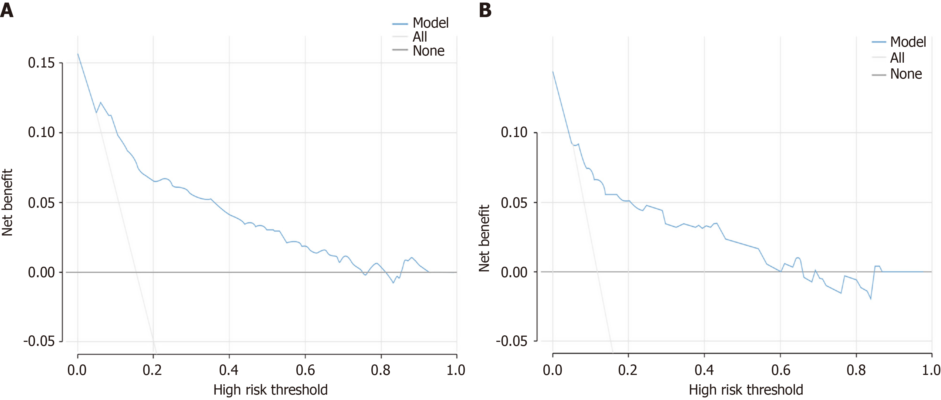
Figure 5 Decision curve analysis of the nomogram.
A: Training set; B: Validation set. The Y-axis depicts net benefit, while the X-axis denotes threshold probability. The blue curve represents the nomogram, whereas the gray descending line illustrates the “treat all” strategy. The gray horizontal line at a net benefit of zero symbolizes the “treat none” strategy.
- Citation: Luo SY, Feng L, Hong YJ, Liang J, Peng Y, Shao LH, Zhang XB. Development and validation of a nomogram model for identifying post-stroke anxiety symptoms. World J Psychiatry 2026; 16(10): 122517
- URL: https://www.wjgnet.com/2220-3206/full/v16/i10/122517.htm
- DOI: https://dx.doi.org/10.5498/wjp.122517