Copyright
©The Author(s) 2025.
World J Psychiatry. Jun 19, 2025; 15(6): 105889
Published online Jun 19, 2025. doi: 10.5498/wjp.v15.i6.105889
Published online Jun 19, 2025. doi: 10.5498/wjp.v15.i6.105889
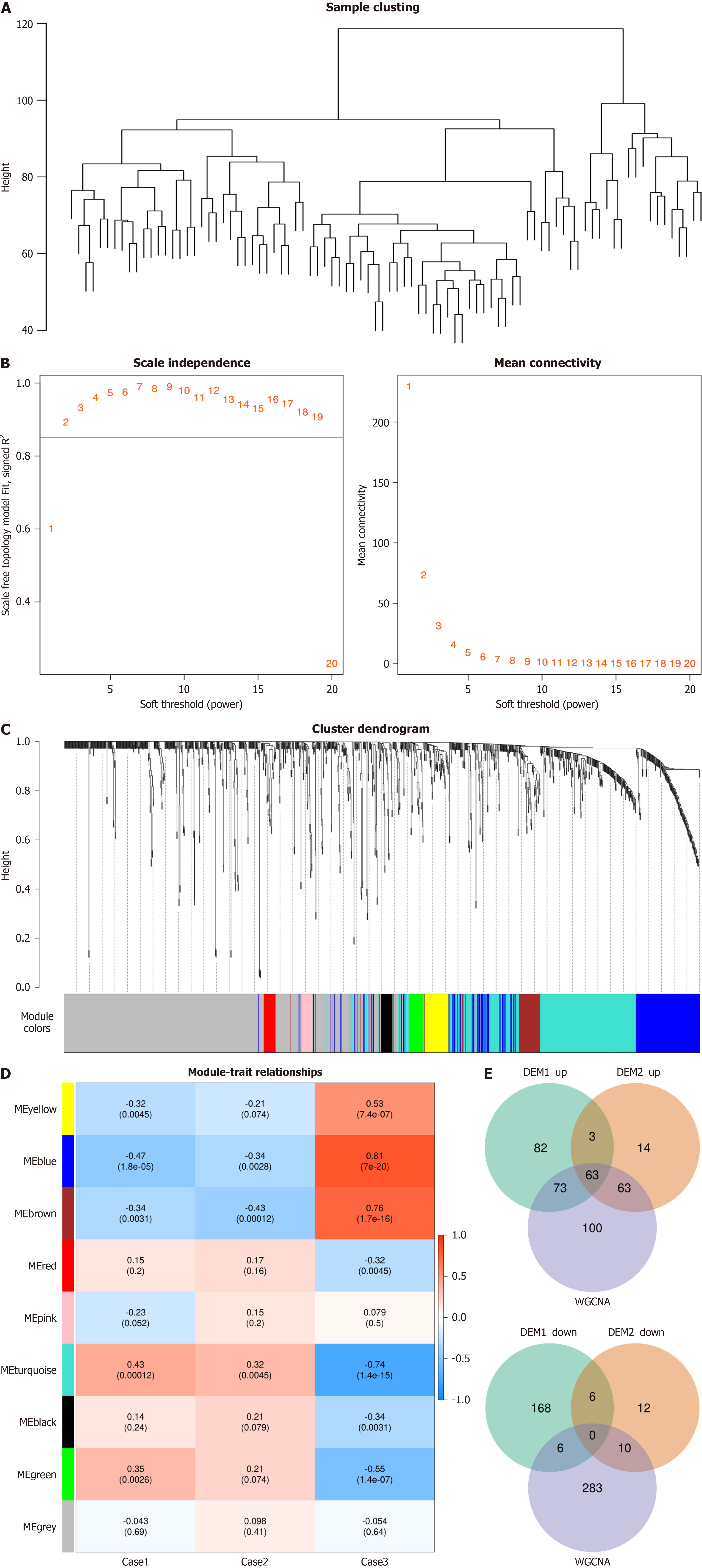
Figure 4 Weighted gene co-expression network analysis.
A: Outlier sample detection and clustering tree of all samples, with the vertical axis representing the spatial distance between samples; B: Scale-free fitting index and average connectivity for the analysis threshold. The horizontal axis in both graphs represents the weight parameter β. The vertical axis in the left graph represents the square of the correlation coefficient between log (k) and log [p(k)] in the network. The higher the square of the correlation coefficient, the closer the network is to a scale-free distribution. The vertical axis in the right graph represents the average adjacency function of all metabolites in the corresponding module; C: Metabolite modules identified by Weighted gene co-expression network analysis. Different colors represent the various modules, with gray indicating metabolites that could not be classified into any module; D: Correlation between metabolite modules and traits. The horizontal axis represents the grouping information, and the vertical axis represents the different modules. The first row within the module represents the correlation coefficient, with P values in parentheses; E: Overlap metabolites. The left graph represents the overlap of upregulated metabolites, while the right graph represents the overlap of downregulated metabolites. WGCNA: Weighted gene co-expression network analysis.
- Citation: Wu CR, Zhu HL, Sun YT, Shen SH, Shi PL, Cui YH, Tang JG, Yang CH, Wang SY, Ge XL, Pan SM. Clinical manifestations of anxiety and depression in sepsis-associated encephalopathy and multi-omics identification of cluster of differentiation 38 as an early biomarker. World J Psychiatry 2025; 15(6): 105889
- URL: https://www.wjgnet.com/2220-3206/full/v15/i6/105889.htm
- DOI: https://dx.doi.org/10.5498/wjp.v15.i6.105889


