
















Copyright: ©Author(s) 2026.
World J Diabetes. Sep 15, 2026; 17(9): 122419
Published online Sep 15, 2026. doi: 10.4239/wjd.122419
Published online Sep 15, 2026. doi: 10.4239/wjd.122419
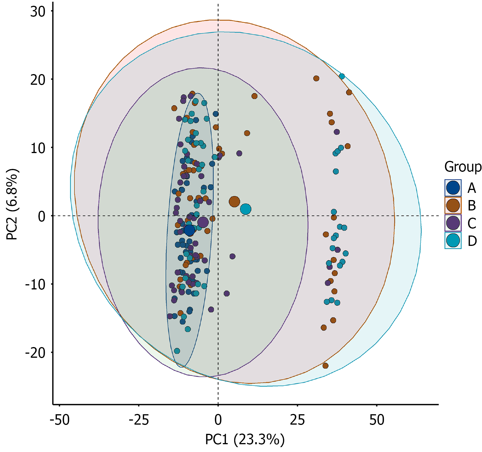
Figure 1 Principal component analysis score plot of the four study groups.
The principal component analysis score plot illustrates the overall distribution of samples across the four study groups: (1) Group A: Normal glucose tolerance; (2) Group B: Isolated impaired fasting glucose; (3) Group C: Isolated impaired glucose tolerance; and (4) Group D: Diabetes. The X-axis indicates the first principal component, explaining 23.3% of the variance, and the Y-axis indicates the second principal component, explaining 6.8% of the variance. First principal component and second principal component together explained 30.1% of the total variance; therefore, this plot was used as an exploratory visualization of overall group trends rather than a complete representation of all sample-level variation. Each point represents an individual sample, and ellipses indicate the confidence regions for each group. PC1: First principal component; PC2: Second principal component.
- Citation: Liu YT, Yu LP, Zhu DL, Li ZP, Zhang JP, Xie LD, Song LL, He YF, Jin X, Li ZQ, Deng RF, Zhang C, Zhang B. Plasma metabolomics reveals progressive alterations across glycemic states. World J Diabetes 2026; 17(9): 122419
- URL: https://www.wjgnet.com/1948-9358/full/v17/i9/122419.htm
- DOI: https://dx.doi.org/10.4239/wjd.122419