Copyright
©The Author(s) 2025.
World J Diabetes. Jul 15, 2025; 16(7): 104789
Published online Jul 15, 2025. doi: 10.4239/wjd.v16.i7.104789
Published online Jul 15, 2025. doi: 10.4239/wjd.v16.i7.104789
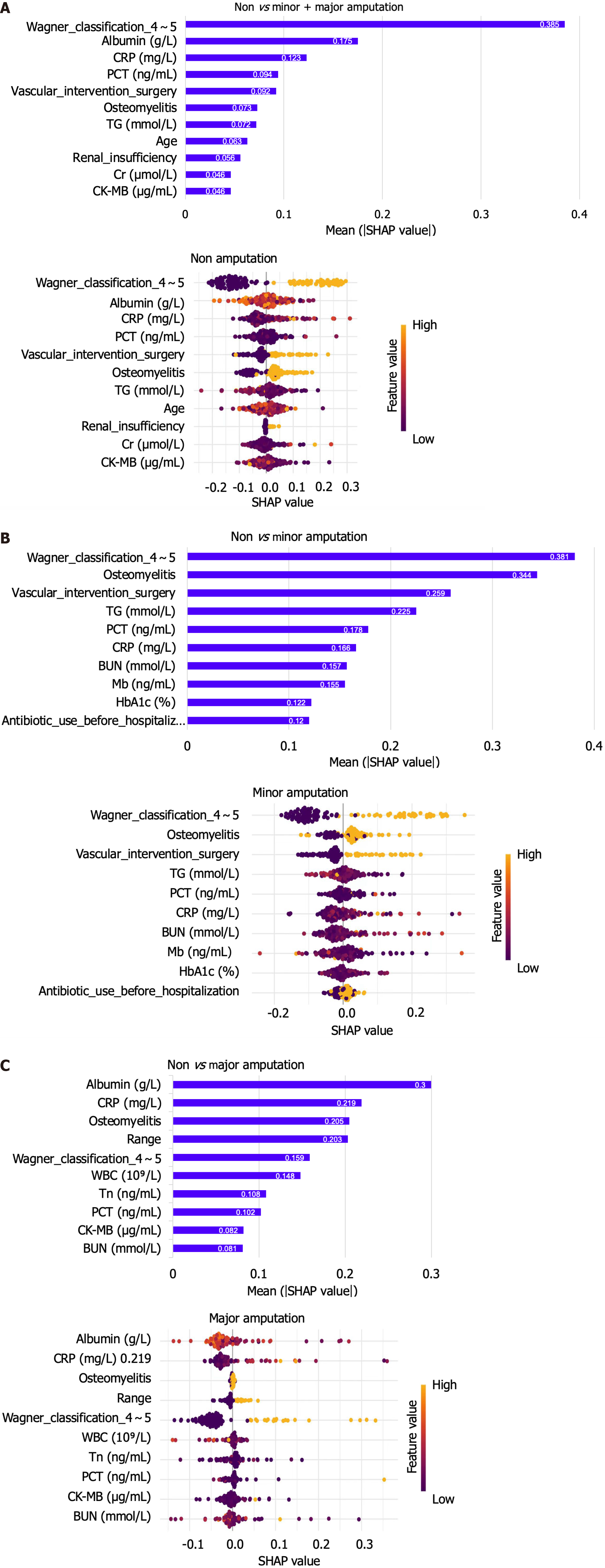
Figure 5 The weights of variable importance and the Beeswarm diagram drawn by SHapley Additive exPlanation to explain the three classification models.
A: The weights of variable importance and the Beeswarm diagram drawn by SHapley Additive explanation (SHAP) to explain the non-amputation model; B: The weights of variable importance and the Beeswarm diagram drawn by SHAP to explain the Minor amputation model; C: The weights of variables importance and the Beeswarm diagram drawn by SHAP to explain the Major amputation model. The values in the bar chart represent the contribution value of each feature, the colors in SHAP value represent the level of correlation, and the left side of 0 represents negative correlation, while the right side represents positive correlation. SHAP: SHapley Additive exPlanation.
- Citation: Gao L, Liu ZX, Wang JN. Predictive model and risk analysis for outcomes in diabetic foot ulcer using eXtreme Gradient Boosting algorithm and SHapley Additive exPlanation. World J Diabetes 2025; 16(7): 104789
- URL: https://www.wjgnet.com/1948-9358/full/v16/i7/104789.htm
- DOI: https://dx.doi.org/10.4239/wjd.v16.i7.104789


