Copyright
©The Author(s) 2025.
World J Diabetes. Jul 15, 2025; 16(7): 104512
Published online Jul 15, 2025. doi: 10.4239/wjd.v16.i7.104512
Published online Jul 15, 2025. doi: 10.4239/wjd.v16.i7.104512
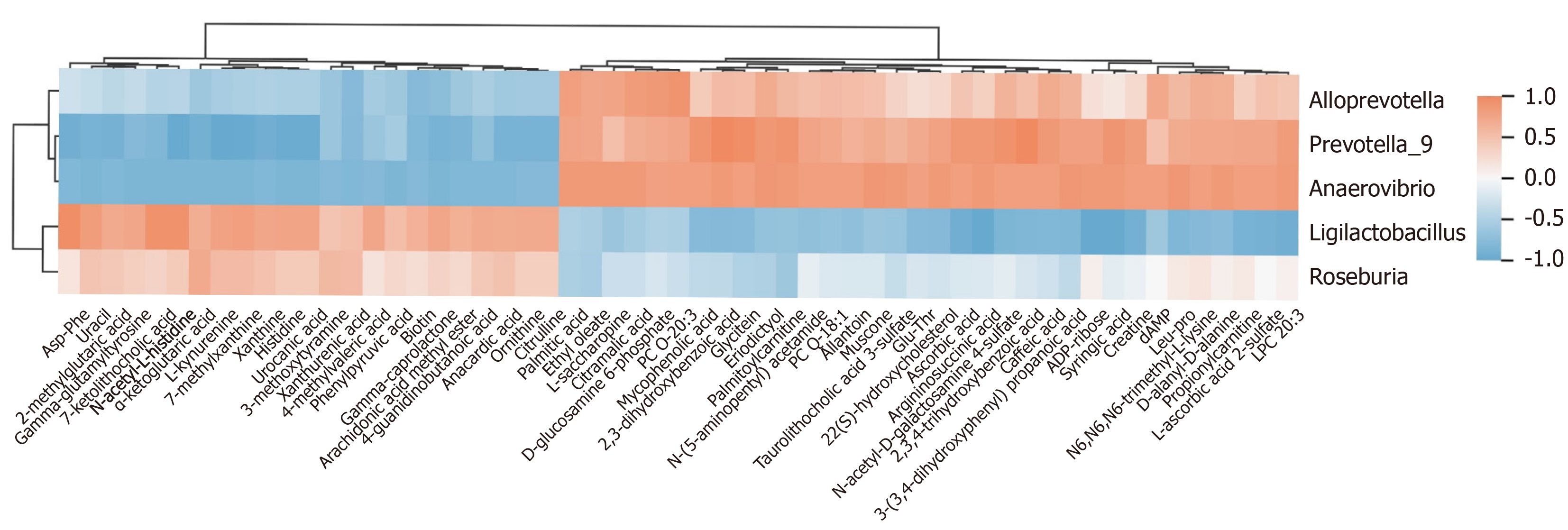
Figure 9 Correlation analysis of the intestinal flora with untargeted metabolomics.
The vertical axis illustrates the varying abundance of gut microbiota. The color coding within the grids reflects the outcomes of the Spearman correlation analysis. Red grids signify positive correlations, where the correlation value exceeds 0.1, whereas blue grids represent negative correlations with values falling below -0.1. The color gradient in the heatmap represents these correlation values, with more intense shades of red or blue indicating stronger correlations.
- Citation: Zheng PX, Lu CL, Liang YL, Ma YM, Peng JW, Xie JJ, Wei JL, Chen SS, Ma ZD, Zhu H, Liang J. Examining gut microbiota and metabolites to clarify mechanisms of Dimocarpus longan Lour leaf components against type 2 diabetes. World J Diabetes 2025; 16(7): 104512
- URL: https://www.wjgnet.com/1948-9358/full/v16/i7/104512.htm
- DOI: https://dx.doi.org/10.4239/wjd.v16.i7.104512


