
















©The Author(s) 2025.
World J Diabetes. Jan 15, 2025; 16(1): 100099
Published online Jan 15, 2025. doi: 10.4239/wjd.v16.i1.100099
Published online Jan 15, 2025. doi: 10.4239/wjd.v16.i1.100099
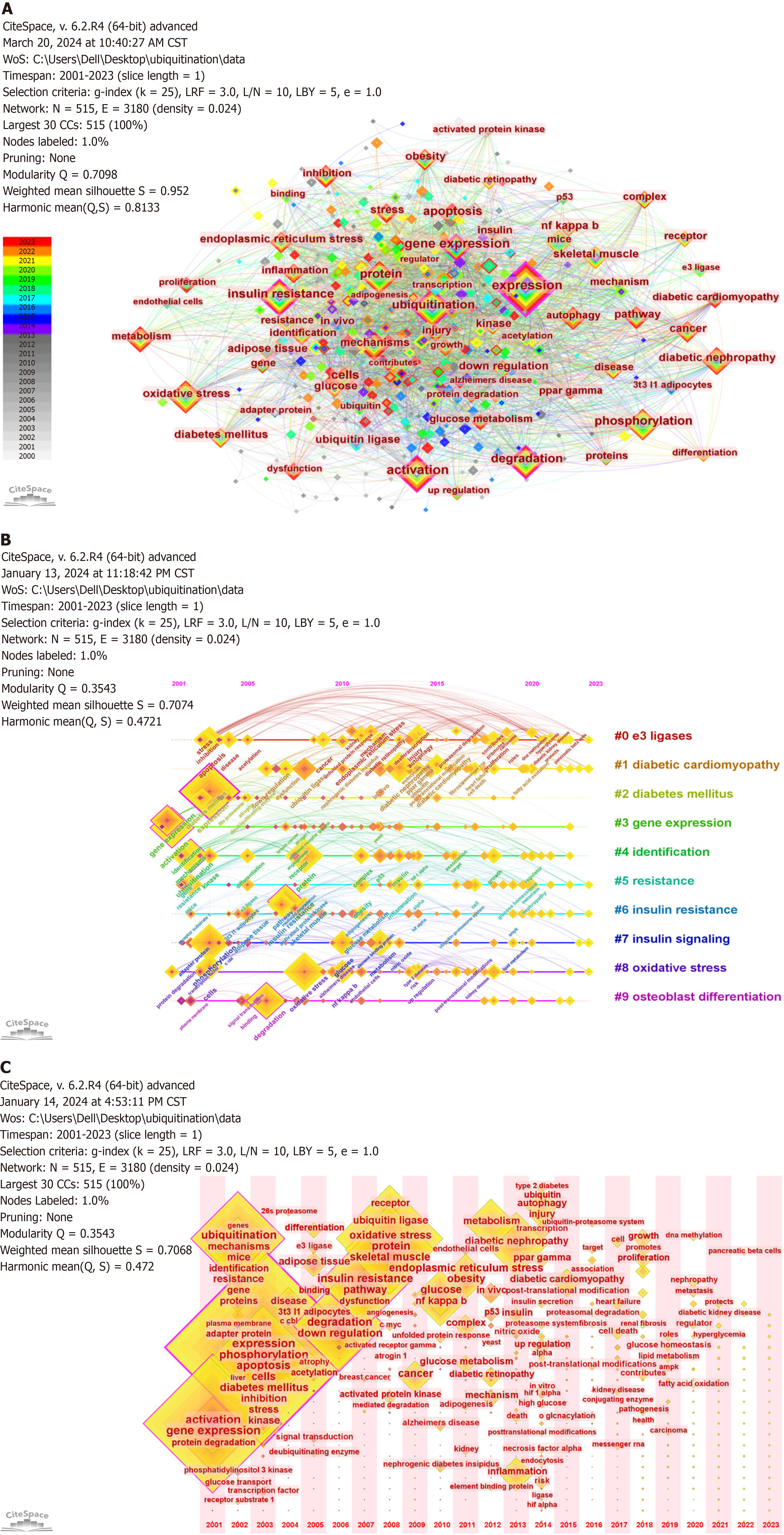
Figure 7 Visualization of keywords in diabetes ubiquitination studies.
A: Visualization of the co-occurrence analysis of keywords in diabetes ubiquitination research. Only keywords with a frequency of 6 or more occurrences are shown. Each node represents a keyword, and the size of the node is proportional to its frequency. The thickness of the connecting lines indicates how frequently two keywords co-occur, and different colors represent the years the keywords appeared; B: Timeline visualization of the top ten keywords clustering analysis. Keywords on the same line correspond to the clusters on the right. Each node represents a keyword, and the size of the node is proportional to its frequency. The position of the node on the horizontal axis indicates the keyword's first occurrence; C: Timeline visualization of keywords. Each node represents a keyword, and its size is proportional to the frequency of the keyword. The position of the node on the horizontal axis indicates the time of the keyword's first appearance.
- Citation: Xiong LY, Zhao W, Hu FQ, Zhou XM, Zheng YJ. Ubiquitination in diabetes and its complications: A perspective from bibliometrics. World J Diabetes 2025; 16(1): 100099
- URL: https://www.wjgnet.com/1948-9358/full/v16/i1/100099.htm
- DOI: https://dx.doi.org/10.4239/wjd.v16.i1.100099